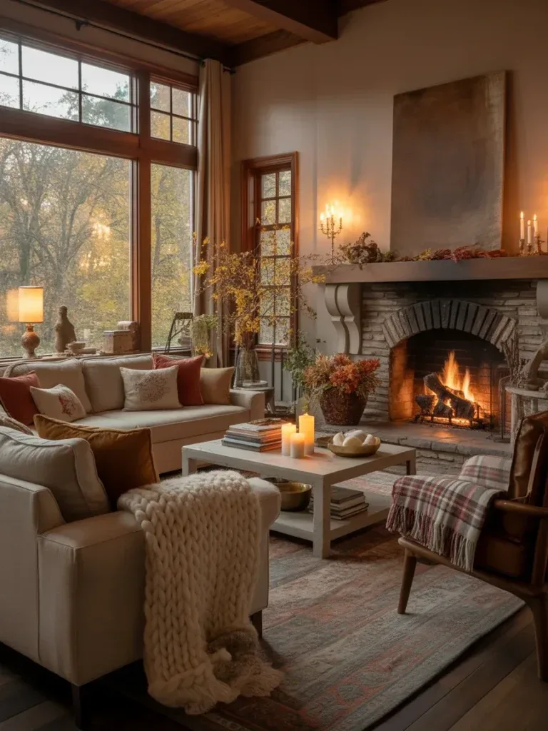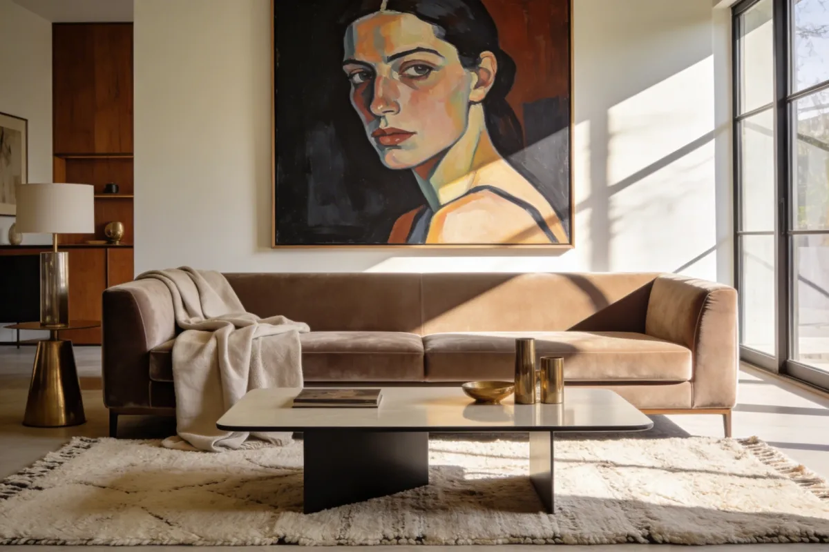
Elegant Living Room Decor Magazine Cover: Luxe on a Budget
Every glossy elegant living room decor magazine cover has the same trick behind it: a handful of deliberate choices, repeated in every corner of the frame. It’s not a bigger budget. It’s fewer, better decisions about texture, light, and what gets left out. If you’re chasing that high-end look on a real budget, these five moves are the ones that actually move the needle — plus two more that most guides skip entirely.
None of this requires a full gut renovation. It requires paying attention to the same five or six things a stylist checks before a photo shoot: fabric mix, artwork placement, light sources, tabletop styling, seating flow, and — often overlooked — the fireplace wall.
What an Elegant Living Room Decor Magazine Cover Actually Requires
Quick-reference summary:
- Mix at least three fabric textures (velvet, linen, wool, or silk) rather than one dominant material
- Anchor the room with one hero piece — art, a sofa color, or a fireplace finish — not five competing focal points
- Build three lighting layers (ambient, task, accent) instead of relying on a single overhead fixture
- Style flat surfaces in odd-numbered groupings, and edit down before you photograph
- Leave visible negative space; a magazine-cover room is edited, not filled
The quiet luxury feminine lifestyle aesthetic that dominates interior boards right now — think soft taupe walls, vogue beige upholstery, brushed brass, and almost no bright color — works because it follows every one of those rules by default. You don’t have to copy it exactly, but understanding why it photographs well will help you apply the same logic to a bolder palette if that’s more your style.
1. Layer Textures Like a Pro
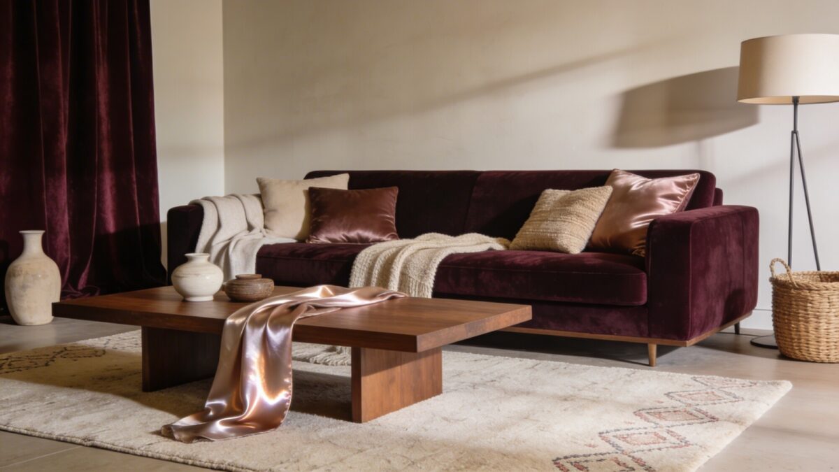
Texture is what separates a photo that looks flat from one that looks expensive, even when the furniture itself is mid-range. Mix velvet, linen, wool, and silk within the same seating area, and the room reads as layered instead of matched.
Start with a neutral base — walls, flooring, and the largest upholstered piece all in the same tonal family, whether that’s a soft taupe aesthetic or a warmer vogue beige. Then add one or two statement textures: a wool rug with visible pile, a velvet ottoman, silk piping on a cushion. That’s usually enough. Three statement textures in one seating group starts to look busy rather than curated.
💡 Pro Tip: If you can only upgrade one texture on a tight budget, upgrade the rug. It covers the most visual real estate in any wide shot, and a flat, low-pile rug is the single fastest way to make a room read as “builder-grade” instead of styled.
Layering fabrics does double duty, too — it hides the wear and tear that comes from actually using a living room, which a magazine set doesn’t have to worry about but your real one does.
2. Balance Bold Art with Quiet, Sophisticated Backdrops
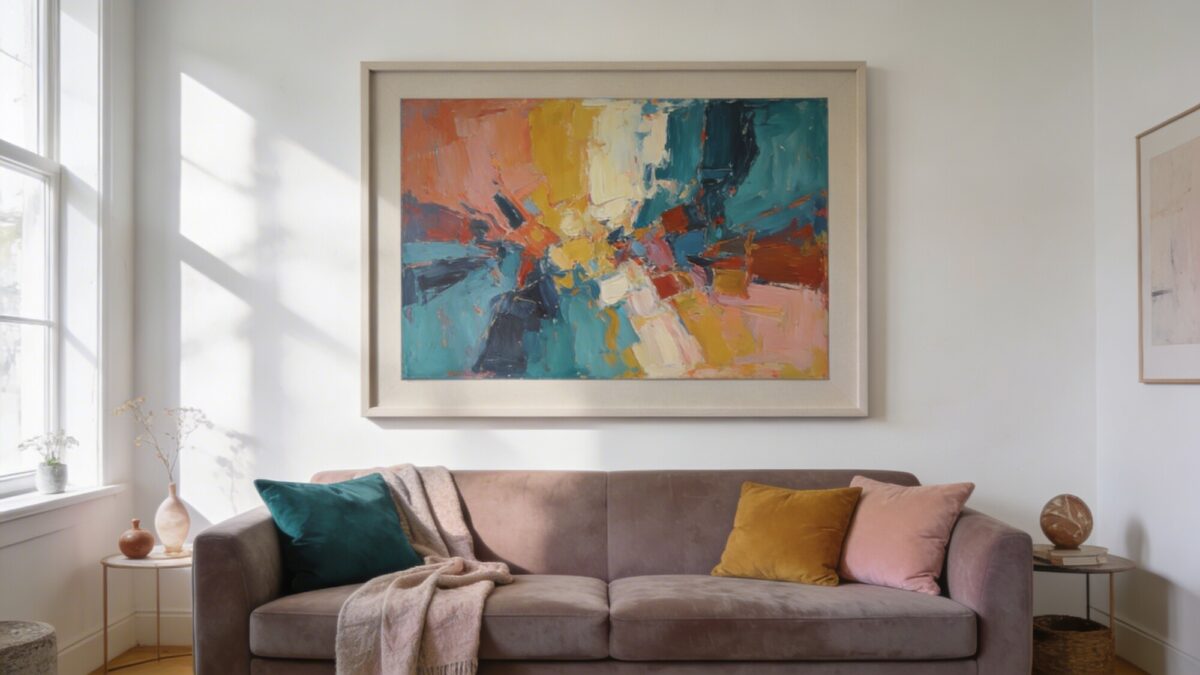
Art should command attention without competing with the room around it. The move that works consistently: one oversized, expressive piece against a calm, uninterrupted wall — not a gallery wall of six smaller frames, which reads as busy in a wide shot even when it looks fine in person.
Frame the piece in a neutral matte, not a glossy black or ornate gold, so the frame doesn’t fight the artwork for attention. Then pull two or three accent colors from the piece into the room — a throw pillow, a candle, a single vase — so the wall doesn’t feel disconnected from everything else. If you want something closer to a fancy living room background than a busy one, this restraint is the whole trick. Anyone leaning toward color can look at how a teal accent palette gets balanced against neutrals for the same effect.
💡 Pro Tip: Hang art at 57–60 inches to the center of the piece, measured from the floor — that’s the standard gallery height. Most people hang art too high because they’re centering it on the furniture below rather than the wall itself, and it throws off every photo taken from a seated eye level.
Get the scale right and a single canvas does more for the room than four smaller pieces ever will. That’s the difference between decor that looks assembled and decor that looks designed.
3. Build Lighting in Layers, Not Just One Fixture
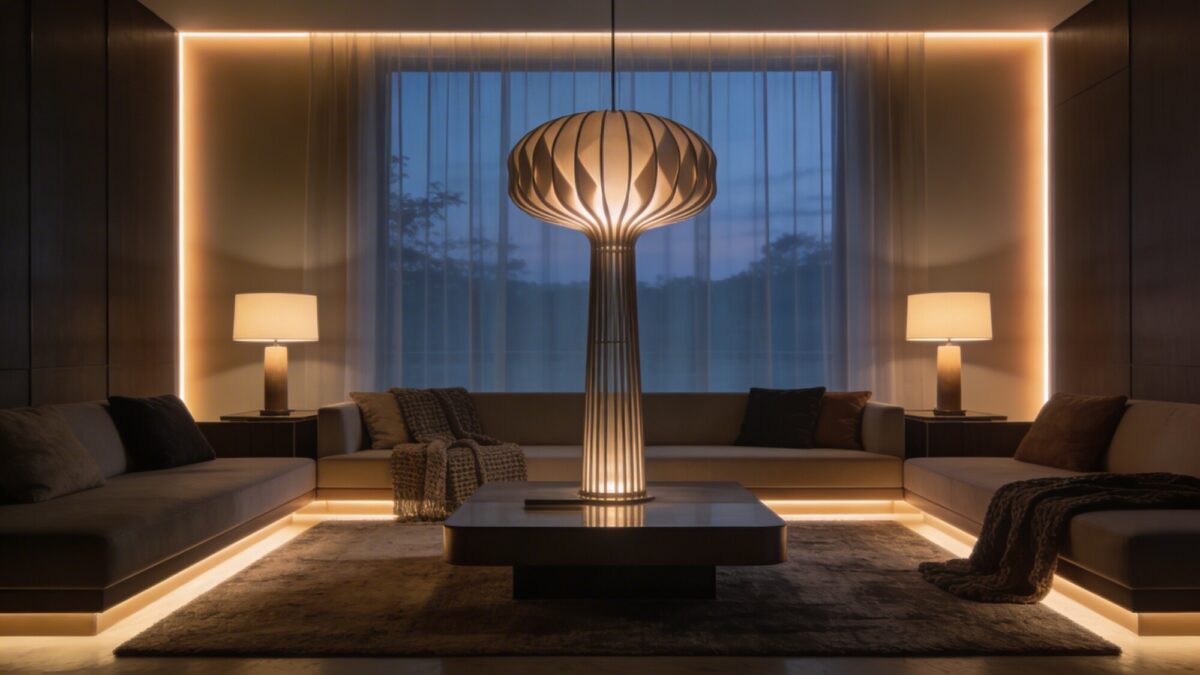
A single ceiling fixture flattens a room in photos and in person — it casts one direction of shadow and leaves everything else in even, characterless light. Real interior photography (and real evenings on the sofa) relies on three separate layers instead.
- Ambient: a statement floor lamp with a sculptural base, positioned where it reads as a design object on its own
- Task: waist-height table lamps flanking the seating, angled to actually be usable for reading
- Accent: low-profile LED strips or puck lights along a shelf or the back of a console, kept dim and warm rather than bright and white
If you’re chasing the chandelier-and-sconce version of this look for a more formal room, the layering principle is identical — you’re still building three separate light sources rather than one. Some chandelier styling approaches apply the same ambient/task/accent split at a larger scale.
💡 Pro Tip: Stick to warm-white bulbs (2700K–3000K) across every layer. Mixing a cool-white overhead with warm-white lamps is one of the most common mistakes in home lighting — the two color temperatures fight each other in a photo, even if you don’t consciously notice it in person.
4. Curate a Coffee Table That Tells a Story
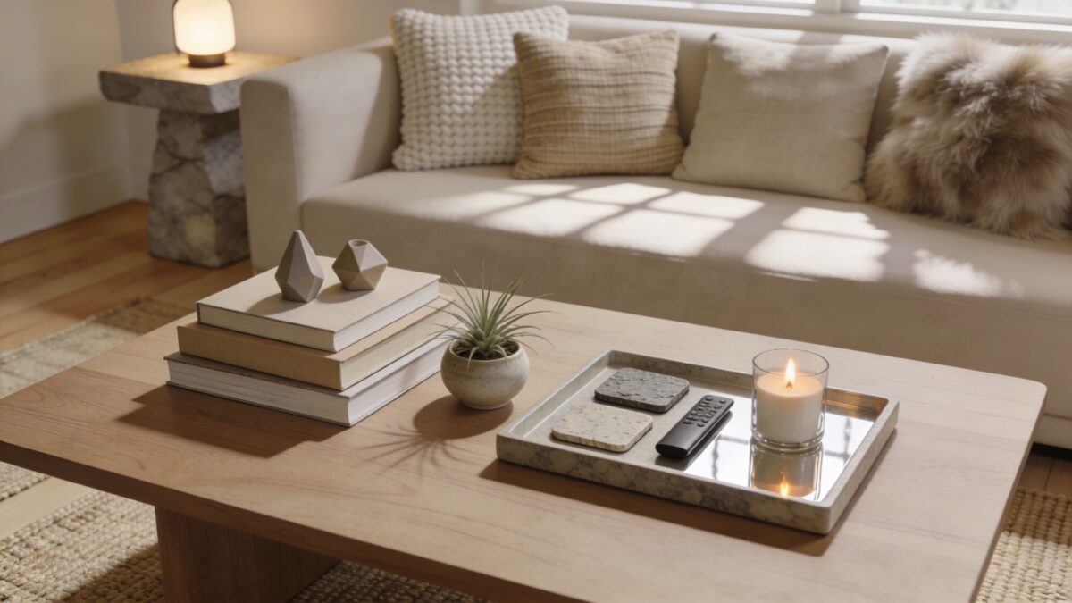
A coffee table is a small stage, and it’s usually the first thing that gets cluttered with remotes, mail, and phone chargers. Styling it well is less about buying new objects and more about editing what’s already there down to a deliberate few.
Group items in odd numbers — three books stacked with two small sculptural objects reads as intentional in a way four matched objects doesn’t. Add one living element, even something as small as an air plant, since a table with zero organic material tends to look staged rather than lived-in. If books are going to be part of the styling, the spines and covers matter more than people expect; a books-as-decor approach covers how to actually select and stack them so they read as curated instead of random.
💡 Pro Tip: Keep a lidded tray on the table specifically for remotes, coasters, and charging cables. It’s the single fastest fix for a coffee table that looks “almost” styled — everything functional gets one designated home instead of scattered across the surface.
Swap two or three items seasonally — a candle in winter, fresh stems in spring — and the table stays interesting without a full restyle every few months.
5. Style a Seating Arrangement That’s Cozy Yet Polished
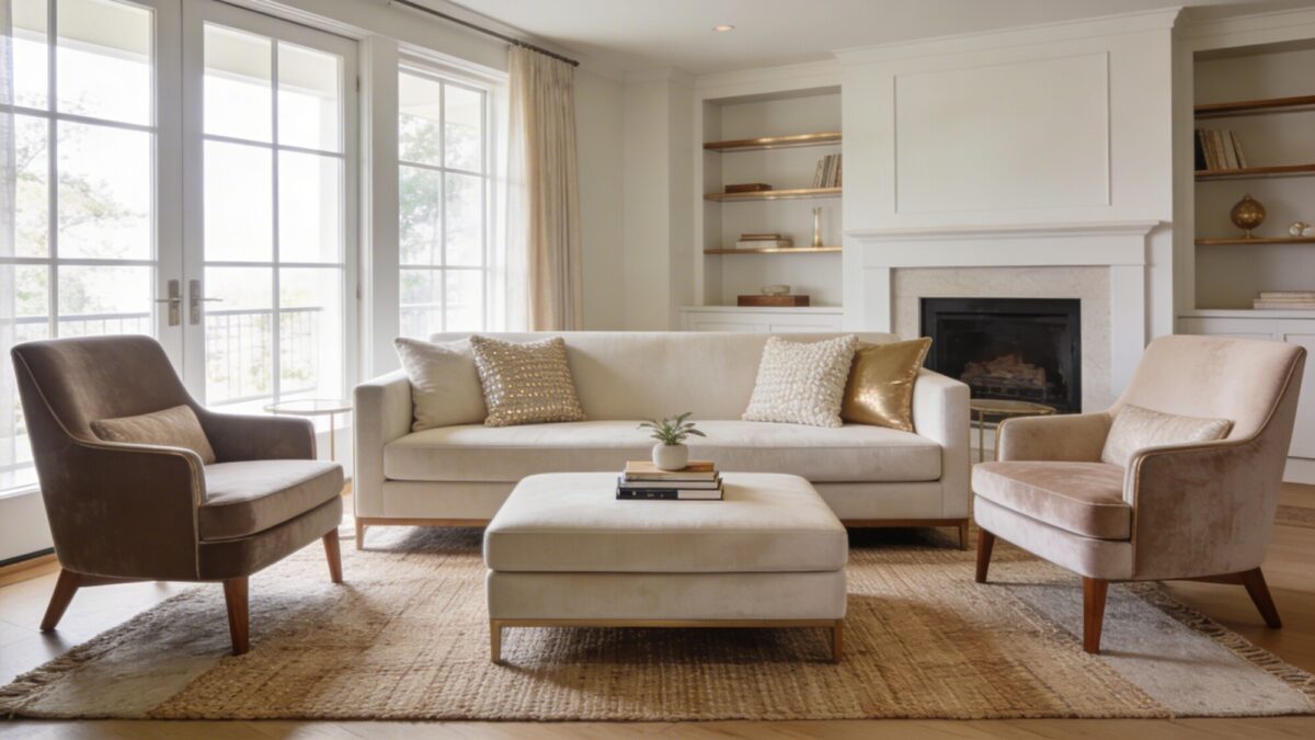
Seating layout affects a room’s photographability more than almost anything else on this list, because it determines the sightlines the camera — and your guests — actually see. Two accent chairs flanking a sofa, with a single ottoman between them, creates a conversational triangle that reads as intentional from nearly any angle in the room.
Leave clear sightlines to whatever architectural feature the room already has — a window, a fireplace, built-in shelving. Furniture that blocks that view makes a room feel smaller in photos even when it’s spacious in person.
💡 Pro Tip: Before buying anything new, try angling your existing chairs 15–20 degrees toward the center of the room instead of squaring them to the walls. It’s free, takes five minutes, and it’s the single most common change stagers make before a listing photo shoot.
6. Give the Fireplace Wall a Quiet-Luxury Update
If your living room has a fireplace, it’s almost always the room’s natural focal point — and it’s the piece most people leave untouched while decorating everything around it. A finish update here does more for the “magazine cover” effect than a new sofa would.
Green marble fireplace surrounds have become one of the more requested updates in higher-end renovations, and a light green or mint green fireplace facing reads as both trend-forward and restrained — closer to a minimalist japandi interior design sensibility than a bold statement color. If a full stone surround isn’t in the budget, a paint-grade mantel in a muted sage still gets you most of the visual effect for a fraction of the cost. Pair it with the same warm lighting layers from Section 3, and the fireplace becomes the anchor the rest of the room’s styling supports rather than competes with.
💡 Pro Tip: If you’re refacing an existing fireplace, get a physical stone sample before committing — green marble varies enormously between slabs, and the swatch in a showroom under bright light often reads several shades darker once it’s installed under your room’s actual light temperature.
Seasonal Styling: From Cozy Winter to a Romantic Evening Setup
The five core moves above hold year-round, but the accents on top of them are worth rotating. Cozy winter home decor leans into heavier textiles — a wool throw over the sofa arm, a deeper color on the accent pillows — while warmer months call for lighter linens and less layering overall.
For an evening-specific look, luxury red decor built around a red velvet sofa (or even just red velvet cushions on a neutral sofa) paired with grouped candles creates a romantic evening living room setup without requiring a full redecoration. Keep the red confined to one or two elements rather than spreading it across the room — the same “one hero piece” rule from the art section applies here too.
Comparing Three Budget Tiers for the Same Look
| Approach | Typical Spend | What It Gets You | Best For |
|---|---|---|---|
| Restyle Only | $0–$150 | Rearranged furniture, edited coffee table, swapped throw pillows and lamps you already own | Renters, or anyone testing the look before committing |
| Targeted Upgrade | $300–$900 | New rug, one statement lamp, reframed existing art, a few textile swaps | Most homeowners — this tier covers 80% of the visual impact |
| Full Refresh | $1,500+ | Fireplace refacing, new sofa or slipcover, a hired-out art piece, layered lighting rewire | Anyone staying long-term or preparing to sell |
Things to Consider Before You Start
- Do you already own pieces in a workable neutral palette, or are you starting from a strongly colored existing sofa or wall?
- Is your lighting hardwired, or can you add lamps freely — this changes how much the lighting layer will cost
- Are you renting? Fireplace refacing and hardwired lighting changes may not be reversible or allowed
- Do you want a quiet luxury feminine lifestyle aesthetic (muted, tonal) or something bolder like the red velvet evening look — pick one direction before buying accents, since mixing both dilutes each
FAQ
Do I need to repaint to get this look?
Not usually. Most of the effect comes from texture, lighting, and styling rather than wall color. If your walls are already a neutral — white, greige, taupe — you can skip repainting entirely and put that budget toward the rug or lighting instead.
What’s the single fastest change with the biggest visual impact?
Lighting layers. A room with three light sources at different heights looks considerably more finished than the same room with one overhead fixture, and lamps are one of the cheaper items on this list.
Is the quiet luxury aesthetic the same as “vogue beige”?
They overlap but aren’t identical. Vogue beige refers specifically to the warm, tonal beige palette; quiet luxury is the broader design philosophy — muted color, high-quality materials, minimal visual noise — that beige palette happens to express well.
Can I get this look with a colorful, non-neutral sofa?
Yes, but treat the sofa as your one hero element and keep everything else — walls, rug, art frame — neutral around it. The mistake is adding a bold sofa and then also adding bold art and a bold rug; pick one focal color per room.
How often should I restyle the coffee table and shelves?
Seasonally is enough for most people — swap two or three small items (candle, greenery, a book or two) rather than restyling the whole surface. A full restyle every few weeks usually means the base styling wasn’t solid to begin with.
Our Take
If you only do two things from this list, layer your lighting and edit your coffee table — those two changes are the cheapest and the most visible in any photo. Texture and art matter more over time, and the fireplace update is worth it only if that wall is already your room’s natural focal point. Skip trying to do all seven changes at once; pick one, live with it for a week, and let that decide what you tackle next. For a broader set of ideas once you’ve nailed the basics, this collection of luxe styling ideas is a reasonable next stop.