7 Elegant Living Room Decor Modern: Luxe in Minutes
An elegant living room decor modern style isn’t about buying more — it’s about a handful of decisions repeated consistently across the room: texture, light, one focal point, and then knowing when to stop adding things. If your living room feels flat rather than finished, it’s usually two or three of the seven moves below, not the whole room. For a broader set of options once these basics are in place, this guide to high-end looks on a budget is worth a look.
None of these seven require a renovation. Most are a weekend project or less, and a few — like the lighting fix — are closer to an afternoon.
Quick-Reference: The 7 Moves
- Layer at least three textures instead of matching one
- Build three lighting layers, anchored by one statement fixture
- Choose one bold art piece over a gallery wall
- Pick one sculptural furniture piece rather than several “interesting” ones
- Keep the palette neutral with a single accent color, not several
- Add real greenery — plastic reads as plastic in daylight
- Style surfaces with purposeful, story-driven objects, not filler
1. Layer Textures Instead of Matching Them
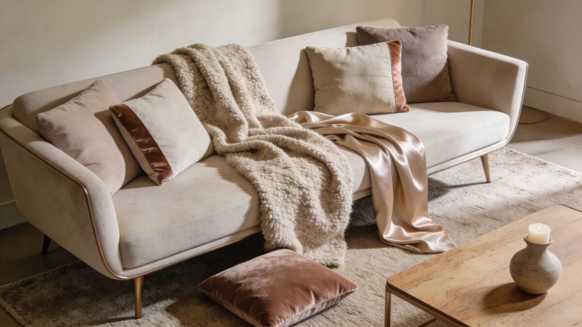
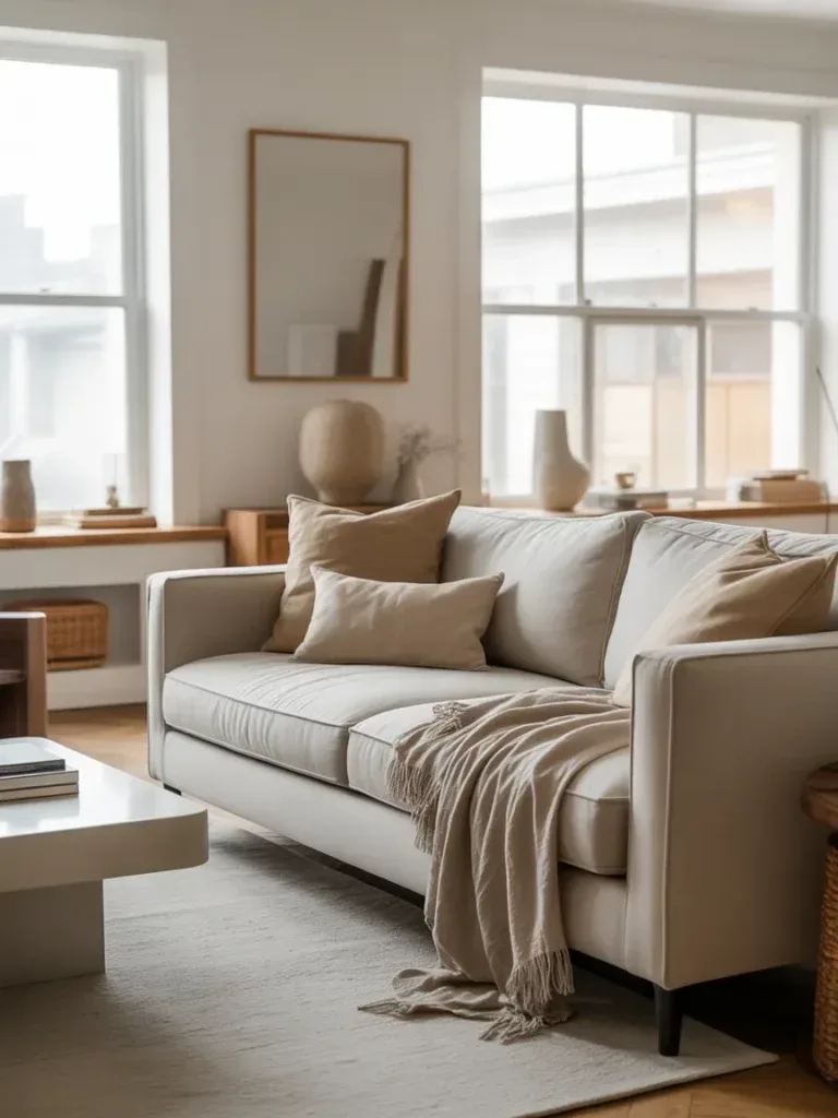
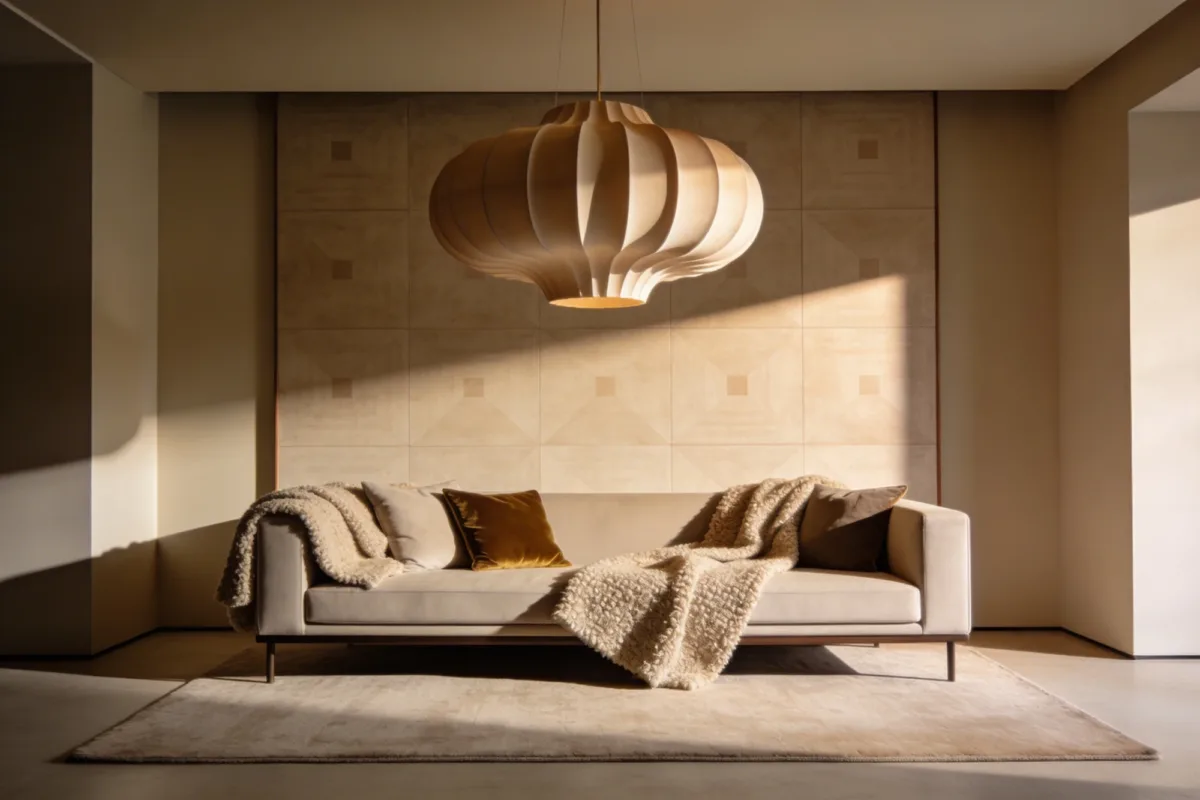
A modern living room that looks flat almost always has one problem: everything is the same material. One sofa fabric, one rug texture, one type of cushion. Layering fixes this without changing the color palette at all — a wool or boucle throw over a smooth mid-century sofa, linen cushions with a velvet accent piped along the edge, a low-pile rug underneath.
The goal is contrast in touch, not in color. Keep the palette tight — beige, taupe, stone — and let the textures do the work of making the room feel dimensional instead of clinical. If you’re aiming for a modern beige living room decor look specifically, this is the step that keeps a beige-on-beige room from reading as bland.
💡 Pro Tip: Pick patterns from three different families — one geometric, one organic, one solid — rather than three variations of the same stripe or dot. Repeating a similar pattern at different scales looks accidental rather than intentional; mixing pattern types looks curated.
2. Make Lighting the Statement, But Keep It Subtle
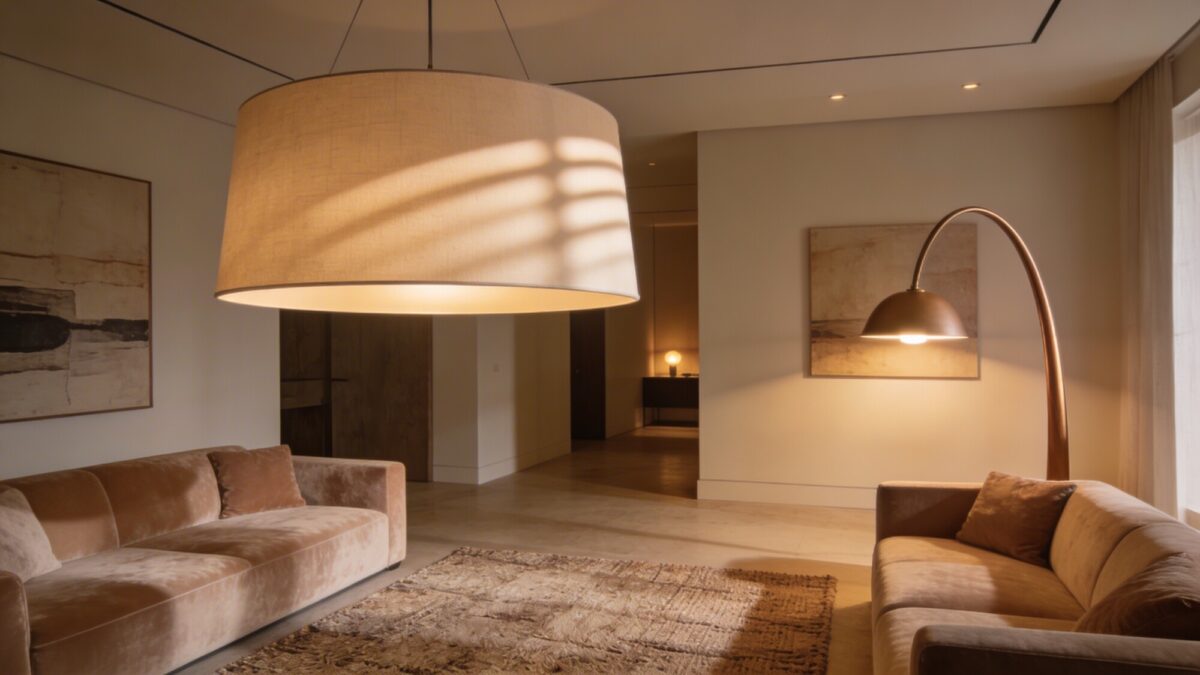
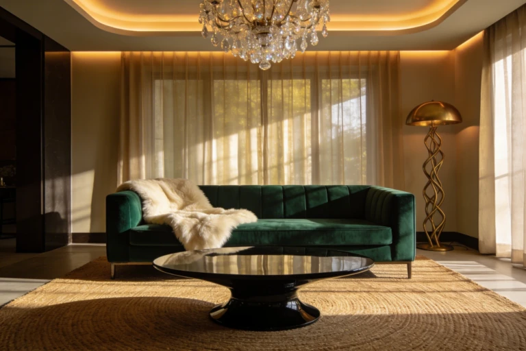
One oversized pendant or arc lamp does more for a room’s character than three matching table lamps ever will — it gives the eye a single place to land. Pair it with warm bulbs, 2700–3000K specifically, since anything cooler reads as office lighting rather than living room lighting.
The mistake most people make here is stopping at the ceiling fixture. A single overhead light, however striking, still casts one flat direction of shadow. Add at least one lamp at seating height so the room has a second, softer light source for evenings.
💡 Pro Tip: Put your statement fixture and your lamps on separate dimmer circuits if you can. Being able to kill the overhead entirely and run on lamp light alone is what actually creates the “gallery-worthy” evening mood — not the fixture itself.
3. Let One Art Piece Carry the Wall
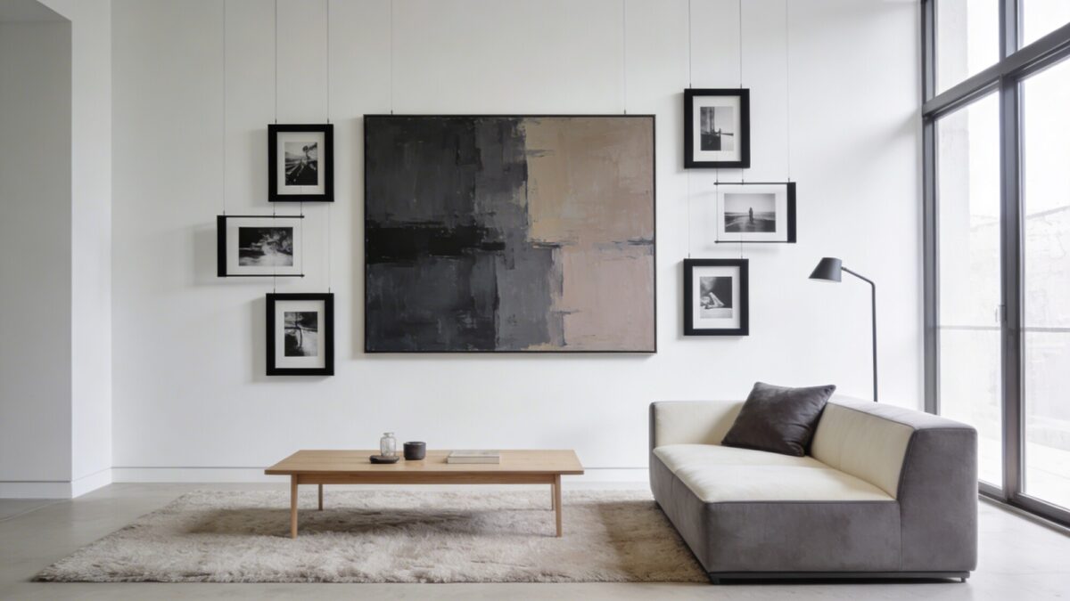
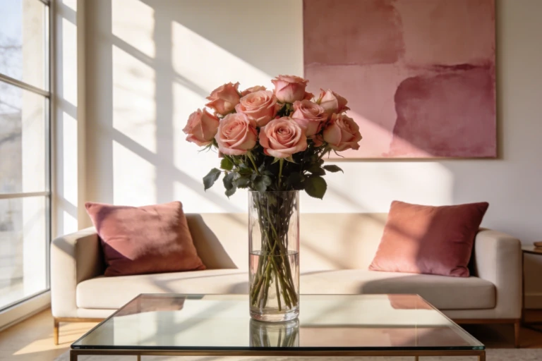
A gallery wall of six small frames photographs fine up close, but from across the room in a modern interior style, it tends to read as visual clutter rather than curation. One or two bold canvases in a cohesive color family — charcoal, graphite, taupe, whatever matches your existing palette — carries more weight with less effort.
Black-and-white photography in slim matte black frames works as a secondary layer if you want more on the wall without competing with the main piece. Keep negative space around everything; a wall that’s “full” stops feeling deliberate.
4. Choose One Sculptural Piece Over Several “Interesting” Ones
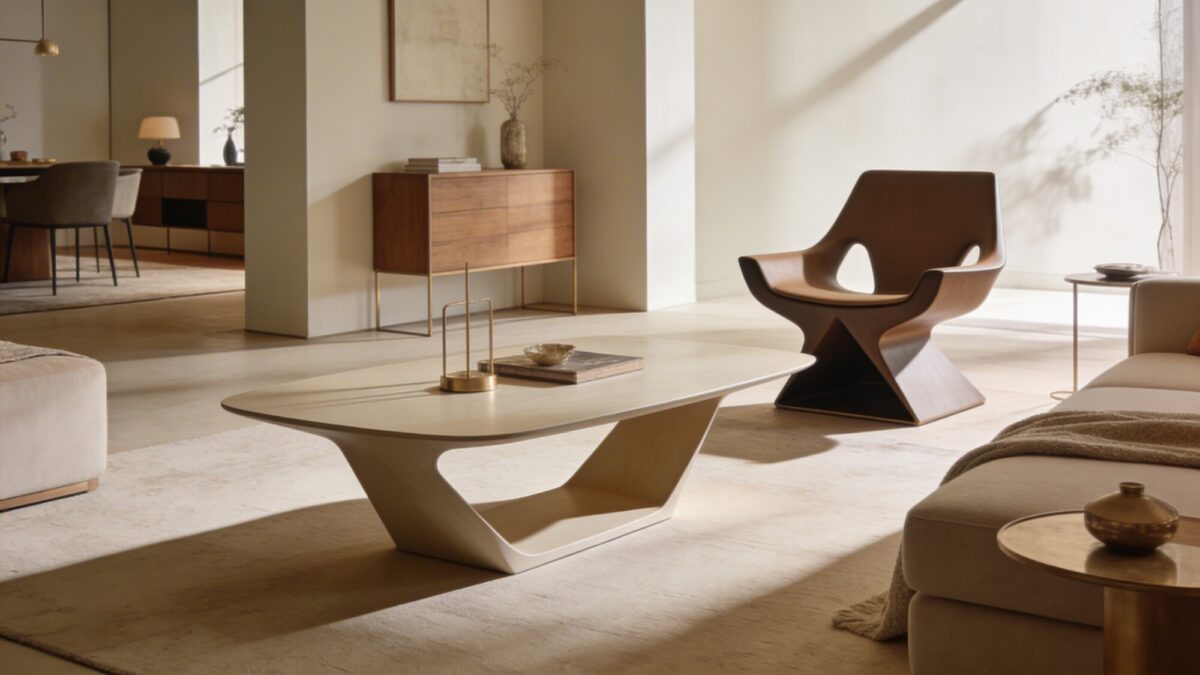
This is where a lot of otherwise-good modern rooms lose the plot: everyone wants furniture with personality, so they buy three or four “statement” pieces, and the room ends up busy instead of curated. Pick one — a coffee table with a genuinely unusual silhouette, or a single accent chair with an architectural shape — and let everything else in the room be quiet by comparison.
Open sightlines matter here too. A sculptural piece only reads as sculptural if there’s clear space around it; wedge it between two other bulky items and the shape disappears.
💡 Pro Tip: If you’re deciding between an unusual coffee table and an unusual chair, go with the chair. A chair’s silhouette is visible from more angles in the room and holds up better in photos taken from the doorway, which is the angle most people actually see first.
5. Keep the Palette Neutral, Then Add One Accent Color
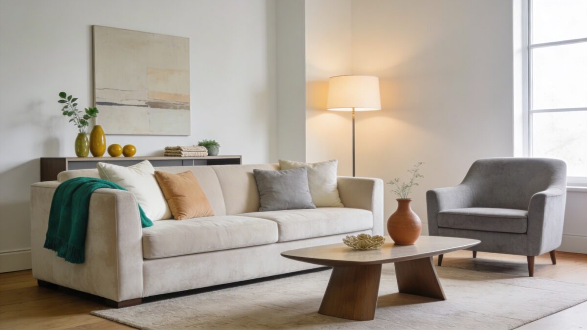
A modern luxury living room apartments look tends to lean heavily neutral — soft white, warm beige, cool gray — and then use exactly one accent color in small, repeated doses. Emerald, terracotta, and mustard all work; what matters is picking one and using it two or three times (a throw, a vase, a small object on a shelf) rather than scattering multiple accent colors around the room.
The reason this reads as more sophisticated than a fully neutral room: total beige-on-beige can look unfinished, while one consistent accent color signals it was a choice. Vary the textile hues slightly too — ivory next to warm beige next to light gray — so the neutral base doesn’t go flat.
6. Add Real Greenery, Not Filler Plants
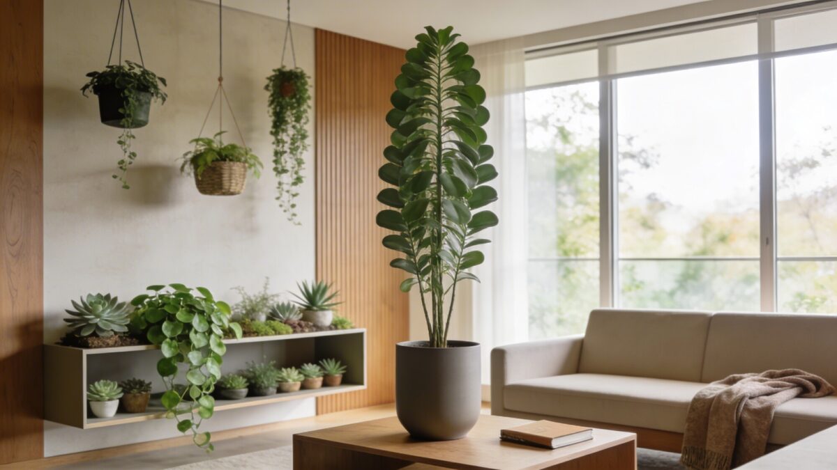
Plastic greenery tends to look like plastic greenery under real daylight, even the expensive kind — the leaf sheen and uniform coloring give it away within a few feet. A single real statement plant in a sleek pot, positioned where its height actually does something architecturally, works better than five smaller fake ones scattered around.
If you don’t have a great light source, pothos and snake plants tolerate low light better than most other options, and hanging planters keep surface space free for the styling from the next section.
7. Style Surfaces With Purpose, Not With Filler
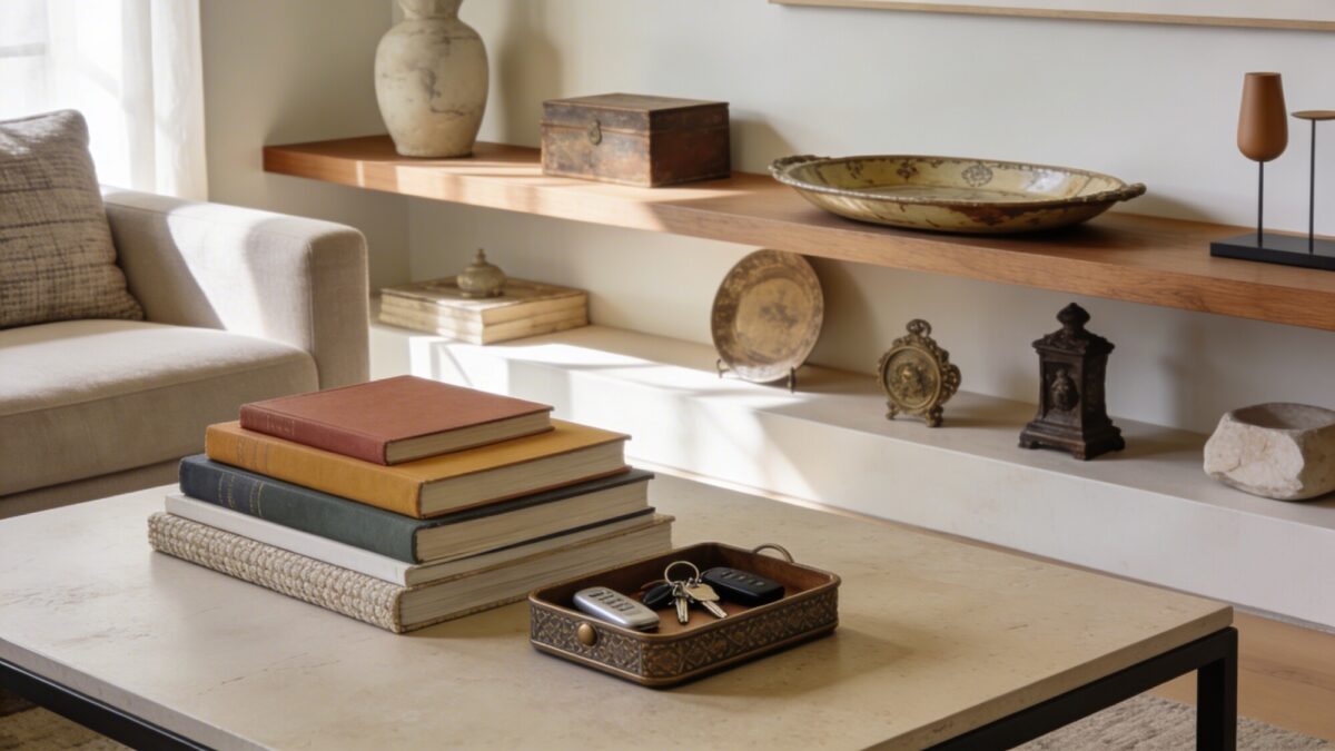
The difference between a coffee table that looks styled and one that looks like a catch-all: a curated stack of books with varied cover textures, a tray specifically for keys and remotes, and one or two objects with actual history — an heirloom bowl, something picked up while traveling — mixed in with modern pieces. If books are part of your styling, this guide to styling with books covers stacking and spine-facing in more detail than most people think to consider.
💡 Pro Tip: If a surface item doesn’t have a function or a story, it’s probably filler. Ask “what does this do, or why do I have it” for everything on the coffee table — anything without an answer is a candidate to remove, not add to.
Common Mistakes in Aesthetic Living Room Design
| Mistake | Why It Happens | Fix |
|---|---|---|
| Multiple “statement” furniture pieces | Each piece looks good alone in a showroom or online | Pick one hero piece; keep the rest quiet |
| Cool-white and warm-white bulbs mixed | Bulbs bought separately over time, no color temp check | Standardize on 2700–3000K across every fixture |
| Gallery wall instead of one bold piece | Feels safer to spread risk across several small frames | One or two large pieces in a cohesive color family |
| Multiple accent colors at once | Each color individually seems like a small addition | Choose one accent color, repeat it two to three times |
Things to Consider Before You Start
- Is your existing furniture mostly neutral, or do you already have a strong accent color to build around?
- Do you have natural light for real plants, or should you plan around low-light varieties?
- Are your fixtures on a single circuit, or can you separate ambient and task lighting onto dimmers?
- Are you renting — does that rule out anything requiring wall-mounted or hardwired changes?
FAQ
What’s the fastest of these seven to actually finish in a weekend?
Textures and lighting. Both are swap-in changes — new throw, new cushions, a lamp or two — that don’t require rearranging furniture or waiting on deliveries for large pieces.
Do I need matching furniture for a modern interior style?
No — matching sets tend to look more like a showroom floor than a lived-in room. Coordinated but not identical (same tonal family, different pieces) reads as more considered.
How many accent colors is too many?
More than one, generally. A single accent color repeated a few times reads as intentional; two or more competing accents usually reads as unplanned, even if each one is nice individually.
Is a modern beige living room decor look too plain without an accent color?
It can be, yes — that’s exactly why the textures and one accent color steps matter. A fully monochrome beige room with no textural or color variation is where “modern” tips into “unfinished.”
Real plants or artificial — does it actually matter?
For anything at eye level or in direct light, yes. Artificial plants read fine in low-visibility spots (a high shelf, a dim corner) but look noticeably fake as a floor-level statement piece under daylight.
Our Take
Start with lighting and textures — they’re the cheapest two moves here and the ones most likely to make an immediate difference. Save the sculptural furniture piece for last; it’s the one item worth spending real money on, and it’s easier to choose well once the rest of the room’s palette and mood are already settled. If your space leans more toward calm minimalism than the layered look above, this minimalist living room approach applies several of the same principles with an even lighter touch.