8 Nordic Living Room Inspiration: Serene and Cozy Vibes
The failure mode of Nordic design isn’t clutter — it’s the opposite. Strip a room down to white walls, a light sofa, and one plant, and you end up with something that photographs well and feels like nobody actually lives there. The Nordic living room inspiration below is built around a different rule: minimal doesn’t mean empty, it means every layer earns its place. If you’re weighing this against a fuller Scandinavian approach, this guide to Scandinavian living room inspiration covers the broader style family this sits inside.
None of these eight ideas require gutting the room. Most are layering and lighting decisions you can make with what you already own, plus a few targeted buys.
Quick Takeaways
- Warmth in a Nordic room comes from wood tone and texture, not from adding more color.
- Natural light is the actual foundation of the style — everything else compensates for how much or little of it you have.
- A styled coffee table with three or four objects does more work than an empty one or a cluttered one.
- Layered lighting (ambient, task, accent) matters more here than in most styles, since Nordic rooms lean on mood over brightness.
- Storage that hides clutter is what actually keeps a minimalist room minimalist day to day.
Things to Consider Before You Start
- Audit your natural light before buying anything — a north-facing room with small windows needs a different lighting plan than a bright south-facing one.
- Pick one or two wood tones for the whole room. Mixing warm oak with cool ash or gray-washed wood is the single most common reason a Nordic room looks disjointed.
- Plan storage before you plan decor. A shelf full of “curated objects” stops looking curated fast if there’s nowhere to put the mail, chargers, and remotes.
- Decide your rug size using furniture placement, not room size — undersized rugs are the most common mistake in this style.
1. Build Soft Minimalism, Not Empty Minimalism
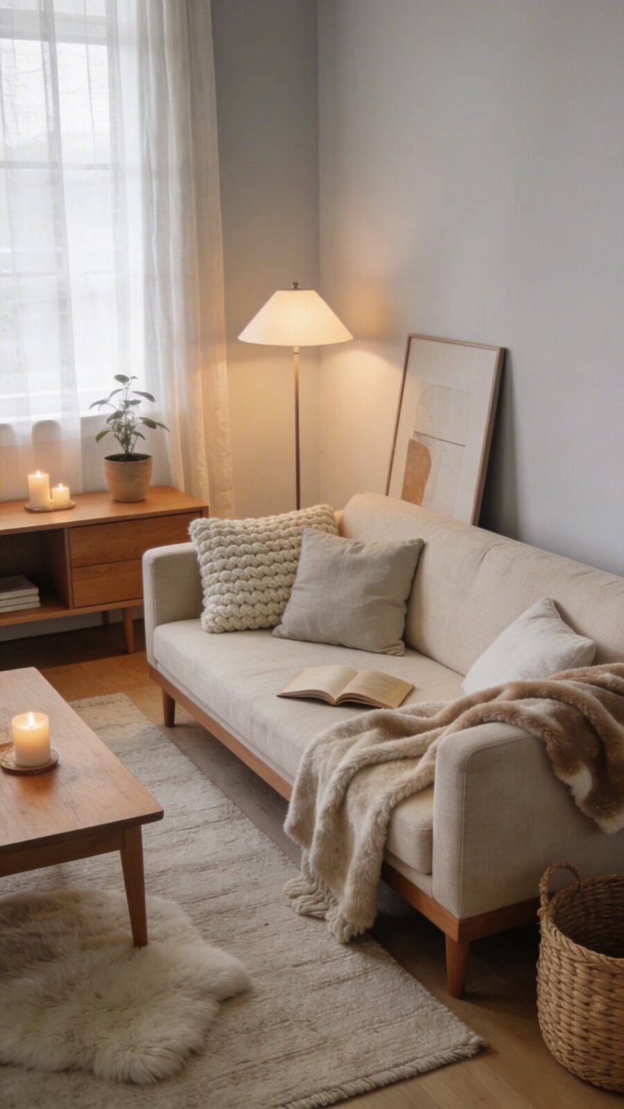
The base palette — off-white or light gray walls, warm wood furniture — is the easy part. What separates a warm Nordic room from a sterile one is what sits on top of that base: a chunky wool throw, linen cushions, a fleece blanket left visibly draped rather than folded stiffly. A room styled entirely for a photo, with every textile perfectly pressed, tends to feel like nobody’s allowed to sit down.
Wood tone matters more than most people budget time for. Oak and ash both read as “Nordic,” but they’re not interchangeable — oak leans warmer and more golden, ash is cooler and paler. Pick one family and stick to it across the coffee table, media console, and any shelving, or the room starts to look like it was furnished in three separate trips.
💡 Pro Tip: If you’re mixing furniture from different sources, bring a swatch or photo of your main wood piece when shopping for the next one. Wood tone names (“natural oak,” “light ash”) vary enough between brands that they’re not reliable on their own.
2. Treat Natural Light as the Actual Foundation
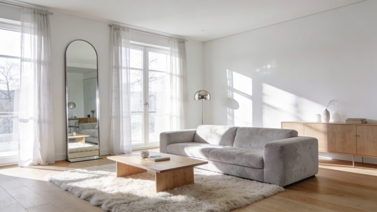
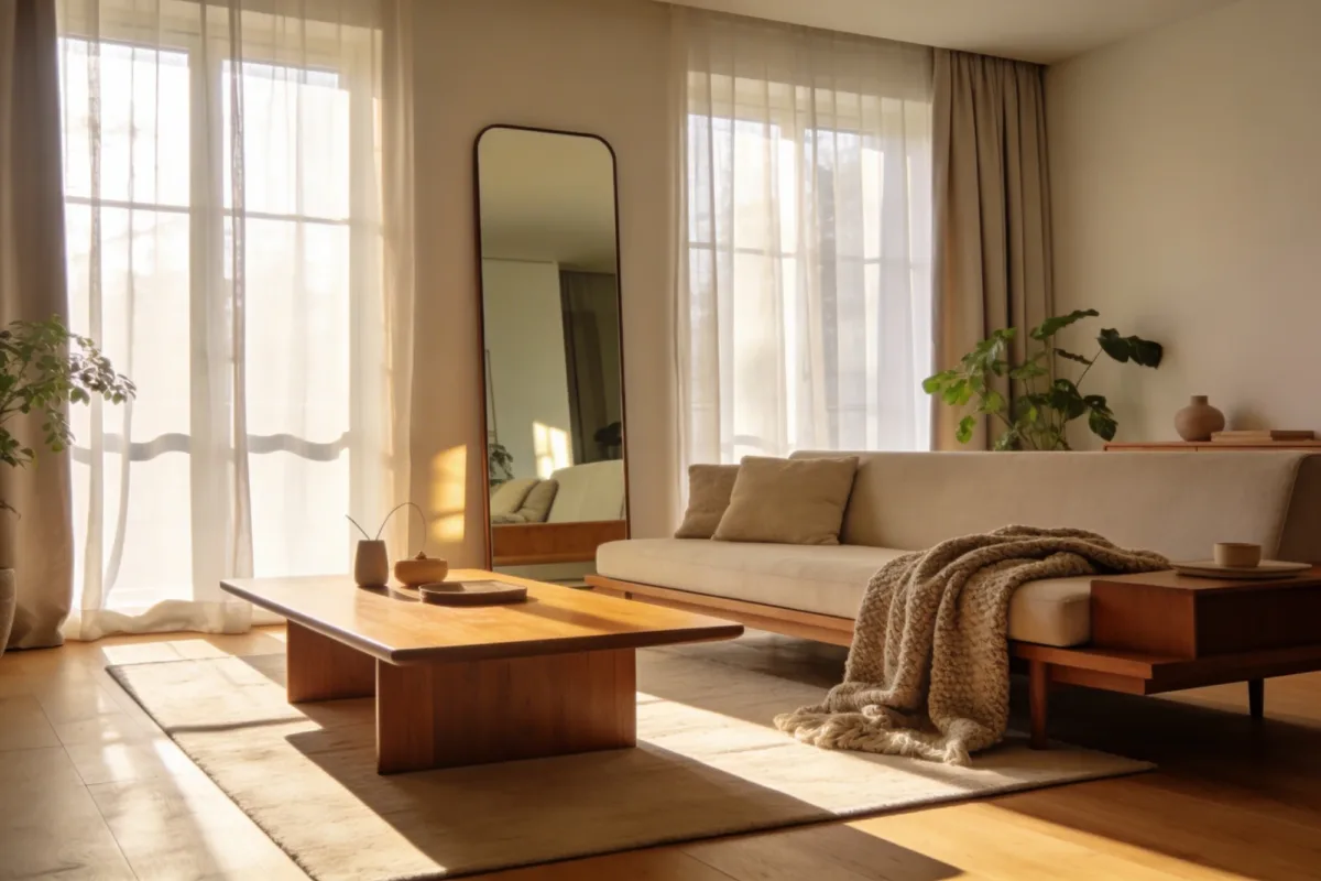
Nordic design developed in places with long, dark winters, which is exactly why it leans so hard on maximizing whatever light is available. Sheer curtains that filter light without blocking it, a large mirror placed to reflect a window, and brushed metal or glass accents that bounce light around a room all do real work here — this isn’t just styling advice, it’s the reason the aesthetic reads as calm rather than dim.
If your room doesn’t get much natural light regardless of what you do, don’t force it. Lean harder into idea seven below (the lighting trio) instead of fighting a losing battle with mirrors and sheer curtains alone.
💡 Pro Tip: Position a mirror to reflect the window itself, not just the wall opposite it. A mirror angled toward a blank wall barely helps; one that catches the window doubles the perceived light source.
3. Style the Coffee Table Like It’s Furniture, Not a Shelf
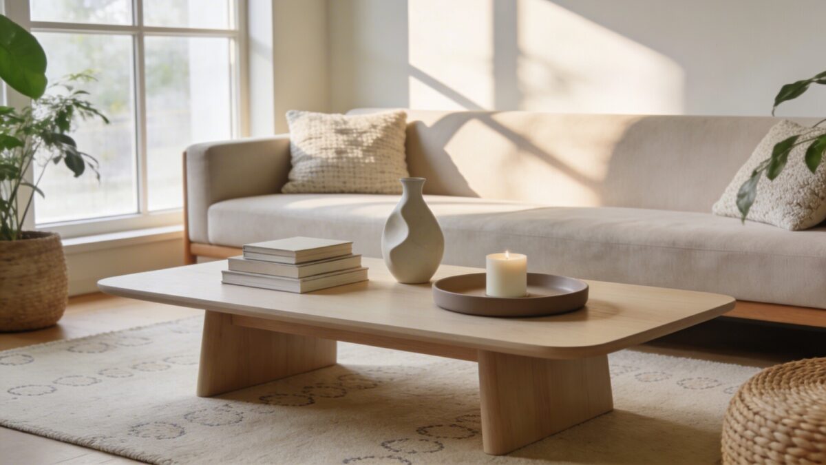
An empty coffee table looks unfinished; a coffee table with six random objects looks cluttered. The middle ground that actually works: a small stack of two or three books (stacked asymmetrically, not squared off), one sculptural object like a ceramic vase, and a tray that corrals the practical stuff — a candle, a small bowl for keys or remotes. That’s it. Three groupings, not three objects — the tray counts as one “zone” even though it holds several items.
The trade-off worth knowing: books chosen purely for spine color look staged the moment a guest picks one up and realizes it’s decor, not a book anyone’s reading. If you want the table to feel lived-in rather than styled, use books you’d actually read, even if the colors don’t match as perfectly.
4. Bring In Wood and Plants Instead of Color
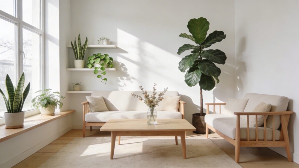
In a palette this restrained, plants and wood grain are doing the job that color does in a bolder room — they’re the visual interest. Low-maintenance plants like snake plants or pothos tolerate the lower light levels common in Nordic-style rooms with sheer (not blackout) curtains; a fiddle-leaf fig or rubber plant works as a taller focal point but needs consistently bright, indirect light or it drops leaves within weeks.
Match your plant choice to your actual light conditions rather than the photo that inspired the room. This is the most common mismatch in Nordic-style spaces: a fiddle-leaf fig bought for a dim corner because it looked right in a reference image, then replaced six months later.
For more on pairing greenery with a genuinely warm, grounded palette, this guide to organic modern living room ideas covers a closely related approach.
5. Layer Texture to Keep a Monochrome Room Interesting
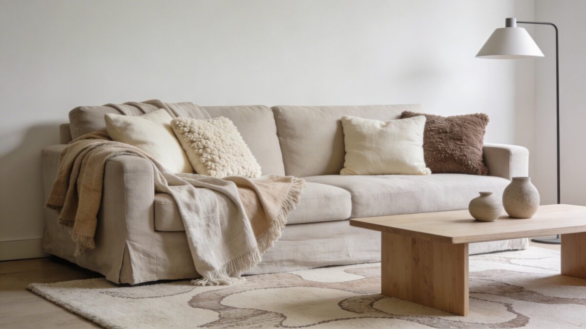
When you’re not using color for contrast, texture has to carry the room. Linen throws, wool or boucle cushions, and a rug with a subtle woven pattern all read as different tones of the same neutral without ever clashing. The mistake to avoid: using only one texture family (all smooth cotton, say) across the whole room — it goes flat fast, even with a perfect color palette.
💡 Pro Tip: Touch the fabric before buying, not just the color swatch. Two cushions can be the exact same shade of oatmeal and feel completely different in the room depending on whether one is smooth linen and the other is nubby boucle — texture reads visually even from across the room.
6. Use Rug Size to Control How the Room Feels
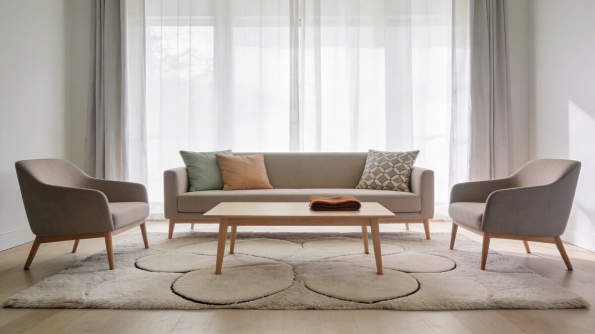
Rug size is a genuine design decision, not an afterthought. A rug where only the coffee table sits on it, with the sofa and chairs floating around the edges, makes a room feel smaller and more fragmented than it is. The Nordic-standard fix is a rug large enough that at least the front legs of every seating piece rest on it — that single change visually anchors a whole seating arrangement.
For pillows, two solid tones plus one subtle pattern is a reliable ratio; more than one patterned cushion in a Nordic room usually reads as busy rather than layered. One bold-colored throw, used sparingly, is enough to keep an all-neutral room from feeling flat.
7. Layer Lighting: Ambient, Task, and Accent
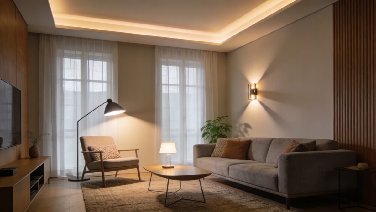
A single overhead light forces a room into one mood all day. Three light sources at different heights — ambient (ceiling or a large floor lamp), task (a reading lamp positioned by a chair), and accent (a table lamp or wall sconce) — let the same room go from bright and functional in the morning to low and warm for a movie night, without moving a single piece of furniture.
Keep the color temperature consistent across all three, ideally in the 2700–3000K warm white range. Mixing a warm floor lamp with a cooler overhead fixture is a small detail that undercuts the whole effect — it’s the kind of thing that makes a room feel subtly “off” without anyone being able to say exactly why.
💡 Pro Tip: Buy one extra bulb of the exact model you’re using in the room and keep it as a spare. Warm white bulbs vary slightly in tint between brands, and replacing just one bulb with a different brand a year later is a common reason lighting suddenly looks mismatched.
8. Add Personal Objects Without Losing the Calm
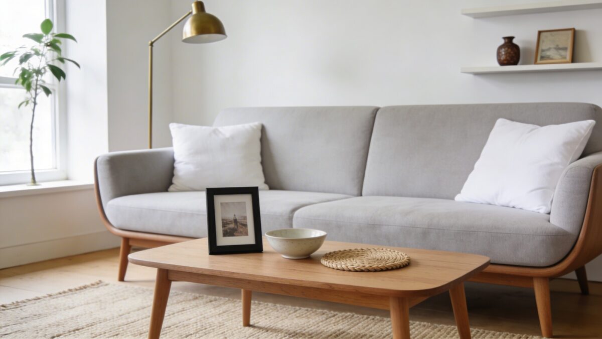
Pure minimalism and a lived-in room aren’t the same goal, and chasing only the first one tends to produce a space that feels like a hotel. A framed photo in a simple frame, a ceramic bowl, one object with an actual story behind it — a handwoven coaster, a keepsake from a trip — do more for how a room feels than a fully “neutral” shelf ever will.
The discipline is in the editing, not the avoidance. Two or three meaningful objects, rotated seasonally, keeps a shelf or table feeling current instead of turning into a permanent display of everything you own. If storage is the bigger issue — where the rest of your stuff actually goes — this guide to cozy living room inspiration has more on balancing warmth with practical storage.
Nordic Room Layering Checklist
| Layer | What to include | Common mistake |
|---|---|---|
| Base | One consistent wood tone, off-white or light gray walls | Mixing warm and cool wood tones in the same room |
| Textiles | Linen, wool, boucle in two or three tones | Using only one fabric texture throughout |
| Lighting | Ambient + task + accent, all at 2700–3000K | Relying on a single overhead fixture |
| Surfaces | Coffee table styled in 3 grouped zones (books, object, tray) | Either a bare table or six scattered objects |
| Greenery | Plants matched to actual light levels in the room | Buying a fiddle-leaf fig for a low-light corner |
Frequently Asked Questions
Is Nordic design the same as Scandinavian design?
They overlap heavily and are often used interchangeably. Nordic tends to emphasize the light-and-warmth balance a little more explicitly; Scandinavian is the broader, more commonly used term for the same general style family.
How do I keep a Nordic room from feeling cold?
Texture and wood tone, not color. A neutral palette with varied tactile layers — wool, linen, warm wood — reads as cozy; the same palette in smooth, hard-surfaced materials reads as cold.
What if my living room doesn’t get much natural light?
Don’t rely on mirrors and sheer curtains alone — invest more in the ambient/task/accent lighting layering instead, and choose lower-light-tolerant plants like snake plants or pothos over a fiddle-leaf fig.
How big should my area rug be?
Big enough that at least the front legs of your sofa and chairs sit on it. A rug that only the coffee table touches makes the seating area look disconnected.
Can a small living room still work in this style?
Yes — Nordic design’s restraint actually suits small spaces well, since it avoids visual clutter by design. The main adjustment is scaling furniture down rather than trying to fit showroom-sized pieces into a tight footprint.
Our Take
Start with the light audit and the lighting trio — they affect how the whole room feels more than any single furniture purchase, and they’re the most commonly skipped step. Texture and wood-tone consistency come next; both are cheap to fix once you’ve noticed the mismatch, and both are the difference between a room that looks intentional and one that looks assembled from unrelated purchases. If your space is on the smaller side and you’re figuring out how much of this style to commit to before buying furniture, this guide to minimalist living room interior ideas is a useful next read.