
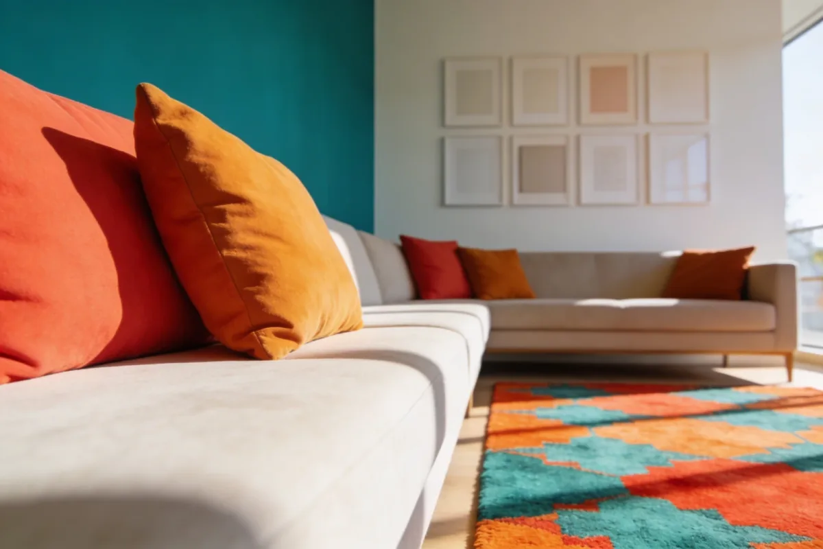
7 Colorful Living Room Inspiration: Vibe with Bold Hues
Most colorful living room inspiration falls apart the second it leaves Pinterest. You pull five bright throw pillows, a rug, and a piece of art, and the room ends up looking busy instead of lively. The difference between a room that reads as intentional and one that reads as cluttered usually comes down to restraint — picking where the color lives and letting the rest of the room support it. If your current space feels flat rather than overwhelming, our modern living room ideas guide covers the calmer end of the same spectrum.
Below are seven approaches that work in real rooms, not just in staged photos, plus the mistakes that usually sink them.
Quick Takeaways
- Pick one dominant color move per room — a wall, a sofa, or a gallery wall — not three competing ones.
- Contrast (warm vs. cool) reads as more sophisticated than variety for its own sake.
- Texture and metallics let you add visual interest without adding more actual colors.
- Lighting changes how saturated colors look more than almost any other factor in the room.
- Cap your palette at 2–3 dominant hues plus neutrals — this is the rule most colorful rooms break.
1. Start With a Bold Color Block Wall
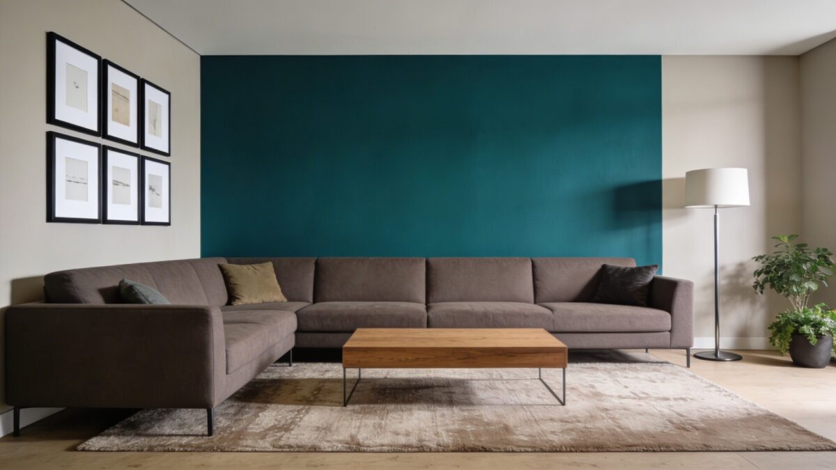
A single saturated wall — deep teal, royal blue, emerald — does more for a colorful living room aesthetic than filling the whole room with color. It gives your eye one clear place to land, and everything else in the room gets to stay quiet by comparison. This matters more than people think: a fully colorful room with no neutral anchor tends to feel exhausting to actually live in, not just to look at in a photo.
Pick the color after you’ve picked your largest furniture piece, not before. A saturated teal wall behind a stone-colored sofa works; the same wall behind a navy sofa competes with it instead of framing it.
💡 Pro Tip: Use an eggshell or matte finish, not satin or semi-gloss, on a color block wall. Glossier finishes bounce light unevenly and show every roller mark and wall imperfection — matte hides both and looks more saturated in person than it does on the paint chip.
2. Mix Warm and Cool Accents for Instant Energy
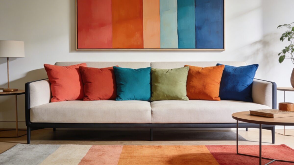
Pairing warm tones — coral, terracotta, amber — with cool ones — teal, sage, ultramarine — gives you contrast without chaos, because the eye reads opposing temperatures as a deliberate choice rather than a random assortment. This is also where a lot of the current interest in a green and pink living room aesthetic comes from: pastel green paired with dusty pink hits the same warm-cool balance, just in a softer register than jewel tones.
The mistake here is treating “colorful” as “more colors.” Cap yourself at two or three dominant hues and let neutrals — cream, taupe, warm gray — do the load-bearing work of walls, sofa, and flooring. If pastel green living room ideas are more your speed than jewel tones, the same warm/cool logic still applies: pair the sage or pastel green with a warm blush or terracotta accent rather than another cool tone, or the room ends up feeling one-note instead of balanced.
3. Embrace Textured Geometry in Soft Furnishings
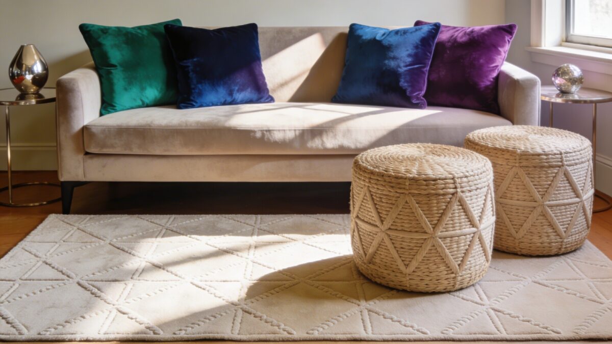
Texture is the cheapest way to add visual interest to a colorful living room without adding more pigment. Velvet cushions in jewel tones, a woven geometric pouf, and a rug with a raised pattern all catch light differently across the day — which means the room actually looks different at 9am and at 7pm, in a way flat paint never will.
Materials Worth Prioritizing
- Velvet cushions in emerald, sapphire, or amethyst — matte finish, not shiny
- Woven or rattan poufs for a low, grounded texture note
- Rugs with subtle raised or looped pile rather than flat weave
Mix matte and glossy surfaces in the same vignette — a matte velvet cushion next to a glossy lacquered side table reads as more considered than an all-matte or all-glossy room. This approach works especially well in a smaller footprint, where you don’t have wall space for a full color block. Our green living room texture guide goes deeper on pairing color with material contrast specifically.
4. Let a Metallic Moment Spark the Scene
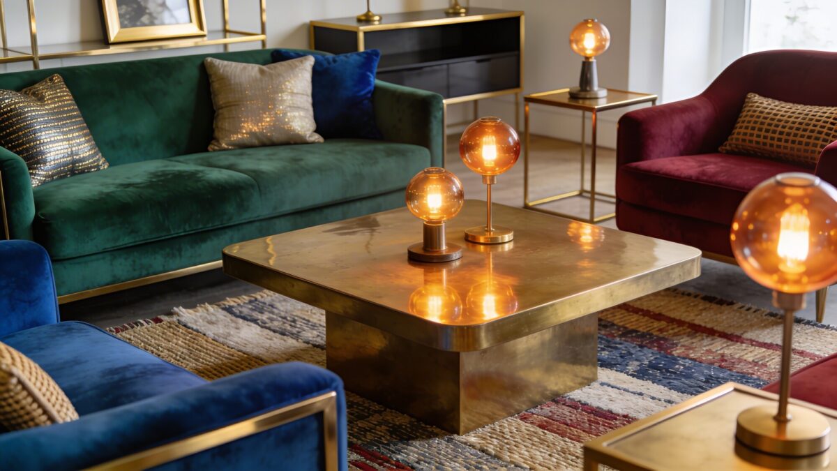
Brass, copper, and brushed nickel don’t compete with color the way another fabric or paint choice would — they reflect it. A brass coffee table next to an emerald sofa amplifies the green without adding a fourth hue to the room’s palette, which is exactly the kind of move that keeps a colorful room from tipping into visual clutter.
💡 Pro Tip: Stick to one metal finish per room — brass or nickel, not both — across lamps, frames, and hardware. Mixing metals can work, but in a room that’s already carrying bold color, a second competing metal tone usually reads as unplanned rather than eclectic.
5. Create a Colorful Gallery Wall That Tells a Story
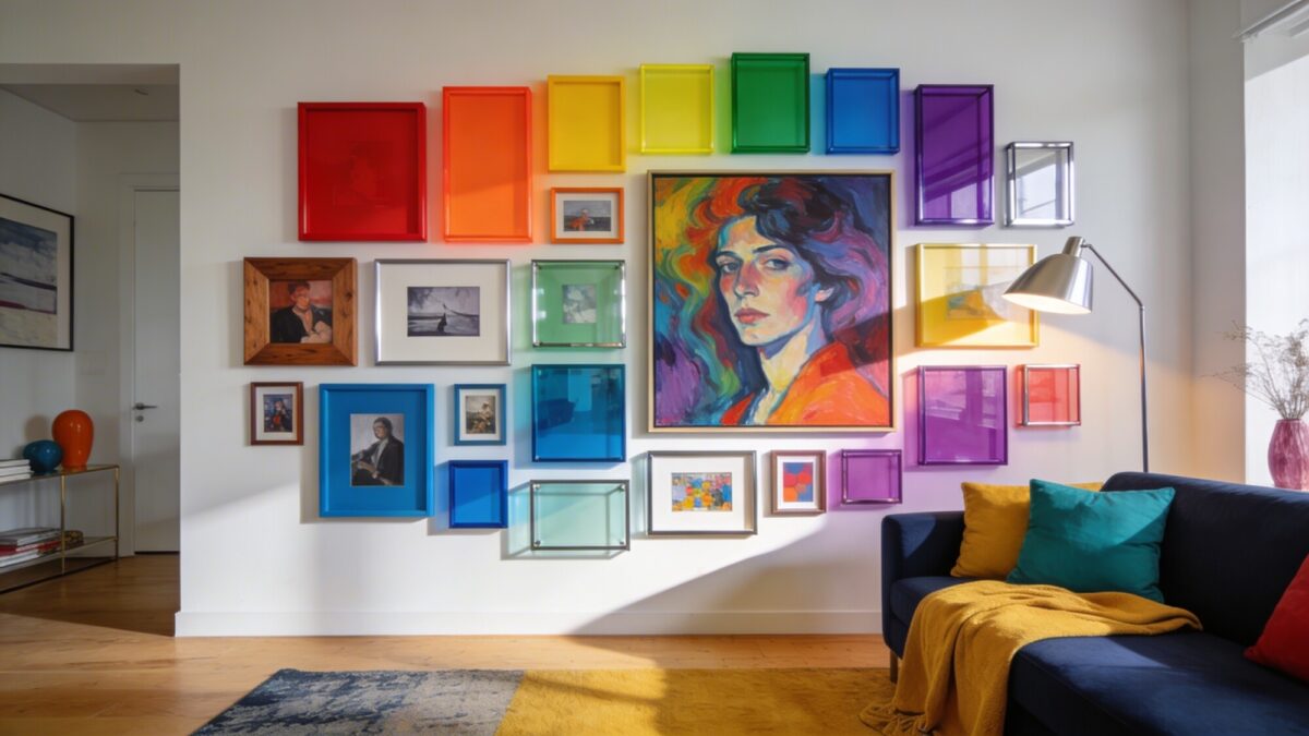
A salon-style gallery wall — mixed frame sizes and finishes, one bold focal piece, a repeated color trio running through the room — gives you a colorful house interior moment that costs less than almost anything else on this list and is the easiest to change your mind about later. Unlike a paint color, you can swap one frame out on a Sunday afternoon.
How to Build One
- Pick a color trio that already exists somewhere in the room — pull it from your sofa, rug, or an existing throw.
- Lay the arrangement out on the floor first, mixing frame sizes and finishes (wood, metal, glossy, matte).
- Place one larger, bolder piece off-center rather than dead-center — it reads as more intentional.
- Hang the smaller pieces around it, leaving roughly 2–3 inches between frames.
- Step back and rotate anything that feels like it’s competing with the focal piece instead of supporting it.
6. Go Playful With a Trendy, But Usable, Colorful Sofa
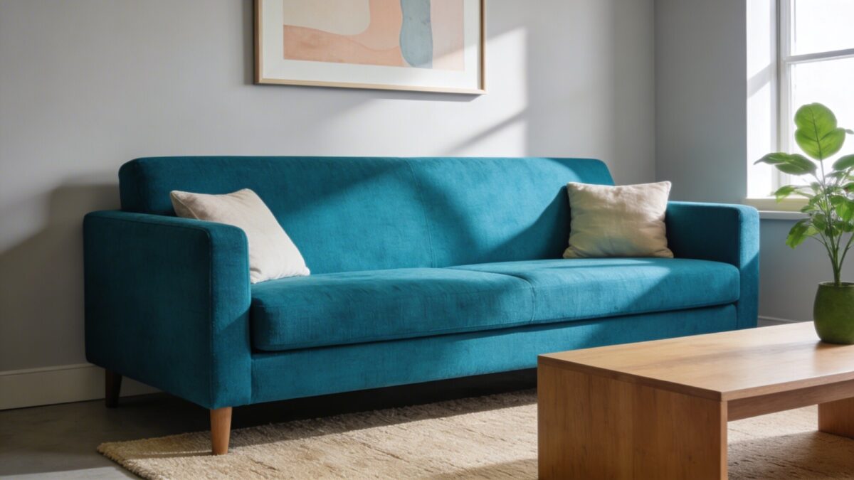
Letting the sofa carry the color — a saturated teal-blue, say — and keeping everything else neutral is the boldest move on this list and also the most forgiving one, because a neutral room around a colorful sofa never looks dated even if the sofa color eventually does. The trade-off is durability: a statement-colored sofa in a performance fabric handles daily use; the same color in a delicate weave shows wear fast.
💡 Pro Tip: Ask specifically about the fabric’s rub count (a measure of abrasion resistance) before buying a bold-colored sofa. Anything under about 15,000 double rubs is better suited to a low-traffic room than a family living room that sees daily use.
7. Layer Light Like You’re Building a Colorful Atmosphere
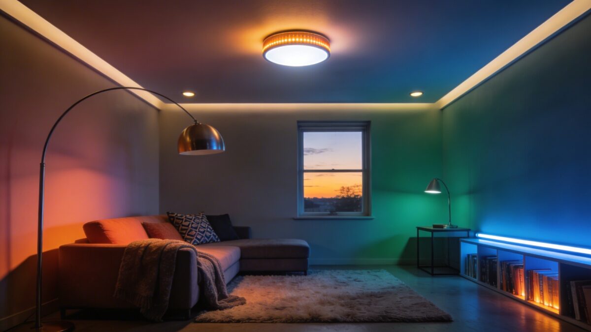
Lighting changes how saturated a color reads more than the paint color itself does. A cool white bulb over a warm terracotta wall will fight the color; a warm bulb over the same wall will make it glow. Layer three sources — ceiling, floor lamp, and one accent light — rather than relying on a single overhead fixture.
Dimmers are worth the extra cost here specifically because colorful rooms shift mood more dramatically under different light levels than neutral rooms do — a jewel-tone room at full brightness reads energetic, the same room dimmed reads moody, and you get both out of one space.
Which Colorful Approach Fits Your Room?
| If your room is… | Try this approach | Why |
|---|---|---|
| Small with limited wall space | Textured geometry + a colorful sofa | Adds depth and color without needing a full feature wall |
| Rented or temporary | Gallery wall + throw pillows/rug | Fully removable, no paint or permanent changes required |
| Large with strong natural light | Color block wall + metallic accents | Bigger walls can carry saturated color without feeling closed-in |
| Already neutral, low-commitment mood | Layered lighting + warm/cool accent pillows | Lets you dial color intensity up or down without buying furniture |
FAQ
How many colors is too many in one living room?
More than three dominant hues (beyond your neutrals) usually starts to feel chaotic rather than lively. Pick two or three and repeat them across furniture, art, and accessories instead of introducing a new color with every object.
Is a pink and green living room aesthetic still in style?
Yes, particularly in its pastel form — dusty pink paired with sage or pastel green reads as soft and current rather than themed, especially when it’s balanced with warm neutral furniture instead of matching everything to the two accent colors.
What’s the easiest way to test a bold color before committing?
Start with something removable — a gallery wall, a rug, or throw pillows — before painting a wall. If you like living with the color after a few weeks, move to the more permanent choice.
Should I match my metal finishes to my color palette?
Not directly, but pick one finish (brass or nickel) and use it consistently. Warm brass tends to complement jewel tones and warm neutrals; brushed nickel sits better with cooler blues and grays.
Do colorful rooms need more neutral furniture than colorful furniture?
Generally, yes. The most durable-looking colorful rooms use one or two colorful anchor pieces — a wall, a sofa, a gallery wall — against a neutral base, rather than making every piece of furniture a different color.
Our Take
The approaches that hold up over time are the ones where color has a job — anchoring the room (the wall), carrying the room (the sofa), or telling a story (the gallery wall) — rather than being scattered across ten small objects with no relationship to each other. Pick one lane from this list, commit to it, and use texture and metallics to fill in the rest instead of reaching for a fourth color. For layout guidance once you’ve settled on a palette, our living room wall inspiration guide is a solid next stop for planning the gallery-wall route specifically.


