
8 Elegant Modern Living Room Inspiration: Luxe Looks You’Ll Love
There’s a version of “elegant modern” that looks great in a photo and terrible to actually live in — all hard edges, no texture, nowhere comfortable to put your feet up. Real elegant modern living room inspiration should hold up under normal use: a room you can sink into on a Tuesday night and still feel proud of when someone stops by unannounced. If you’re coming from a more traditional starting point, it’s worth first seeing how a genuinely modern living room design balances comfort against clean lines before you start swapping furniture.
The eight ideas below aren’t a checklist to do all at once. Most elegant modern rooms get there by nailing two or three of these well, not by cramming in all eight.
- Layer textures deliberately — this is the single biggest difference between “modern” and “cold”
- Pick one accent color and let neutrals carry the rest — not the reverse
- Design seating around your actual light source, not just the TV wall
- Let one sculptural piece be the room’s signature — everything else stays quiet
- Zone the room into two or three functions instead of one big sofa-and-TV setup
- Hang art at true eye level, matched to your room’s hardware finish
- Layer ambient, task, and accent lighting — never rely on one ceiling fixture
- Build storage that looks like furniture, not like storage
1. Layer Textures Like You Mean It
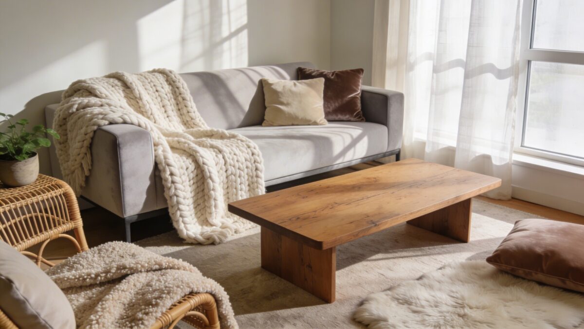
A minimalist living room aesthetic without texture just looks unfinished, not elegant. The rooms that get called “elegant modern” almost always have three or four materials working against each other in a controlled way — a wool throw against a smooth leather or linen sofa, a rattan side table next to a glass or marble coffee table, a boucle cushion on a velvet seat.
The trade-off to understand here: more texture reads as warmer but can tip into “busy” fast if the color palette isn’t unified first. Pick your neutral base — cream, taupe, warm gray — before you start layering materials, not after.
💡 Pro Tip: If you’re only adding one texture layer this month, make it a chunky knit or boucle throw draped over the sofa arm, not folded on the seat. Folded throws read as staged; draped ones read as lived-in.
Key Elements
- Wool or boucle throws over a smoother base fabric
- Velvet or suede cushions in tones that echo the wall color
- Rattan, cane, or unfinished wood accents to break up hard surfaces
2. Warm Neutrals, One Bold Accent
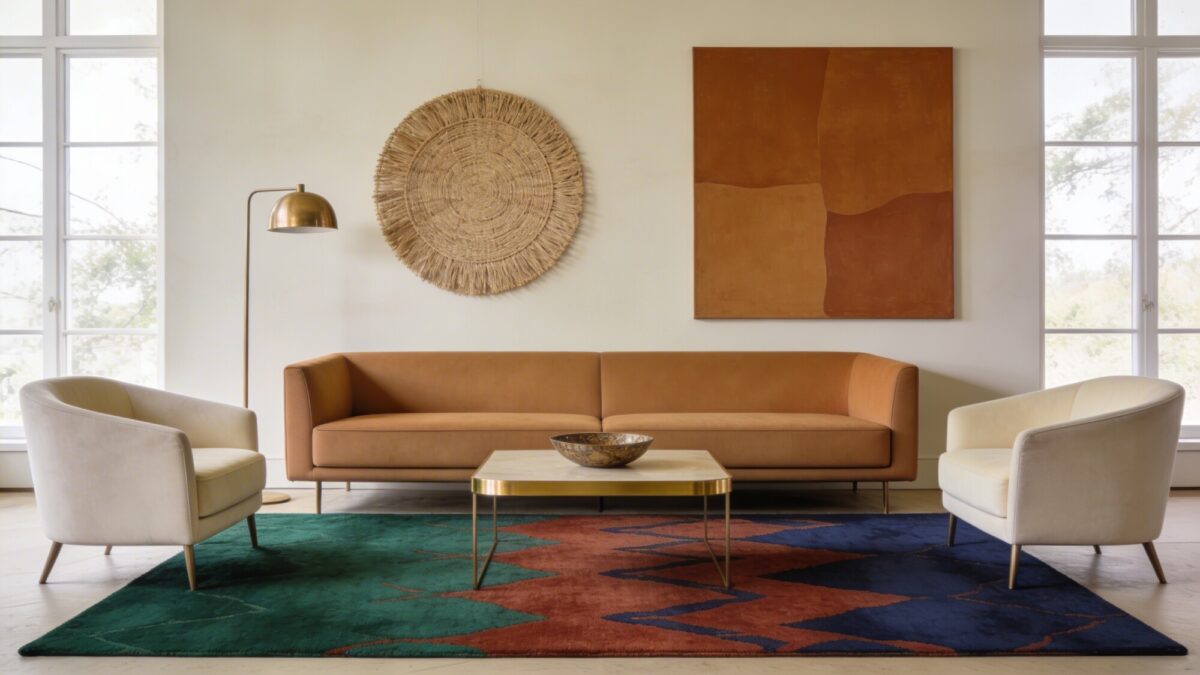
A genuinely elegant living room usually runs on a 90/10 split: about 90 percent camel, taupe, cream, and greige, with one accent color doing all the visual work. Emerald, terracotta, and cobalt are the usual suspects, and they read as “designed” specifically because they don’t have to compete with three other loud colors in the same room.
Where people go wrong: they pick the accent color for a rug and then also bring it in through throw pillows, a vase, and the art, until the “accent” has taken over the whole palette. One or two touches of the accent color is usually enough — a rug and maybe an art piece, not five separate items.
Color Strategy
- Base tones: camel, taupe, cream, greige
- One accent color, used in no more than two places in the room
- Brushed gold or matte black hardware in small doses — a lamp base, a table leg, a picture frame
3. Design Around Your Actual Light Source
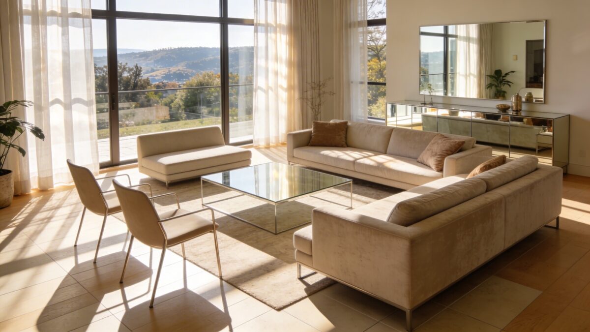
Most living rooms get arranged around the TV wall by default, which usually means the sofa’s back is to the window. That’s the opposite of what makes a room feel bright and expensive. Turn the seating so it faces or angles toward the window, add a mirror or mirrored console across from the light source to bounce it further into the room, and skip heavy drapes in favor of something sheer that still lets the room breathe.
A low-profile glass or light-wood coffee table also matters more here than people expect — a bulky, opaque table in the middle of a sunlit room blocks the light from traveling across the floor and visually chops the space in half.
💡 Pro Tip: Walk through the room at the time of day you’re actually there most — evening, usually. If your “bright, light-maximizing” layout only looks good at noon, it’s not solving the right problem. Plan the lighting layers in section 7 around your real schedule, not the daytime photo.
Practical Setup
- Angle the sofa toward the window rather than backing it against a wall
- Add a mirror or mirrored surface opposite the main light source
- Choose a low-profile, light-toned coffee table so sightlines stay open
4. One Sculptural Piece, Everything Else Quiet
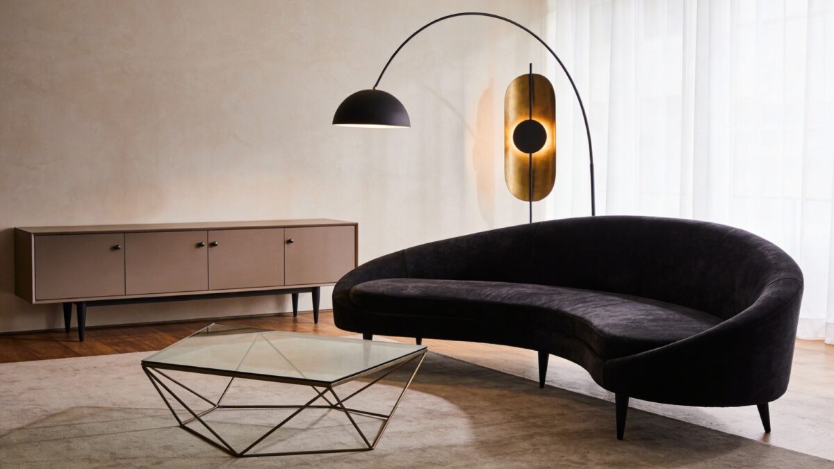
An elegant modern sofa with a curved silhouette or an unusual tapered leg does more for a room than three matched accent chairs ever will. This is the modern art deco couch instinct at work — pick one piece with real presence and let it be the thing people notice, then keep the credenza, side tables, and lighting deliberately understated so they don’t compete with it.
The common mistake is treating every furniture purchase as an opportunity to make a statement. A room with three “statement pieces” doesn’t read as curated — it reads as cluttered, because the eye has nowhere to rest.
What to Consider
- A curved sofa or one with a distinctive tapered leg
- A geometric coffee table with a metal frame as a secondary conversation piece
- A slender credenza with minimal hardware, kept visually quiet
5. Zone the Room Into Two or Three Real Functions
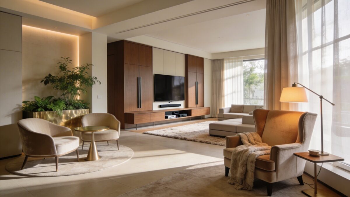
Treating a whole living room as one undifferentiated sofa-and-TV zone wastes square footage in bigger rooms. A reading nook with a single wingback chair and an adjustable lamp, a small conversation circle of two chairs around a round side table, and a separate media zone with hidden storage all give the room distinct reasons to be used at different times of day.
This matters more the larger your living room is. In a smaller space, zoning too aggressively can backfire — if you’re working with limited square footage, a lighter touch works better than trying to force three zones into one room; formal living room ideas that still feel inviting covers how to keep a more contained room from feeling stiff.
Zoning Ideas
- A reading nook with one comfortable chair and a dedicated lamp
- A conversation circle of two chairs around a slim side table
- A media zone with a low-profile console and closed storage for cables
6. Bold Art, Hung Right
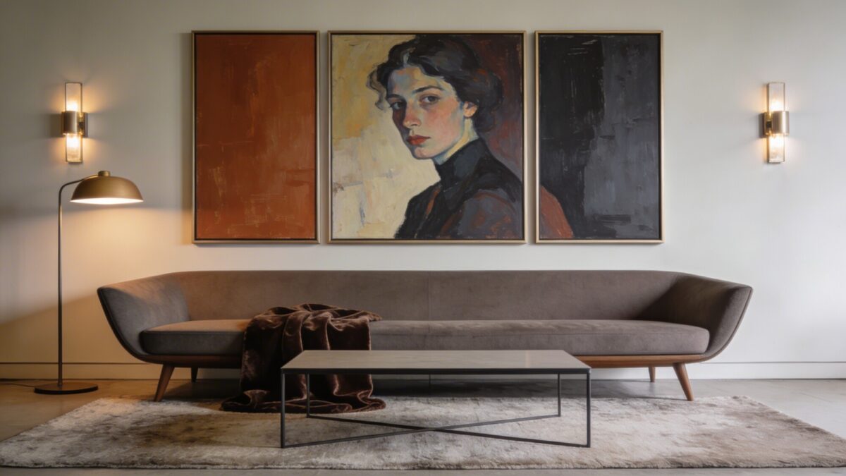
One large canvas or a triptych does more for an elegant room than a gallery wall of small prints, mostly because scale reads as confidence. The two details that separate “art that elevates the room” from “art that looks randomly placed” are hanging height and frame finish — center the piece at true eye level (roughly 57–60 inches to the center of the artwork from the floor), and match the frame to your room’s existing hardware, whether that’s brushed brass, matte black, or warm wood.
Give it space. A large piece crowded by shelving or furniture on both sides loses most of its impact — leave visible wall around it.
How to Choose
- Scale the piece to your wall — err larger, not smaller
- Match frame finish to existing hardware in the room
- Hang at true eye level, not just “wherever looks centered on the wall”
7. Layer Ambient, Task, and Accent Lighting
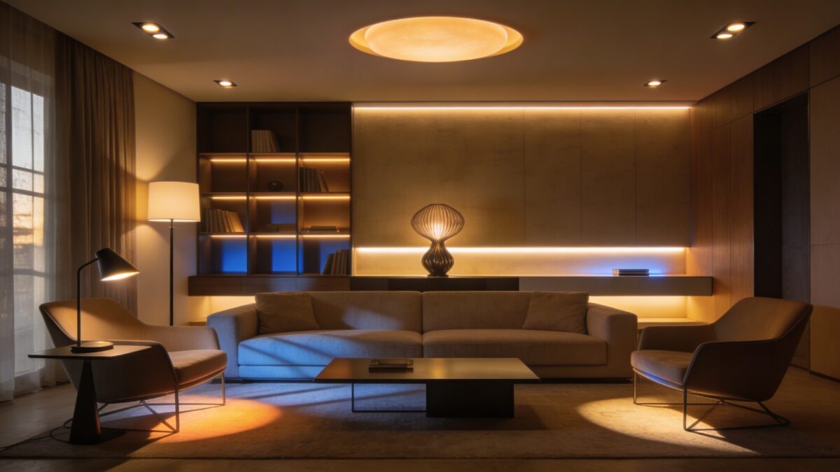
A single overhead fixture is the fastest way to flatten an otherwise well-designed room. Elegant modern spaces almost always run on three lighting layers stacked together: ambient (recessed or a central fixture for general glow), task (a floor lamp by a reading chair, a desk lamp on a side table), and accent (an LED strip behind open shelving, or a sculptural lamp used purely for effect).
You don’t need smart bulbs to pull this off, though they help if you want to shift the room’s warmth from daytime to evening without swapping fixtures. What actually matters is having at least three separate light sources at different heights in the room, not the specific technology behind them.
💡 Pro Tip: Test your lighting layers with everything off except lamps in the evening — no overhead light at all. If the room still feels usable and warm, your layering is working. If it feels dim and uneven, you’re missing a layer, usually accent lighting.
Layering Guide
- Ambient: recessed lighting or a central fixture for overall glow
- Task: a floor lamp by seating, a desk lamp on a console or side table
- Accent: LED strips behind shelving, or a sculptural lamp used as a focal point
8. Storage That Reads as Furniture, Not Storage
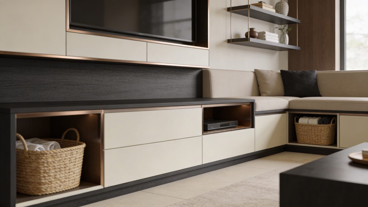
Visible clutter undoes elegant styling faster than almost anything else. A low-profile media console with closed compartments, floating shelves styled with a handful of curated objects instead of everyday items, and woven seagrass baskets tucked into open storage all keep the room’s function hidden without making it feel bare.
The habit worth building here isn’t a one-time purge — it’s giving every category of “stuff” (remotes, chargers, mail) an actual assigned spot inside a closed piece of furniture, so it never ends up on the coffee table in the first place.
Smart Choices
- Low-profile media consoles with hidden compartments
- Floating shelves with a small, curated set of objects rather than full storage
- Woven baskets or bins to corral everyday items out of sight
Elegant Modern vs. Other Directions: A Quick Comparison
| Style Direction | Signature Move | Risk If Overdone |
|---|---|---|
| Elegant modern | Warm neutrals, one bold accent, layered lighting | Can feel cold without enough texture layering |
| Luxury maximalist | Rich materials, multiple statement pieces, deep color | Easily tips into visually overwhelming without editing |
| Pure minimalist | Restraint, negative space, monochrome palette | Reads as unfinished or sterile without deliberate texture |
If a fuller, more layered version of luxury appeals to you more than the restrained approach above, it’s worth comparing this piece against luxury living room inspiration built around a lounge-style layout before committing to a direction.
Elegant Modern Living Room: Frequently Asked Questions
What makes a living room read as “elegant modern” instead of just modern?
Texture and restraint. A modern room can be clean-lined and still feel bare; elegant modern adds layered materials and one confident accent color on top of those clean lines.
Is a minimalist living room aesthetic the same as elegant modern?
Not quite. Minimalist is about restraint and negative space; elegant modern borrows that restraint but leans harder on texture and a warmer palette so the room doesn’t feel cold.
Do I need to hire a designer to get a modern luxury interior design result?
No, but you do need a plan before you buy furniture. The biggest gains in this style come from sequencing — palette first, then one statement piece, then lighting layers — not from budget alone.
What’s the fastest way to make an existing modern living room feel more elegant without buying new furniture?
Add lighting layers and one textured throw or set of cushions. Both are inexpensive and both address the two most common reasons a modern room reads as cold: flat lighting and a lack of texture.
Our Verdict
Elegant modern living room inspiration works best as a sequence, not a shopping list: settle on a warm neutral palette first, choose one piece to be the room’s signature, then build texture and lighting around it. Skip any of those three steps and the room tends to land somewhere between “unfinished” and “showroom” — technically correct, but not somewhere you actually want to sit.
If your current living room already has good bones and just needs the finishing layer, this guide to textured luxury living room styling is a solid next stop for getting the material layering right.


