7 Living Room Inspiration Cozy Colorful: Cozy Hits You’Ll Love
A colorful living room can go two ways: it either feels like a room you want to sink into, or it feels like a room that’s trying too hard. The difference usually isn’t the colors themselves — it’s how much restraint you use around them. If you want living room inspiration cozy colorful enough to actually live in, the trick is picking one or two colors to commit to and letting everything else (texture, lighting, layout) do the supporting work. If you’d rather see a range of bolder palettes side by side first, this colorful living room inspiration roundup is a good place to compare options before you commit to one.
Below are seven approaches that hold up in a real living room — not just in a photo. I’ve included what tends to go wrong with each one, because that’s usually more useful than another list of pretty combinations.
Quick-Reference: What to Try First
- Small budget, big impact: start with textiles — throws, cushions, a rug — before you touch paint.
- Renting or hesitant about color: color-block through furniture and accessories, not walls.
- Room feels flat or “showroom”: add personal objects before you add more decor.
- Room feels chaotic: drop to one dominant color and two supporting tones, max.
1. Layer Textures Before You Add More Color
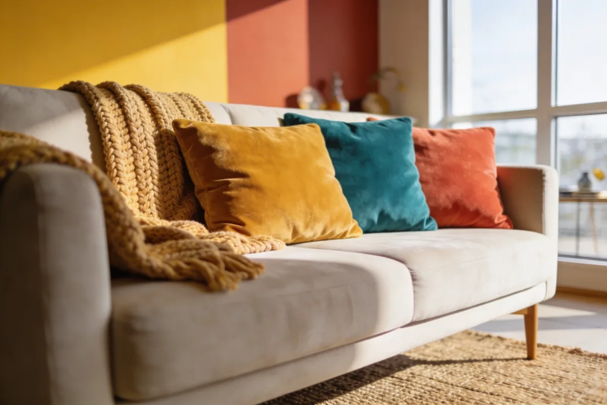
Most rooms that feel flat aren’t missing color — they’re missing texture. A room painted in three neutrals but dressed in a chunky knit throw, a couple of velvet cushions, and a jute rug will read warmer than a room with four accent colors and nothing but smooth surfaces. Texture is what makes color feel intentional instead of just loud.
Build it in layers: a base of neutrals on the big pieces (sofa, walls, rug foundation), then color introduced through things you can change cheaply — cushion covers, a throw, a pouf. A $60–$80 chunky knit throw and two velvet cushion covers will shift the whole feel of a beige sofa without any commitment.
💡 Pro Tip: Mix at least two textures with different light behavior in the same seating area — something matte (a wool throw) and something with a bit of sheen (velvet or a lacquered side table). All-matte rooms tend to look heavy and can swallow color; a little contrast keeps it lively.
Materials Worth Having on Hand
- A chunky knit throw for the back of the sofa
- Velvet or corduroy cushion covers (easy to swap seasonally)
- A woven jute or sisal rug for warmth underfoot
- One or two matte-vs-glossy surface pairings (a matte wall next to a glossy coffee table, for example)
2. Color-Block With One Clear Priority
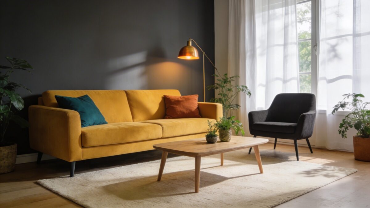
Color-blocking works when there’s a clear hierarchy: one dominant color, two supporting colors, and everything else neutral. It stops working the moment three colors are all fighting to be the star. If you’re chasing a beige and rust living room look, for example, beige needs to stay the quiet majority — walls, larger upholstery, floors — while rust shows up in maybe 20% of the room: a chair, a rug border, a set of cushions.
A common mistake here is choosing the accent color first and building around it, which usually ends with too many “accent” pieces competing for attention. Start with the dominant color instead, then ask what two colors would sit comfortably next to it without clashing.
| Approach | Best For | Watch Out For |
|---|---|---|
| Bold sofa, neutral walls | Renters, smaller budgets | Sofa becomes the only statement — pair with at least one supporting color |
| Neutral sofa, bold accents | People who redecorate often | Can feel underwhelming if accents are too small or scattered |
| Bold wall, neutral furniture | Owners comfortable with paint | Hardest to reverse; test a swatch for a full week before committing |
💡 Pro Tip: Before buying anything, hold your intended dominant and accent colors next to each other in the room’s actual daylight and evening lighting. Colors that look great together in a paint aisle can shift noticeably under warm bulbs at night — check both before you buy furniture, not after.
If you want to see this idea taken further into a more eclectic mix rather than a tight two-color plan, this eclectic living room color guide shows how far you can push it while still keeping the room readable.
3. Build Seating Zones People Actually Use
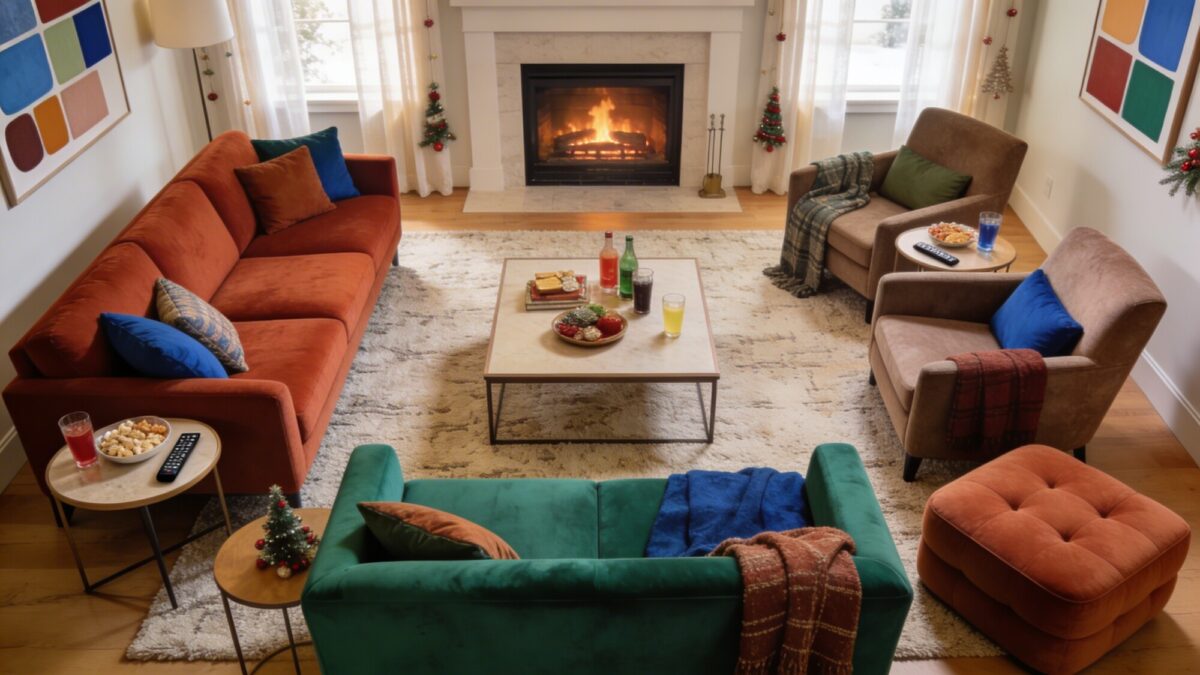
A colorful room with bad furniture layout still feels off, no matter how good the palette is. The goal isn’t just “put a sofa facing a TV.” It’s making sure every seat has a sightline to whatever the room’s focal point is, and that nobody’s more than an arm’s reach from a surface to put a drink down.
A workable core setup: a three-seat sofa, two accent chairs angled toward it rather than in a straight line, and a coffee table sized to the gap between them (not the room). Add a rug big enough that at least the front legs of every seating piece sit on it — a rug that’s too small is one of the most common reasons a furniture arrangement feels like it’s floating in the middle of the room.
A Layout Checklist
- Anchor the arrangement to one focal point (TV, fireplace, or a window view)
- Angle chairs slightly inward instead of lining everything up straight
- Make sure every seat has a side table or coffee table within reach
- Size the rug so all seating pieces have at least their front legs on it
- Leave 30–36 inches of walking clearance around the main path through the room
4. Let One Piece of Art Do the Heavy Lifting
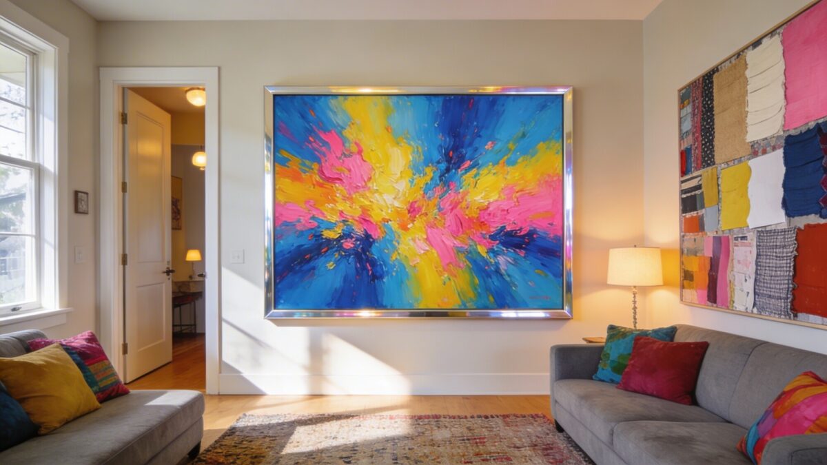
You don’t need color on every wall if you have one piece of art that’s doing enough work on its own. A single large abstract piece with strong color, hung at eye level on the first wall you see when entering the room, can carry the whole “colorful” brief while the rest of the room stays neutral and calm.
This is also the lowest-commitment way to test a color direction. If a bold teal-and-orange painting doesn’t feel right after a month, it’s a lot easier to swap than a teal accent wall. A gallery wall works too, but it’s a different effect — busier, more collected, less of a single statement.
For more of an art deco living room direction specifically, lean into geometric prints, metallic frame edges, and a slightly more formal hang — art deco reads as curated color rather than casual color, so the framing and spacing matter as much as the artwork itself.
5. Add Plants for Color That Doesn’t Need a Repaint
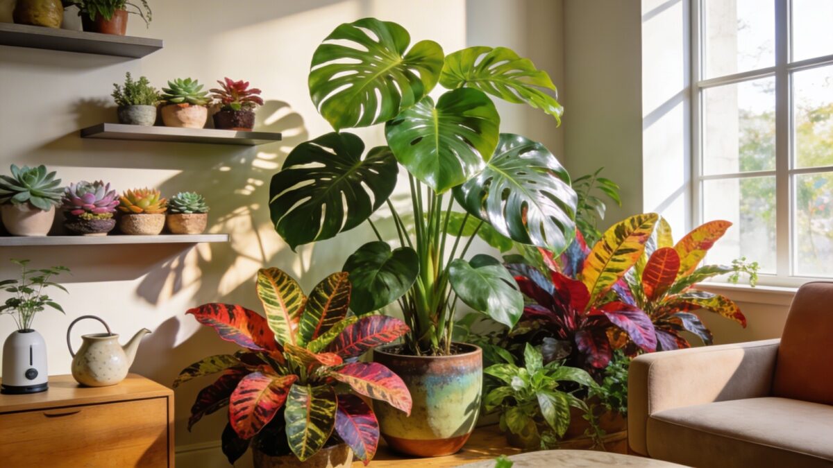
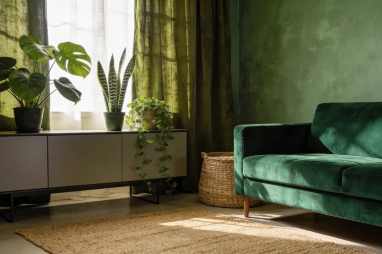
Plants are the cheapest form of color you can add and remove without any commitment. A monstera in the corner softens hard angles and adds height; calatheas and crotons bring in patterned color without needing a single can of paint; a cluster of small succulents on a shelf fills in gaps that would otherwise sit empty.
Group plants in odd numbers — three tends to look more natural than two or four — and vary the heights so they don’t all read as one flat green block. If you tend to forget watering schedules, choose low-maintenance options like pothos or snake plant for the larger pieces and save the fussier calatheas for spots you pass daily, where you’re more likely to notice if they’re struggling.
6. Layer Lighting Instead of Relying on One Overhead Fixture
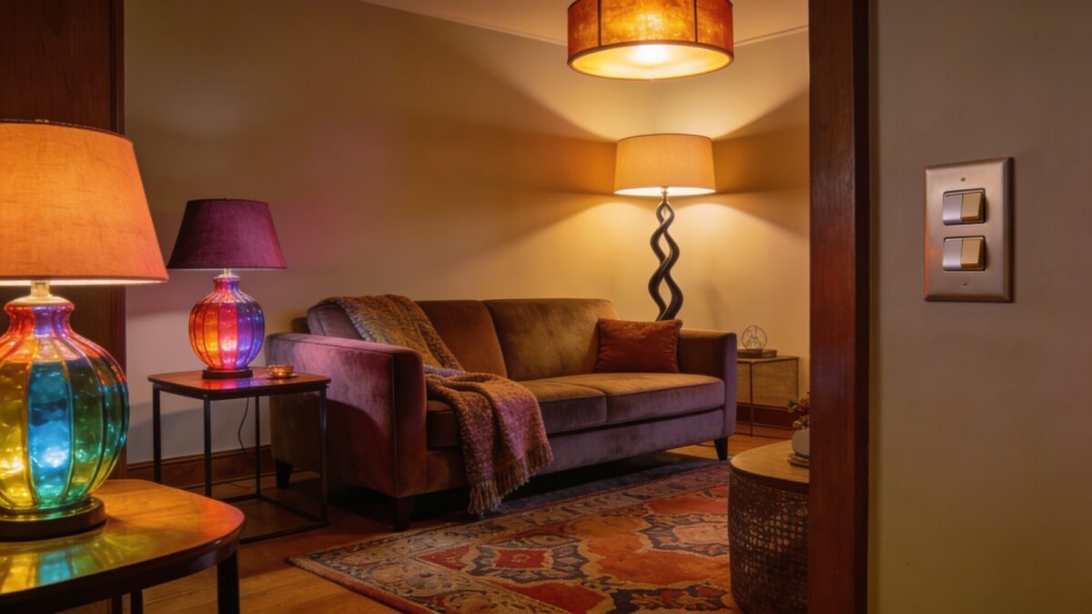
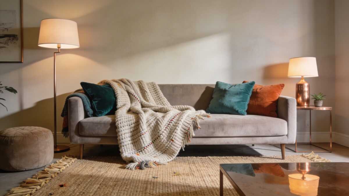
A single overhead light flattens color and makes even a well-planned palette look washed out at night. Three light sources at different heights — ceiling, table lamp, floor lamp — do more for a room’s coziness than almost anything else on this list, and they’re usually the fastest fix if a room feels “off” but you can’t figure out why.
Warm-white bulbs (around 2700K) will make rust, terracotta, and mustard tones look richer; cooler bulbs (4000K+) tend to wash out warm palettes and are better saved for task lighting like a reading lamp. If you’re aiming for a colourful apartment aesthetic in a smaller space, colored lamp shades or a tinted glass base can add a hit of color without taking up floor space the way a bold rug or sofa would.
💡 Pro Tip: Put your floor lamp and at least one table lamp on the same dimmer or smart plug group. Full brightness in the evening kills the cozy effect almost instantly — most people underestimate how much a simple dimmer changes the mood of a colorful room after dark.

If you’re specifically chasing a brighter, more eclectic look with lots of pattern mixed in, this boho living room ideas guide covers how to layer color and lighting for a more maximalist boho bright colors feel without it turning into visual noise.
7. Add the Things That Don’t Show Up on a Shopping List
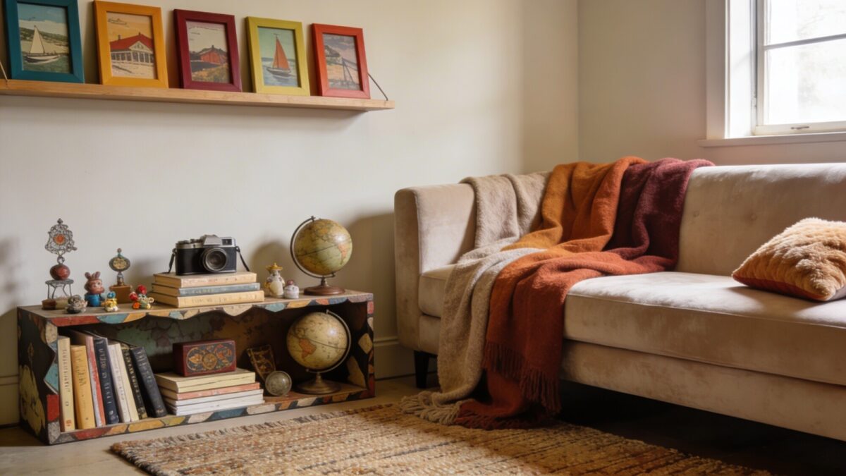
This is the step people skip because it’s harder to plan than “buy a rug.” A room can follow every color rule perfectly and still feel like a showroom if there’s nothing in it that’s actually yours. Travel souvenirs, an odd vintage find, a stack of books you’ve actually read — these are what make a colorful room feel lived-in instead of styled.
The trick is restraint: two or three personal pieces displayed with intention read as curated. Ten scattered around read as clutter. If you’re not sure where to draw the line, pick your favorite three objects and give each one its own small space — a shelf, a side table — rather than grouping everything together.

💡 Pro Tip: If you’re mixing several personal or vintage pieces, tie them together with one repeated element — a similar frame color, a shared material, or a consistent color family. Without that thread, a mix of personal items tends to look random instead of curated.
Which Approach Fits Your Room?
| If your room feels… | Start with |
|---|---|
| Flat, no personality | Textiles and layered lighting (Ideas 1 and 6) |
| Busy, overwhelming | Drop to one dominant color, two accents (Idea 2) |
| Comfortable but boring | One statement art piece and plants (Ideas 4 and 5) |
| Nicely decorated but impersonal | Personal objects and a layout check (Ideas 7 and 3) |
Frequently Asked Questions
Do I need to paint my walls to get a colorful living room?
No. Textiles, art, lighting, and plants can carry most of the color, and they’re all reversible if you rent or aren’t ready to commit to paint.
How many colors should a cozy colorful living room actually have?
One dominant color and two supporting tones is a safe working limit. Beyond that, most rooms start to feel busy rather than warm — you can always add more through small, swappable pieces later.
What’s the fastest way to make a room feel cozier without buying furniture?
Layered lighting. Swap a single overhead light for a table lamp and floor lamp combo with warm-white bulbs, and put them on a dimmer. It’s a bigger shift than most people expect for the cost involved.
Is a living room 2025 interior design trend still relevant, or should I ignore trend cycles entirely?
Trend cycles are worth glancing at for ideas, but they shouldn’t dictate your palette. A room built around colors you actually like tends to outlast whatever’s trending, and you’ll be less likely to want to redo it in two years.
Can a small apartment pull off bold color, or is it too much for a small space?
Bold color works fine in small spaces — the mistake is spreading it too thin across many small elements. One or two bold pieces (a sofa, an accent chair) usually reads better in a small room than five scattered small colorful accents.
Our Take
If you only do one thing from this list, layer your lighting and textiles before you buy anything new — it’s the cheapest change and it affects how every other color decision reads. Color-blocking and statement art matter, but they land better in a room that already has warm light and some texture underneath them. Start small, live with it for a couple of weeks, and adjust from there rather than trying to finish the whole room at once.
For a broader mix of eclectic, patterned takes on cozy color, or if you want to see how a more relaxed, textured version of this comes together, this modern cozy living room ideas guide is a solid next stop.