9 Elegant Living Room with Patterned Decor: Chic Patterns, Calm Vibes
These ideas prove that patterns aren’t loud; they’re the heartbeat of a chic living space. Ready to elevate your room without chaos? Let’s dive into nine polished looks that balance bold prints with calm vibes.
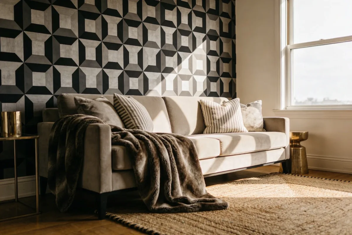
1. Bold Geometric Walls Meet Soft Furnishings
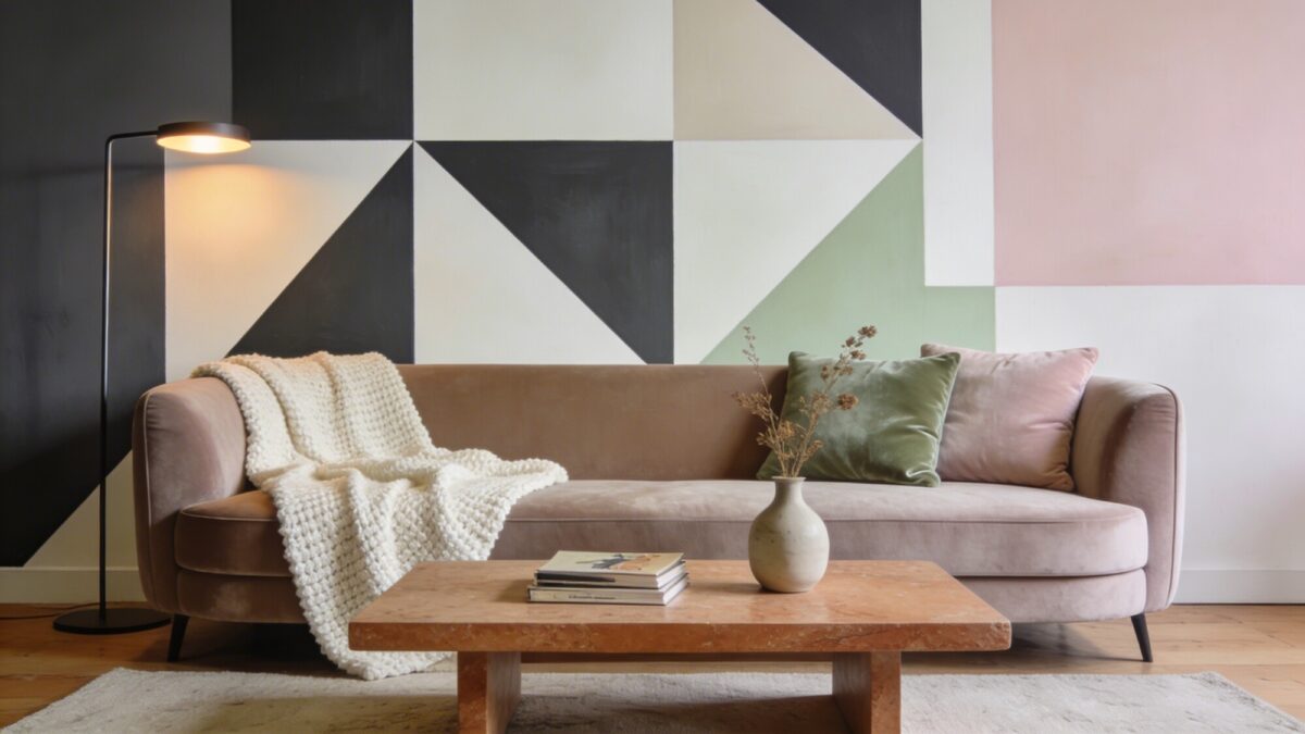
Why this look rocks: A statement wall in geometric patterns instantly anchors a space, while plush textiles keep it approachable. FYI, balance is everything—don’t go full tile avalanche.
Why it works
- Creates a focal point without needing loud furniture
- Texture contrast adds depth
- Easy to swap with new textiles if you crave change
Start with a graphic wall panel or wallpaper and layer with a subdued sofa. Trust me, the room will feel intentional rather than busy.
2. Striped Sophistication Across Soft Surfaces
Striped patterns aren’t just for nautical vibes. They elongate ceilings, ground a room, and feel modern without trying too hard. Seriously, stripes are surprisingly versatile.
Tips for success
- Use wide stripes on larger surfaces
- Pair with solid neutrals to prevent overwhelm
- Mix direction: horizontal on textiles, vertical on pillows
Radiate calm by letting stripes appear on a rug or cushions, then keep walls simple. If you’re inching toward maximalism, add a single striped curtain to anchor the space.
3. Floral Patterns With a Modern Twist
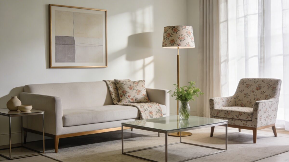
Floral prints can be playful or refined, depending on scale and palette. A modern twist means clean lines, restrained color, and a few florals as accent pieces.
Key considerations
- Choose a limited color palette to unify the room
- Use florals in small doses (one chair, one cushion, one lamp shade)
- Pair with matte metals for a contemporary edge
When done right, blooms feel fresh and timeless, not grandma-chic. FYI, pattern clashing is not your friend here—keep a cohesive vibe.
4. Checkerboard Charm That Feels Lux
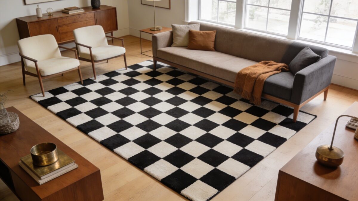
Checkerboard patterns bring a playful sophistication, especially in black-and-white or muted tones. It’s a classic that reads upscale when paired with curated pieces.
How to pull it off
- Invest in a high-contrast rug or throw quilt
- Balance with warm wood tones and soft textures
- Keep seating simple to let the pattern shine
Benefits? Instant polish, timeless appeal, and easy updating with new textile colors. It’s like wearing a tailored suit for your living room.
5. Chevron Chic With Calm Color
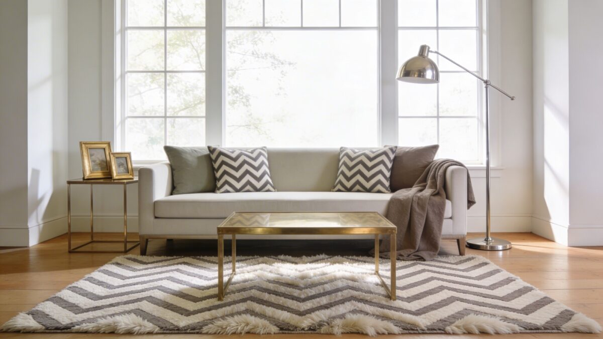
Chevron is energetic but not chaotic—especially when you soften the palette. This pattern adds movement without shouting at you.
What to include
- Chelon rug or accent pillows with subtle color
- Complement with solid throws in a coordinating shade
- Introduce metallic accents for shine
When to use: a sunlit living room, or a media space that benefits from a lively yet controlled vibe. Trust me, it lands well in both modern and traditional schemes.
6. Maximalist Yet Minimal: Repeating Motifs
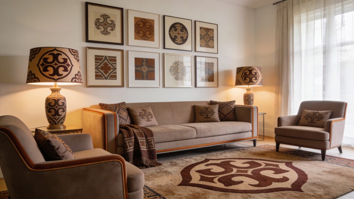
Pattern repetition is your best friend if you love energy but hate clutter. Repeat one motif across different scales to unify a bold room.
Structure this look with
- One motif in a rug, cushions, and a lamp shade
- Neutral backdrop to let prints pop
- Selective trims in the same hue family
End result: a cohesive, fashionable space that feels curated, not chaotic. Use this approach in a living room that doubles as a gallery for your favorites.
7. Animal-Inspired Patterns With Subtle Glam
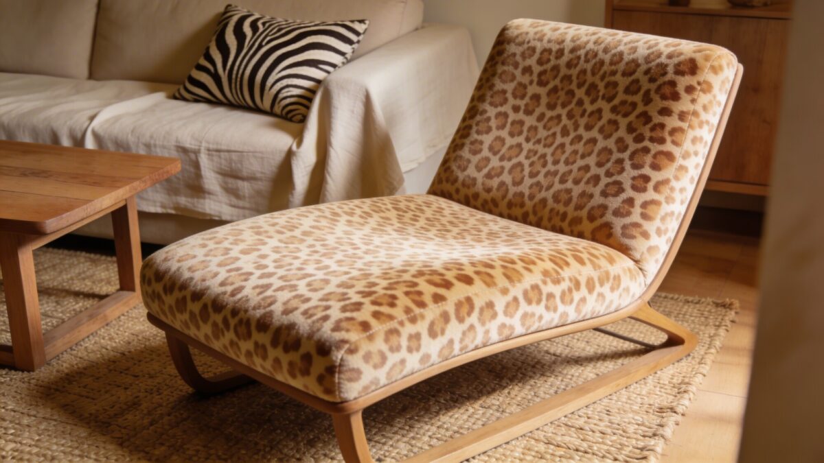
Animal prints can read luxe when scaled and colored thoughtfully. Think soft leopard on a chair or zebra stripes on a pillow with beige tones.
Practical touchpoints
- Keep the base color warm neutrals
- Limit to two items to avoid overpower
- Pair with natural textures like wood or linen
This pattern adds personality without shouting. It’s a quick upgrade for a dated room that needs fresh energy.
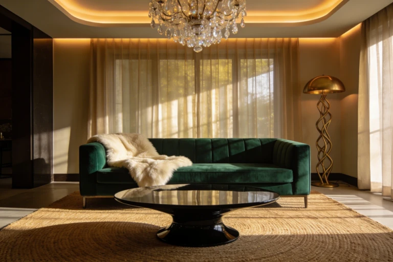
8. Ikat and Velvet: Texture Rich Combo
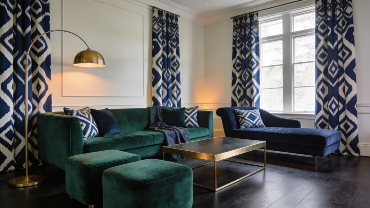
Ikat blends tradition with a modern edge, and velvet brings luxury into the mix. Together, they create a space that feels high-end yet totally comfy.
What to layer
- Ikat curtains or cushions as the anchor
- Velvet sofa or poufs in a complementary color
- Metallic or matte accents to finish the look
Benefits: depth, richness, and a space that invites lounging. This combo screams “sit down, stay awhile.”
9. Monochrome Pattern Play With a Pop
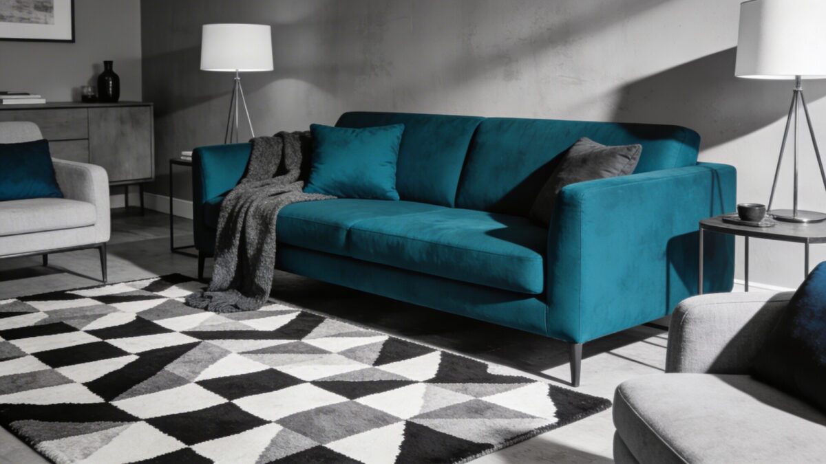
Monochrome doesn’t mean boring; it means intentional. Use patterns in grayscale and add a bold color as the accent to keep things lively.
How to execute
- Patterned rug in black, white, and gray
- Solid sofa in a striking color like emerald or cobalt
- Accent pieces (throws, lamps) in the same strong hue
End result: a sophisticated space that looks expertly styled without feeling cold. FYI, the pop color should be used sparingly to avoid clashes.
Want a quick recap? Patterned decor can transform a room by adding depth, personality, and warmth. Each approach above helps you keep balance while letting your style shine. IMO, the right pattern is less about chasing trends and more about crafting a space you want to live in every day.
Feeling inspired to mix patterns with confidence? Go ahead and experiment—start small, then scale up as you refine what feels right in your home. Seriously, your future self will thank you for taking the leap.
Now go grab a swatch book, a coffee, and a friend who won’t veto your bold choices. Your living room is about to become the chicest, coziest corner of your home.