6 Book Shelf Styling: Chic Shelf Styling Ideas
Good book shelf styling isn’t really about the books — it’s about what surrounds them. The same stack of hardcovers can look like a forgotten pile or a designer-curated moment depending on the texture, color, and proportion choices around it. If you’re pairing this with broader minimalist shelf styling techniques, the two approaches overlap more than you’d expect — both come down to restraint and deliberate placement rather than piling on more objects.
These six techniques work on a single freestanding bookcase, a built-in wall unit, or a run of floating shelves — the mechanics of good shelf decor ideas don’t really change based on the furniture underneath.
Quick Takeaways
- Texture variety (wood, metal, fabric, ceramic) does more for a bookshelf’s look than adding more books or objects.
- A repeated 2–3 color palette across book spines and objects is one of the fastest ways to make a shelf look designer-curated.
- Uneven proportions — a tall item next to a low wide tray — read as intentional, not messy, as long as there’s negative space between them.
- Personal items matter more than matching decor sets for making a shelf feel lived-in rather than staged.
1. Layer Textures Instead of Just Books
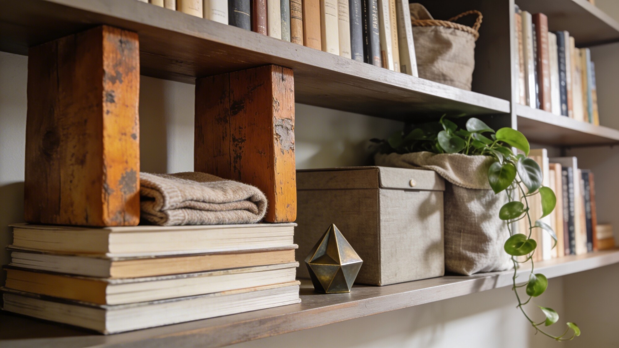
A shelf of books alone, no matter how nice the spines look, reads as flat because paper is the only texture in play. Adding aged wood bookends, a folded fabric throw, and one matte metal accent gives the eye three different surfaces to register instead of one.
A small trailing plant tucked at the edge softens the whole arrangement. It doesn’t need to be large — a single trailing vine draping over the shelf edge does more visual work than a large potted plant taking up a full shelf section.
2. Anchor the Shelf With a Repeated Color Story
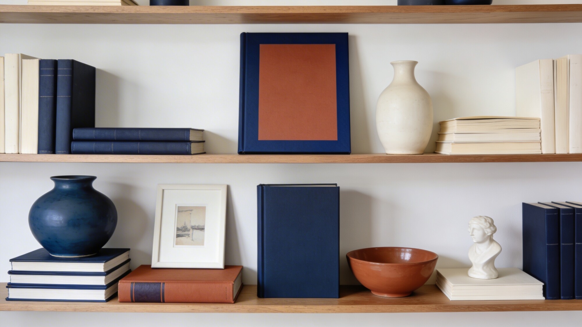
Picking 2–3 colors — navy, terracotta, and ivory is a workable combination — and repeating them across book spines, a ceramic vase, and a small framed print is what separates a designer-looking shelf from a random assortment. One bold accent piece, like a hardcover with a striking dust jacket, anchors the whole story.
💡 Pro Tip: Build your color story around books you’d keep anyway, not books bought purely for their spine color. A shelf of color-matched books you’ve never read is a common giveaway that the shelf was staged rather than lived-in.
The real payoff of this approach shows up later: when you want to refresh the shelf, you can swap one object and keep the rest of the palette intact instead of restyling from scratch.
3. Play With Proportion for Visual Interest
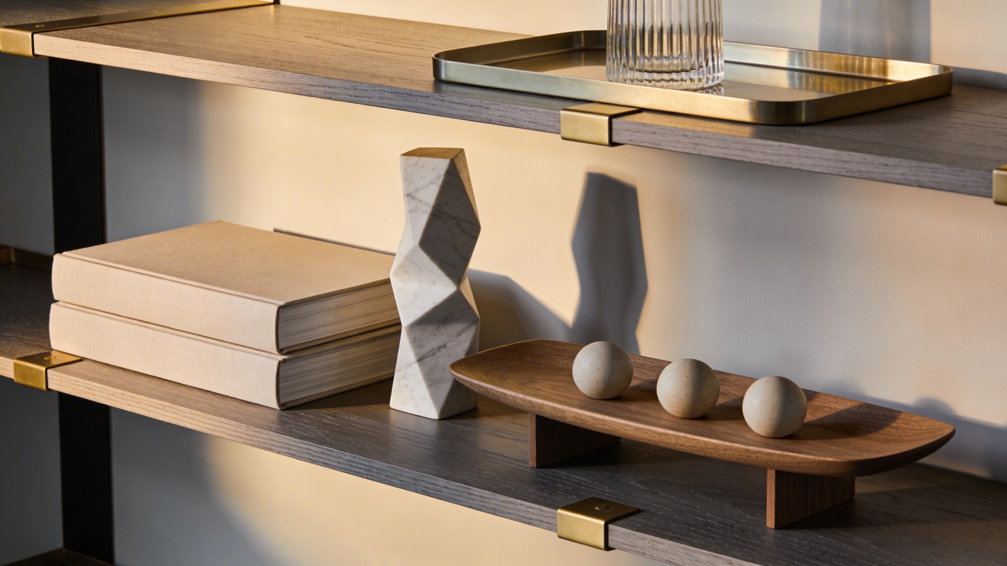
Two same-sized books stacked flat next to a tall sculptural vase, with a low wide tray corralling small objects nearby, creates the kind of height variation that makes a shelf feel dynamic rather than uniform. Uneven proportions read as intentional as long as there’s breathing room between the pieces.
The mistake to avoid is stopping halfway — mismatched heights without enough negative space just look unfinished, not deliberate. Give each height tier room to actually register before adding the next element.
4. Mix Personal Treasures With Restrained Pieces
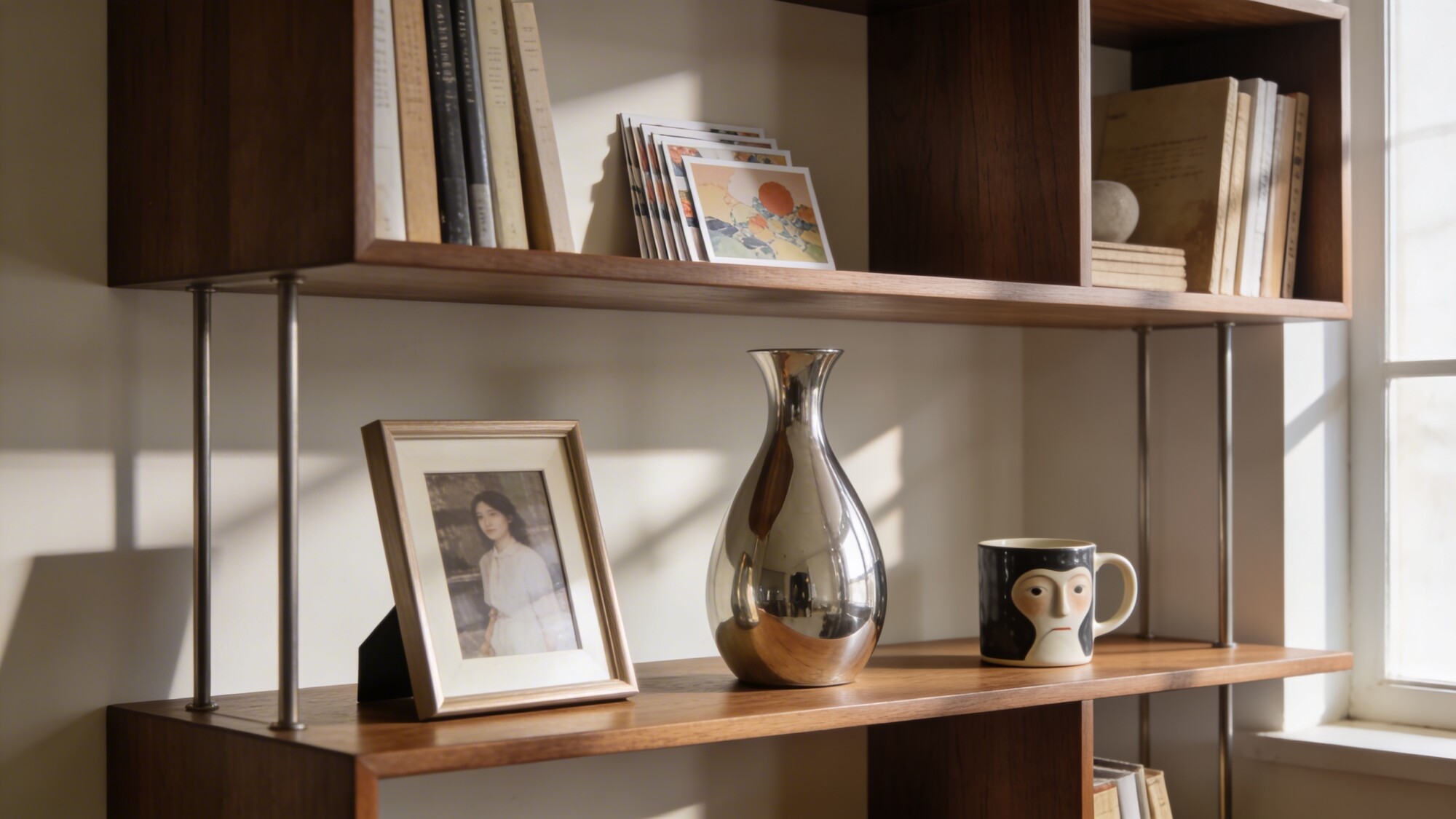
A shelf entirely made of matching decor-store objects looks like a showroom. Interleaving a cherished photo, a small stack of postcards, or one genuinely quirky item — a funny mug, an odd little sculpture — among more minimal pieces gives the shelf an actual story instead of a purchased aesthetic.
One wildcard item per shelf section is usually enough. More than that and the personal touches start competing with each other instead of standing out individually.
5. Add Greenery Without Overtaking the Shelf
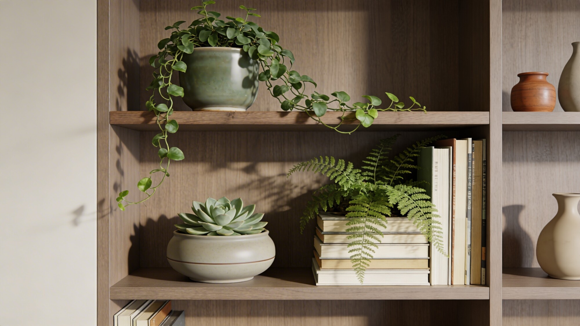
A trailing plant on a top shelf, a low succulent in a ceramic pot at eye level, and a small fern tucked into a book stack cover three different scales without any single plant dominating the shelf. Match the pot finishes to your existing color palette rather than treating plant pots as a separate decision.
💡 Pro Tip: Rotate any shelf plant that gets light from only one side every couple of weeks. Books block more ambient light than open floor space, so bookshelf plants tend to lean or grow unevenly faster than plants elsewhere in the room.
6. Add Function With Decorative Storage
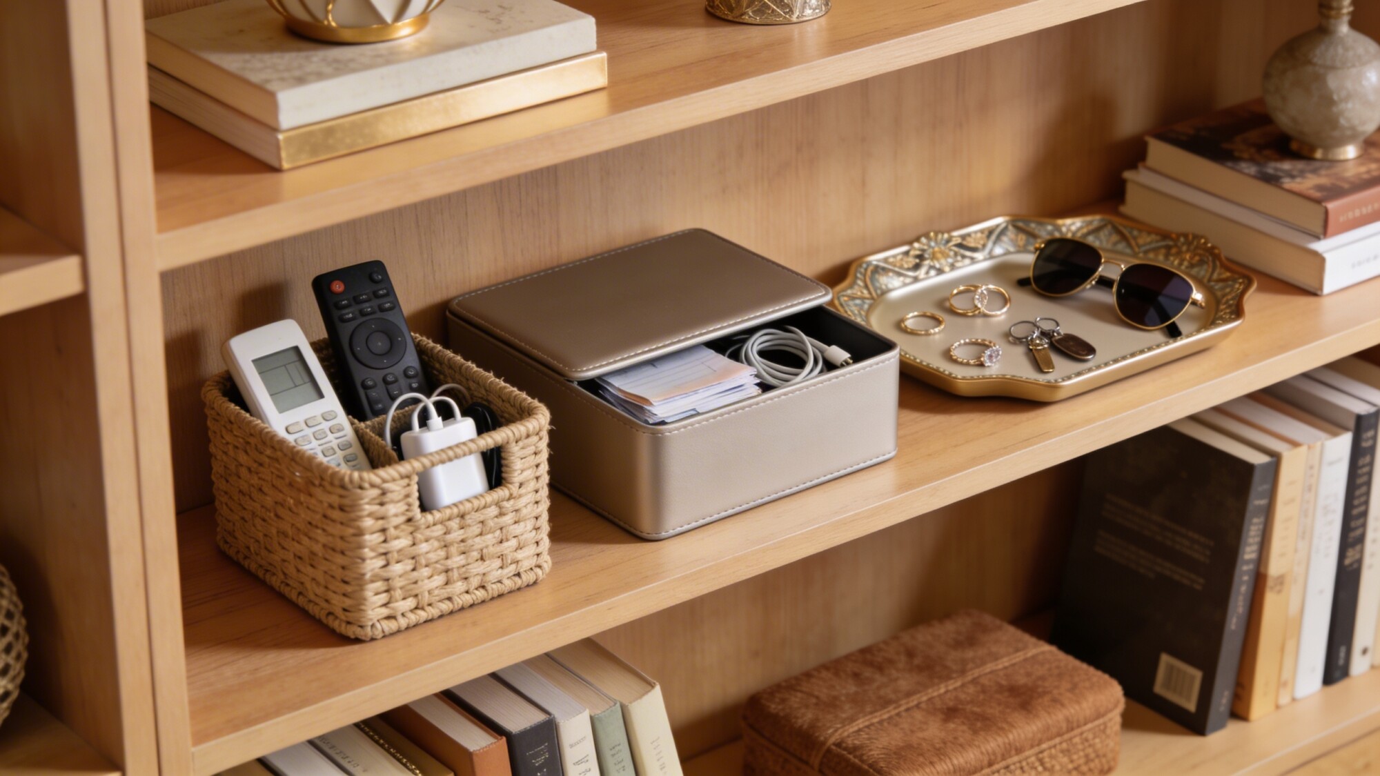
A woven basket for remotes and chargers, a lidded box for cables, or a small tray for keys and sunglasses gives a shelf real function without turning it into obvious storage. This matters most on shelves in a high-traffic room, where actual clutter (mail, chargers, loose items) tends to accumulate whether you plan for it or not.
The trade-off worth knowing: decorative storage only stays decorative if you actually use it for its intended purpose. A basket that becomes a catch-all for random junk defeats its own design.
Things to Consider Before You Style
- Sort your books by what you’ll actually keep out — donate or box up anything you’re only displaying for color, and build the shelf around books you use.
- Choose your 2–3 color palette before buying new objects, so future additions have a built-in filter.
- Decide which shelf sections need functional storage (remotes, cables, mail) before you finalize the decorative layout around them.
- If styling built-ins, avoid using the exact same arrangement on every shelf — rhythm across a full wall unit comes from variation, not repetition of the identical layout.
Frequently Asked Questions
How do I style shelves in a living room without it looking staged?
Mix in personal, non-matching items alongside curated decor — a shelf that’s 100% purchased-to-match objects is what reads as staged, not the presence of books and clutter-catching storage.
What’s the easiest way to make a bookshelf look more expensive?
Repeat a tight 2–3 color palette across book spines and objects. It’s a low-cost change (you likely already own most of what fits) that has an outsized visual effect.
Should every shelf in a unit be styled the same way?
No — vary the density and arrangement across shelves. A wall of identically styled shelves reads as repetitive rather than intentional.
How many books should be color-coordinated versus left as-is?
There’s no fixed ratio, but coordinating a portion — not all — of your visible books keeps the shelf from looking artificial. Mixing coordinated spines with a few natural, mismatched ones looks more genuine than a fully matched wall.
Our Take
Start with the color story and one textural addition — those two moves alone transform most flat-looking shelves without requiring new furniture or major reorganization. Once that’s dialed in, layer in personal items and functional storage as needed. For more on the mounting and spacing side of things if you’re working with floating units specifically, see our guide to floating shelf styling secrets.