9 Room Decor Posters Bedroom Ideas That Wow You
Most bedroom walls don’t need a renovation — they need better posters and a plan for hanging them. If you’ve searched room decor posters bedroom ideas and landed on a wall of stock photography with no actual guidance on framing, spacing, or which style fits your room, this is the practical version. For layout inspiration beyond posters, our budget bedroom aesthetic guide covers the furniture side of the same problem.
Below are nine poster styles that consistently work in real bedrooms, plus the details that usually get skipped: what size to buy, how much framing actually costs, where people go wrong with spacing, and when a style stops looking curated and starts looking like a dorm room.
Quick Takeaways
- Standard poster sizes are 18×24 or 24×36 inches — buy to the frame, not the other way around, or you’ll pay double for custom cutting.
- A three-poster gallery needs roughly 2–3 inches of breathing room between frames to read as intentional rather than crowded.
- Removable mounting strips (not tape) protect rental walls and hold most poster-weight frames without a nail.
- Pick one dominant color from your posters and repeat it once elsewhere in the room — a pillow, a throw, a lamp shade — so the wall doesn’t feel disconnected from everything else.
1. Bold Abstract Prints for a Room With No Real Focal Point
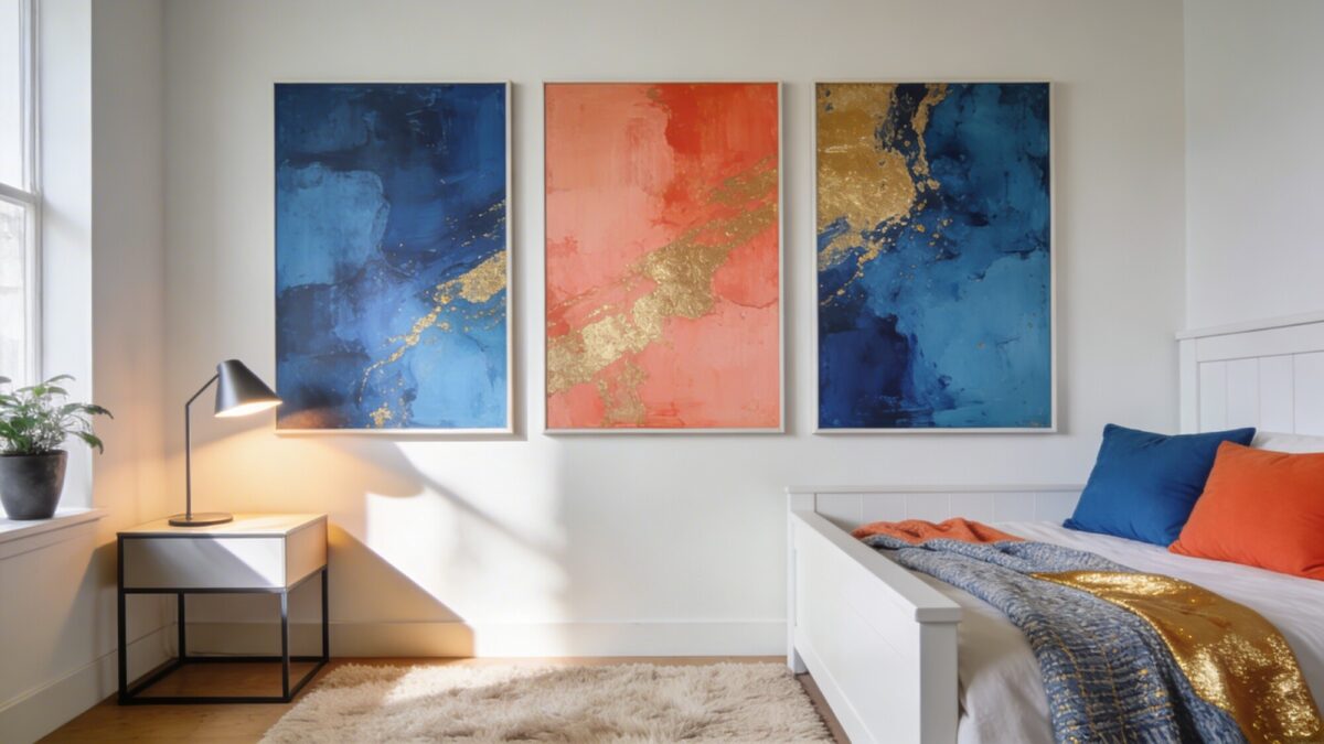
Abstract posters are the easiest entry point into aesthetic wall poster ideas because they don’t require matching anything else in the room. A trio of large-format abstract prints in coordinated but not identical colors gives a wall a center of gravity without forcing you to commit to a theme.
The trade-off: abstract art reads as “art” when the colors are restrained and as “poster” when they’re not. Three prints that all use the same two or three colors in different proportions will look like a set. Three prints with completely different palettes will look like they were bought separately, because they were.
A common mistake with this style: hanging the center of the arrangement at eye level while standing, rather than eye level while sitting on the bed. Since you experience your bedroom mostly seated or lying down, the sweet spot is usually 4–6 inches lower than typical gallery height.
💡 Pro Tip: Lay your poster arrangement out on the floor first using painter’s tape as a stand-in for the wall outline. It takes five extra minutes and saves you from a wall full of nail holes from a layout that didn’t work.
2. Motivational and Quote Posters, Done Without Looking Like a Classroom
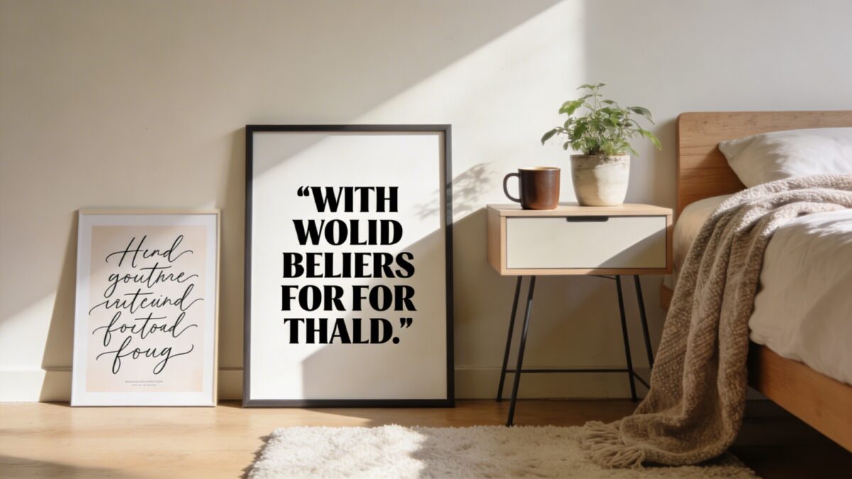
Cool motivational posters have a reputation problem — done badly, they read like a corporate break room. Done well, they work because the typography carries the weight, not the sentiment. A short phrase in bold sans-serif next to a softer script piece creates contrast without competing.
The line to walk: one quote poster reads as a statement piece. Three or more starts to feel like a Pinterest board rather than a room. If you love this format, pick your single favorite phrase and let everything else on that wall be visual rather than text-based.
Rotating a quote poster seasonally is easy if you frame it with a clip frame or a simple poster hanger with magnetic bars rather than glued mounting — both run about the same price as a basic frame but let you swap the print in under a minute.
3. Nature Scenes When You Want the Room to Feel Bigger and Calmer
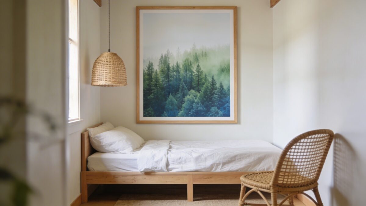
This is the category most people reach for without realizing why it works: a nature poster with depth — a forest that recedes, a horizon line, an open sky — tricks the eye into reading the wall as a window rather than a flat surface. That’s genuinely useful in a small bedroom, where every flat, busy surface makes the room feel more closed in.
What matters more than the subject is the color saturation. Muted, slightly desaturated nature photography reads as calming; oversaturated versions of the same photo read as a screensaver. If you’re shopping for posters to print aesthetic versions of your own travel or nature photos, drop the saturation slider 10–15% before you send the file to print.
💡 Pro Tip: Frame nature posters in light or natural wood instead of black. Black frames add contrast that fights the “open window” effect you’re going for — light wood keeps the eye moving into the image instead of stopping at the border.
4. Monochrome and Minimalist Posters for a Room You Don’t Want to Redecorate Every Year
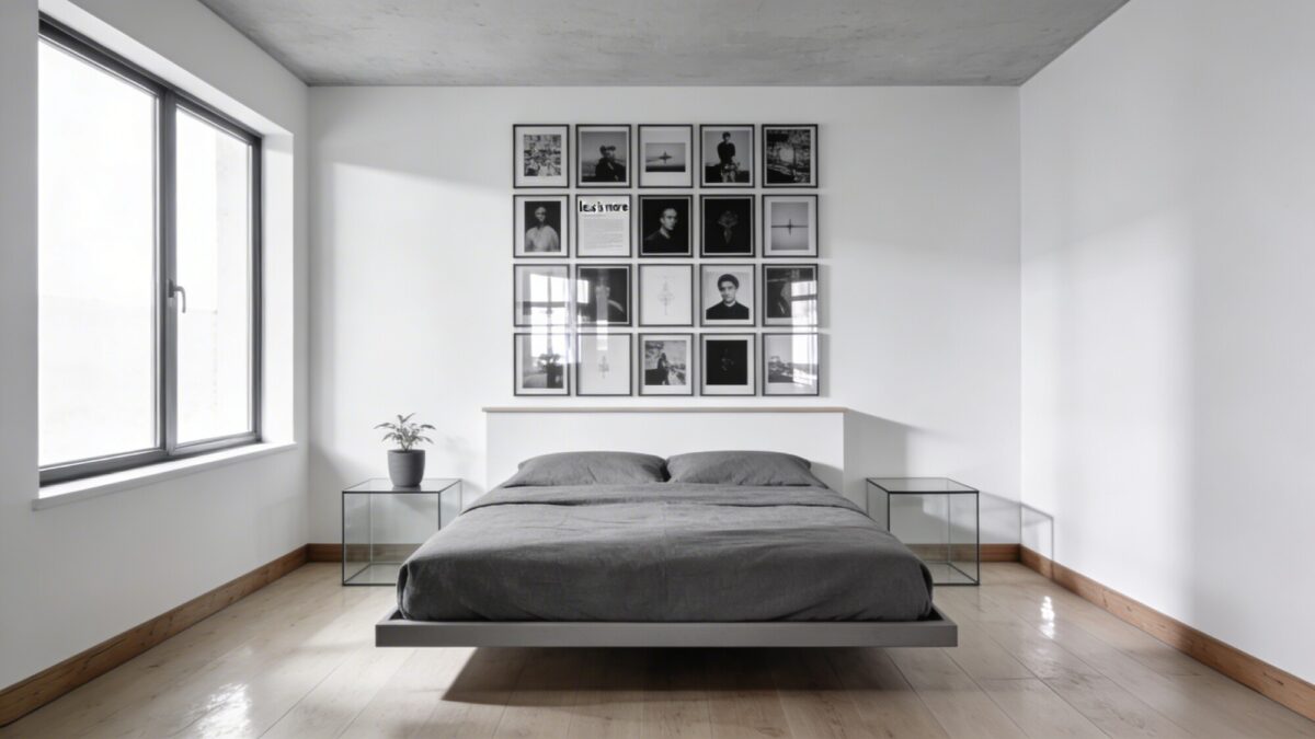
Room decor aesthetic posters in black, white, and gray are the lowest-maintenance option on this list because they never clash with a bedding change. If you like switching up your duvet cover every season but don’t want to touch the walls, this is the category to commit to.
Where people get this wrong: hanging monochrome posters in mismatched frame finishes. A black frame next to a natural wood frame next to a white frame reads as leftover pieces rather than a set. Pick one frame finish and stick with it across the whole arrangement — matte black is the safest, most forgiving choice.
A tight grid (equal spacing, aligned edges) reads as more formal and modern. A single oversized monochrome print reads as more relaxed. Neither is wrong — it depends on whether the rest of the room is fairly minimal already or has some clutter you’re trying to visually settle down.
5. Vintage Travel Posters for a Room With Some Personality to Spare
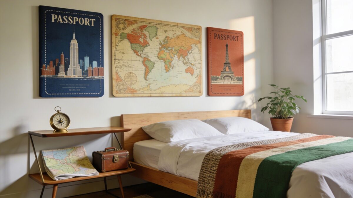
Posters for room aesthetic vintage collections tend to work best in threes: one city or landmark poster, one map-style piece, and one solid color block or type-driven piece to keep the trio from feeling too busy. The classic mid-century travel poster palette — deep blue, terracotta, cream, muted green — is forgiving because it’s built to coordinate by design; these were originally produced as matched print series.
If you want posters on wall bedroom vintage looks without the cost of original prints (originals from mid-century airlines and railways can run into the hundreds of dollars at auction), reproduction prints from a print shop cost roughly the same as any other poster — the difference is entirely in the artwork, not the paper.
💡 Pro Tip: If you actually travel, save this style for places you’ve been rather than places you want to go. A poster of a city you’ve visited pulls double duty as decor and as a genuine keepsake, which is the difference between decoration and a room that tells you something about the person living in it.
6. Botanical Prints When You Want Green Without the Maintenance
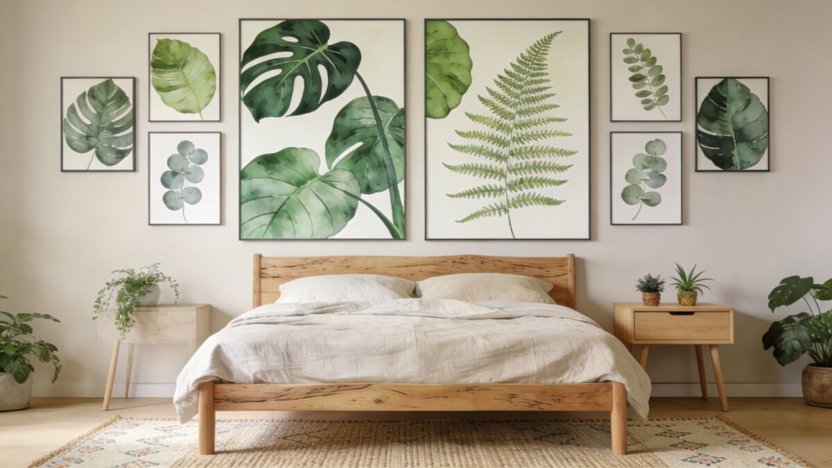
Large-scale leaf prints — monstera, fern, eucalyptus — do a version of what nature photography does but with more graphic punch and less realism, which makes them easier to pair with linen and other natural-fiber bedding. They also solve a real problem: plants die if you’re bad at watering, and a poster never will.
The mistake people make here is going too small. A botanical print under 18×24 inches next to a full-size bed looks like an afterthought. If you’re only hanging one piece in this style, size up — 24×36 is the safer choice for a single statement print.
7. Movie Posters for a Room That Doesn’t Take Itself Too Seriously
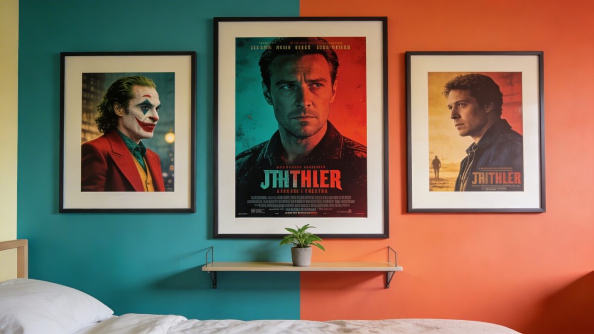
This category has a real image problem, mostly because most people hang the free promotional poster straight from the theater, unframed, with a strip of tape at each corner. The fix isn’t the artwork — it’s the frame. A matte black or dark wood frame on a real print, even a reproduction, instantly reads as intentional rather than leftover from a movie premiere in 2019.
Sticking to one genre or director keeps a multi-poster wall from feeling random. Mixing eras within a genre (a 1970s sci-fi poster next to a modern one) tends to look more curated than mixing genres.
8. Geometric Patterns for a Sharper, More Architectural Wall
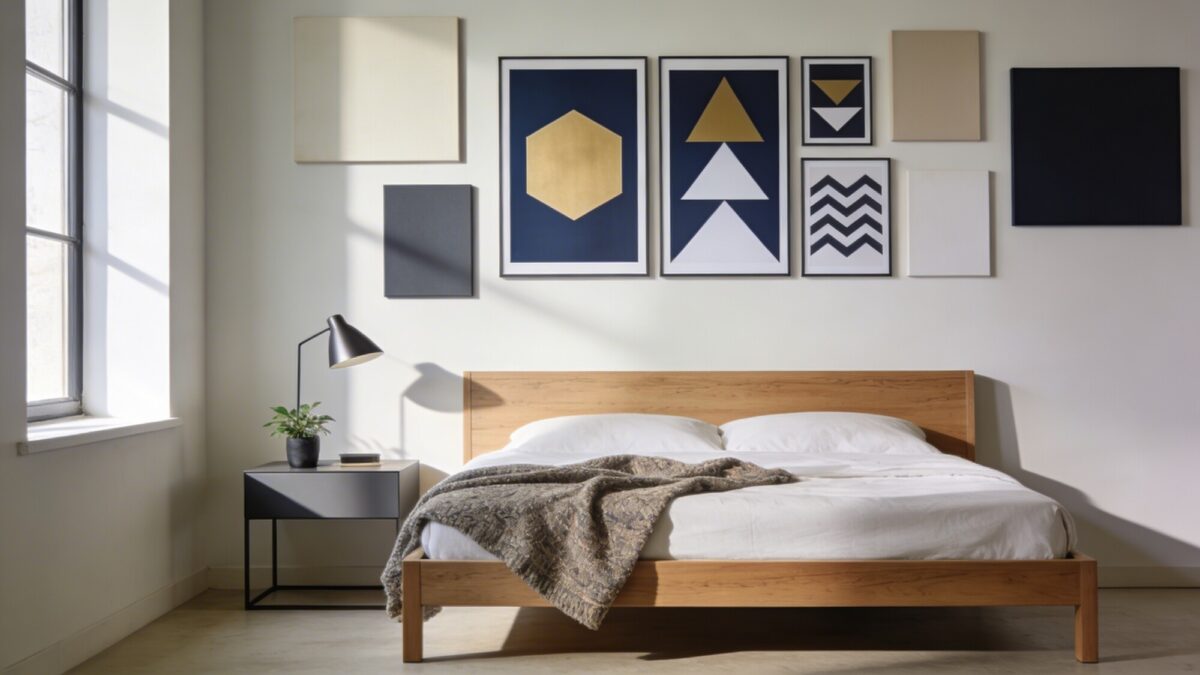
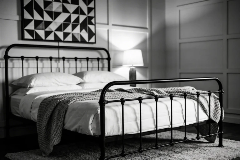
Geometric room decor wall posters work especially well in a bedroom with a lot of soft textures — a quilted duvet, a shag rug, linen curtains — because the hard edges and flat color give the eye something crisp to land on. Limit yourself to three colors in the arrangement; a fourth color usually turns “bold” into “busy.”
Symmetry reads as calm and formal; a deliberately off-center gallery arrangement reads as more energetic. Both work — just don’t split the difference with an arrangement that’s almost symmetrical but not quite, since near-misses are more noticeable than either extreme.
9. Personal Photo Collages for the One Wall That Should Feel Like Yours
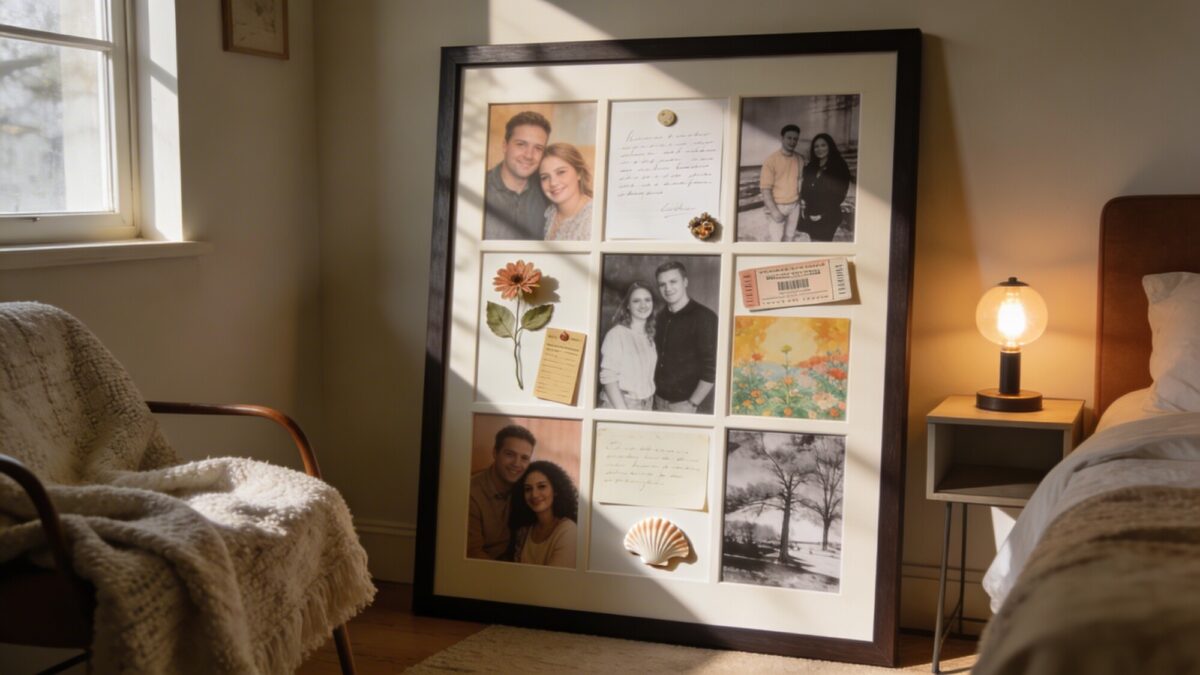
A photo collage is the one category on this list that isn’t really about posters for room decor ideas in the design sense — it’s the wall where design rules matter least, because the value is entirely sentimental. That said, two small tricks keep it from looking chaotic: converting roughly a third of the photos to black and white so the eye has somewhere to rest, and using one consistent frame or a single large mat rather than a dozen different frame styles.
💡 Pro Tip: Print a few photos noticeably larger than the rest — even just two or three at double size. A collage where every photo is the same size tends to look flat; a few size variations give the eye a place to start and a path to follow.
Poster Style Comparison
| Style | Best for | Upkeep | Watch out for |
|---|---|---|---|
| Bold abstract | Rooms lacking a focal point | Low | Mismatched palettes across pieces |
| Motivational quotes | Morning motivation, small accents | Low | Overdoing it — one is a statement, three is a slogan wall |
| Nature scenes | Small or dark bedrooms | Low | Oversaturated prints reading as artificial |
| Monochrome | Rooms with changing bedding/decor | Very low | Mixed frame finishes |
| Vintage travel | Rooms with personality to spare | Low | Buying “vintage” reproductions at original-print prices |
| Botanical | Natural-fiber, plant-lover rooms | None | Sizing too small for the wall |
| Movie posters | Casual, fan-driven rooms | Low | Unframed promotional prints |
| Geometric | Soft, texture-heavy rooms needing contrast | Low | Using more than 3 colors |
| Photo collage | Sentimental, personal walls | Medium (photos to update) | Every photo at the same size |
Things to Consider Before You Hang Anything
- Measure your wall space and your bed width first — a poster arrangement should generally span no wider than the furniture it sits above.
- Decide on frame finish before you buy more than one poster, so you’re not retrofitting a mismatched set later.
- Check whether your lease allows nail holes — removable mounting strips rated for poster weight are a safe default either way.
- Pick your dominant color from the poster, not the wall paint, if the two don’t already match.
- If you’re framing prints yourself, order the poster to the frame’s standard size (18×24 or 24×36) rather than paying for custom cutting on an odd size.
If your walls are already painted a strong color, our guide to pairing posters with bolder wall colors goes into which styles hold up against a busier background and which ones get lost.
Our Recommendation
If you only do one thing from this list: pick a single style and stay in its color family across every poster on that wall. Mixing eight different aesthetics — one abstract print, one movie poster, one quote, one landscape — is the single biggest reason a poster wall ends up looking unplanned rather than curated. Choose the category that matches how you actually want the room to feel, then let that category do all the work.
For a specific, personality-driven variation on this idea, our music poster wall decor guide and album cover wall decor ideas both work as drop-in replacements for the movie poster or photo collage sections above if music fits your room better than film.
FAQ
What size poster should I buy for above a bed?
For a full or queen bed, a single statement poster around 24×36 inches, or a gallery arrangement spanning no more than two-thirds of the headboard width, reads as proportional. Anything smaller than 18×24 tends to look lost above a full-size bed.
How do I hang posters without damaging rental walls?
Removable mounting strips rated for poster or picture weight hold most framed posters without nails and come off cleanly. Poster putty works for lighter, unframed prints but isn’t rated for framed glass.
How many posters is too many for one wall?
There’s no fixed number, but if you can’t name the color palette or theme tying the arrangement together in one sentence, it’s probably too many or too mismatched.
Should posters be framed or unframed?
Framed posters read as more finished and last longer without curling or yellowing at the edges. Unframed prints are cheaper and easier to rotate, which makes sense for a wall you plan to change often, like a quote or photo collage wall.
Do I need to match my poster frames to my furniture wood tone?
Not exactly, but a stark mismatch (a warm oak bed frame with cool gray or black poster frames) can make the room feel like two different projects. It doesn’t need to match exactly — just avoid a hard clash.
Once you’ve settled on a style, the layout matters almost as much as the artwork itself — our small bedroom layout ideas page covers wall-space planning if you’re working with limited square footage.