Mastering Interior Design Living Room Colors for Wow-Worthy Spaces
You know that moment when you walk into a living room and instantly feel… seen? Color is doing the heavy lifting here—it sets the mood, hides the chaos, and maybe even makes your coffee look better. Let’s skip the doomscrolling and get straight to the fun part: nailing interior design living room colors that truly work for real life.
Color fundamentals you can trust (without a boring lecture)
Color isn’t magic, it’s psychology + a little science. Start here so your choices actually stick.
– Neutrals aren’t boring. Think warm taupe, crisp greige, or a creamy off-white. They act like a blank canvas and make furniture pop.
– Warm vs. cool tones matter. Warm colors feel cozy and inviting; cool colors feel calm and spacious. Mixing is possible, just do it thoughtfully.
– Light matters. A north-facing room will resist warm tones; south-facing rooms drink them up. Always test paint chips on walls at different times of day.
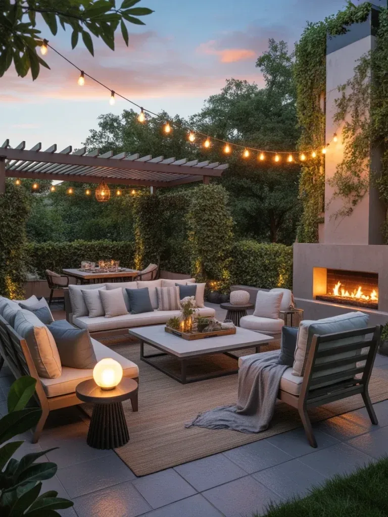
– Accent with purpose. Use bold color sparingly on an accent wall, a rug, or a statement chair. Too much color all at once can feel chaotic.
Start with a backbone color and layer from there

The easiest way to keep things cohesive is choosing one backbone color and then layering with accents.
– Pick a backbone: warm beige, soft gray, or a creamy white. This is your “main” hue.
– Add the second layer: a secondary color that complements the backbone. This could be a taupe, sage, or blush.
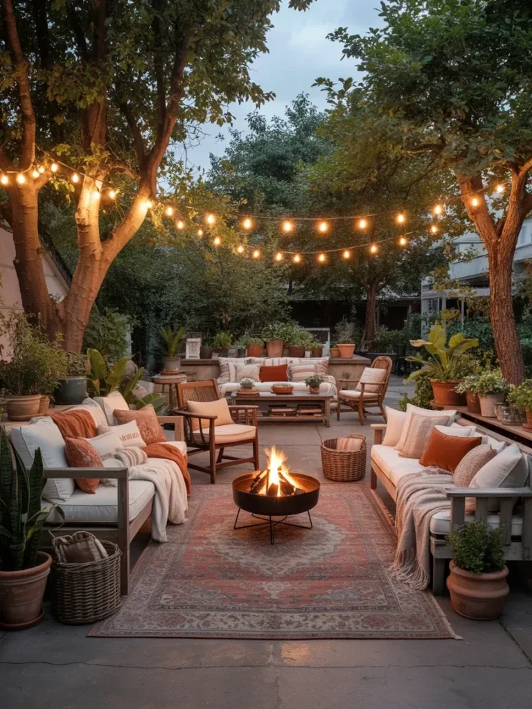
– Introduce pops: one or two saturated tones for personality (navy, emerald, or terracotta work wonders).
Which palettes actually feel like home (and why)
Not all color combos age well. Here are palettes that readers tend to adore, plus why they click.
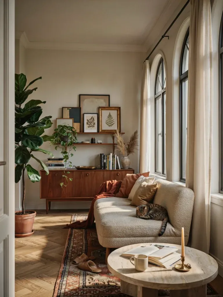
Soft, airy neutrals with a cozy twist
– Backbone: warm ivory or pale greige
– Secondary: dusty rose, sage, or muted blue-green
– Accent: charcoal or deep navy for contrast
Why it works: it looks intentional but never clinical. It feels like a warm hug, not a clinical hospital ward.
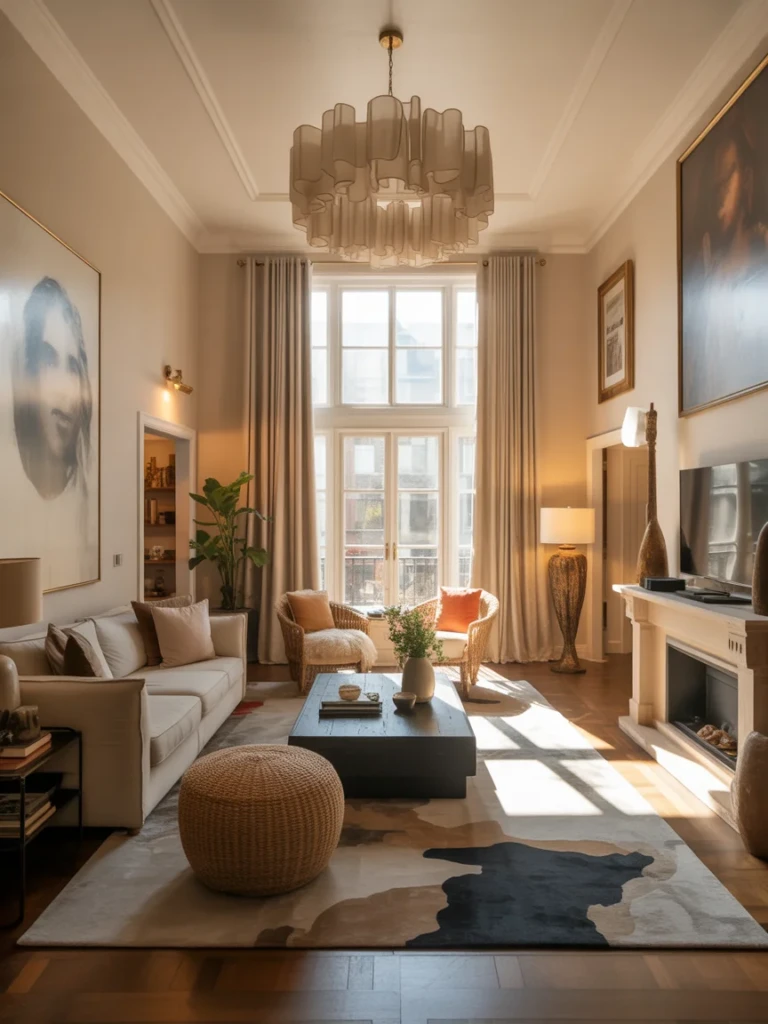
Dramatic and moody without blocking light
– Backbone: deep greige or charcoal with warm undertones
– Secondary: brass, caramel, or amber accents
– Accent: a jewel tone—emerald, sapphire, or ruby
Why it works: depth adds drama while lighting keeps the space alive. FYI, add a lot of texture to prevent it from sinking.
Bright, playful, and surprisingly grown-up
– Backbone: clean white with a touch of warmth
– Secondary: sunny yellows, coral, or lime as accents
– Accent: navy or charcoal to anchor
Why it works: it feels cheerful without shouting. Perfect for a living room that doubles as a creative studio.
Practical picks for different vibes
Let’s map color ideas to real-life vibes, so you don’t have to guess.
Cozy cottage with modern touches
– Wall color: soft taupe or warm off-white
– Wood tones: honey or driftwood
– Textiles: plaid, chunky knits, and muted florals
– Pops: forest green or cranberry red in cushions or art
Why it works: it feels lived-in and approachable, not fussy.
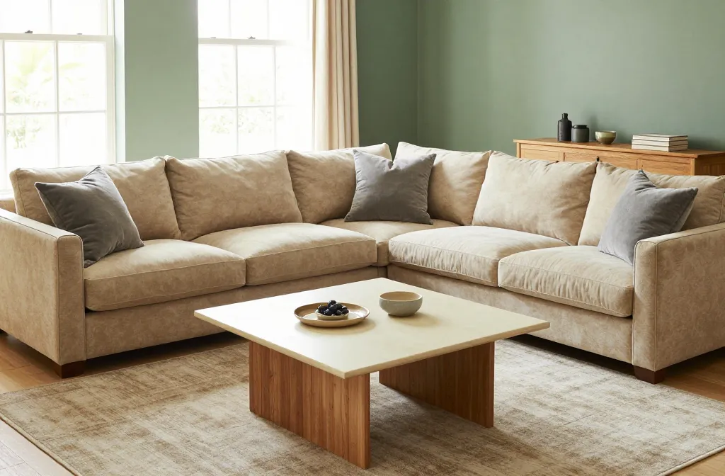
Minimalist, calm, and clean
– Wall color: cool gray or warm white
– Wood: your lightest possible to keep airiness
– Textiles: monochrome with subtle textures (linen, wool)
– Pops: a single saturated color—think cobalt or emerald—on one piece
Why it works: serenity without boring.
Glam with a wink
– Wall color: warm mink or champagne
– Metals: brass or rose gold
– Textiles: velvet, metallic threads, tactile boucle
– Pops: deep teal or plum
Why it works: luxe without being loud, if you pull the right textures into the room.
How to test color without feng shui-level commitment
Testing matters. Here’s how to avoid paint regret.
– Test patches on multiple walls and in different lighting. Don’t rely on a tiny chip.
– Live with it for 48 hours. See how it shifts from morning to evening.
– Consider the furniture you already own. If you’re keeping big pieces, pick colors that harmonize with them.
– Use tapestry and textiles as trial runs. Swap pillows and throws first to simulate future color changes.
When you should lean into bold colors

Bold doesn’t have to mean “every surface is saturated.” It can be strategic.
– Use bold color on one wall for drama, and keep the rest neutral.
– Choose a colorful rug to anchor the space. Rugs are color-changers with less commitment.
– Pick accent furniture (a blue sofa, a red chair) to draw the eye without overwhelming.
– Don’t forget the ceiling. A tinted ceiling can surprise you in the best way—just keep it light enough not to crush the room.
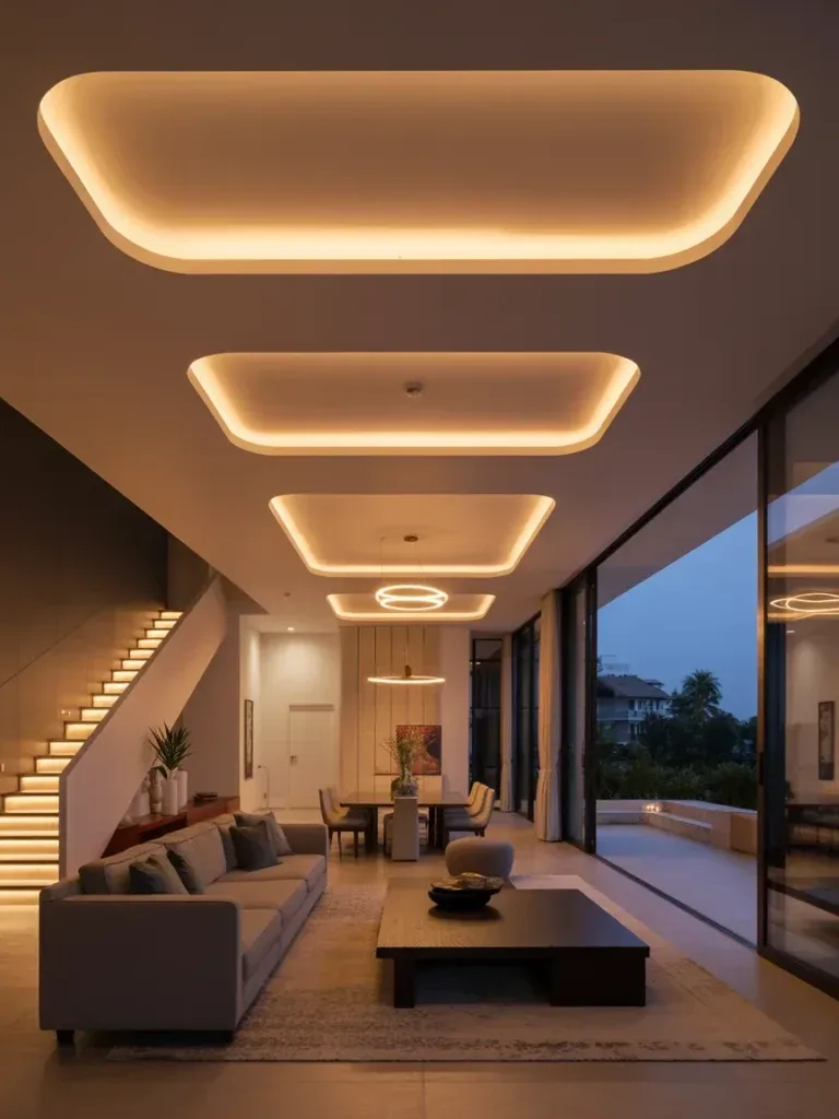
Lighting: the secret weapon for color accuracy
Lighting changes how color reads, so it deserves its own spotlight.
– Natural light brightens colors and helps you see true tones.
– Warm artificial light (2700-3000K) makes warm colors cozier; cool light (3500-4000K) highlights neutrals and blues.
– Layer light with overhead, task, and ambient options. The same wall can feel different in each layer.
– Test with lamps before you commit. A color you love in daylight can look muddy under incandescent.
Frequently asked questions
Is it better to pick a color first or furniture?
It depends on your vibe. If you already own bold furniture, pick wall colors that pull it together. If you’re starting fresh, choose a wall color that makes your favorite pieces pop. IMO, start with the backbone, then build around it.
How many colors should a living room have?
Three to four are usually plenty: a backbone neutral, a secondary color, and one or two accent colors. More than that can feel busy, less can be boring. FYI, you can swap in textures to add interest without adding color.
What if my landlord won’t let me repaint?
Rugs, textiles, artwork, and removable wallpaper are your best friends. You can achieve big color shifts with soft furnishings and wall art without touching paint. Challenge accepted, right?
How can I tell if a color will clash with my furniture?
Use swatches and place them near furniture you own. If the color makes you click your tongue or you notice it in every photo you own, it might clash. Test under different lights, because the same piece can look totally different with another hue.
What are some no-fail color pairs?
– Navy with warm neutrals and brass accents
– Sage green with creamy whites and natural wood
– Blush pink with charcoal gray and black metal
– Rust orange with teal and tan leather
Why these work: they balance warmth, contrast, and texture without screaming for attention.
Conclusion
So, you’ve got a toolbox of color ideas, a sense for mood, and a plan to test smarter, not harder. Interior design living room colors aren’t about chasing trends—they’re about crafting a space that feels like you, every day. FYI, if you keep the backbone neutral and layer with texture, you’ll dodge the “next room redo” guilt for years. And if you want a quick win, start with a rug or a single accent chair in a bold color. It’s like giving your room a personality upgrade without a full makeover.