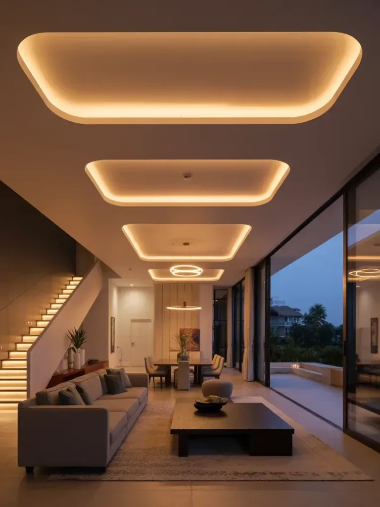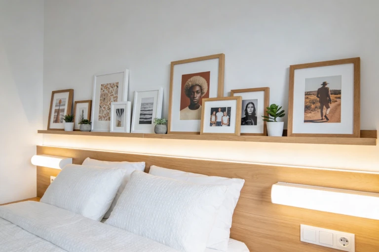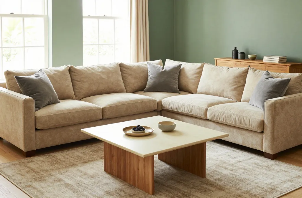
Mastering Interior Design Living Room Colors for Wow-Worthy Spaces
You know that moment when you walk into a living room and instantly feel at ease? Color is doing most of the heavy lifting — it sets the mood, hides everyday clutter, and shapes how the whole space reads. Mastering interior design living room color choices isn’t about chasing trends; it’s about understanding a few fundamentals and applying them with intention.
This guide covers the psychology behind color, how to build a palette that lasts, and how lighting changes everything you thought you knew about your walls.
Quick-Reference: Key Takeaways
- Backbone first: Pick one dominant neutral before anything else
- Rule of three or four: Backbone, secondary, and one or two accents
- Light direction matters: North-facing rooms need warmth; south-facing rooms can handle cooler tones
- Test before committing: Live with a swatch for 48 hours across different light
- Bold, but strategic: One wall, one rug, or one chair — not everything at once
Color Fundamentals for Modern Living Room Design
Color isn’t magic — it’s psychology plus a bit of science. Getting these fundamentals right is what separates a modern living room design that feels intentional from one that feels accidental.
- Neutrals aren’t boring. Warm taupe, crisp greige, and creamy off-white act as a blank canvas that makes furniture stand out.
- Warm vs. cool tones matter. Warm colors feel cozy and inviting; cool colors feel calm and spacious. Mixing the two works, but it needs to be deliberate.
- Light changes everything. A north-facing room resists warm tones, while a south-facing room absorbs them easily. Always test paint chips at different times of day.
- Accent with purpose. Save bold color for an accent wall, a rug, or a statement chair — too much saturation at once tends to feel chaotic.
Start With a Backbone Color and Layer From There

The simplest way to keep a room cohesive in any living room interior design plan is choosing one backbone color and layering everything else around it.
- Pick a backbone: Warm beige, soft gray, or creamy white — this becomes your dominant hue.
- Add a secondary layer: A complementary color like taupe, sage, or blush.
- Introduce pops: One or two saturated tones for personality — navy, emerald, or terracotta all work well.
Palettes That Actually Feel Like Home
Not every color combination ages well. These three approaches consistently hold up over time, whether you’re aiming for a cozy living room design or something more dramatic.
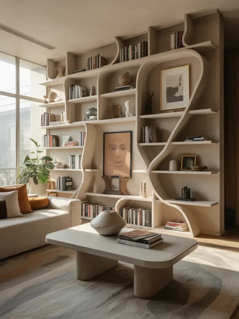
Soft, Airy Neutrals With a Cozy Twist
- Backbone: Warm ivory or pale greige
- Secondary: Dusty rose, sage, or muted blue-green
- Accent: Charcoal or deep navy for contrast
This combination looks intentional without feeling clinical — it reads more like a warm hug than a showroom.
Dramatic and Moody Without Blocking Light
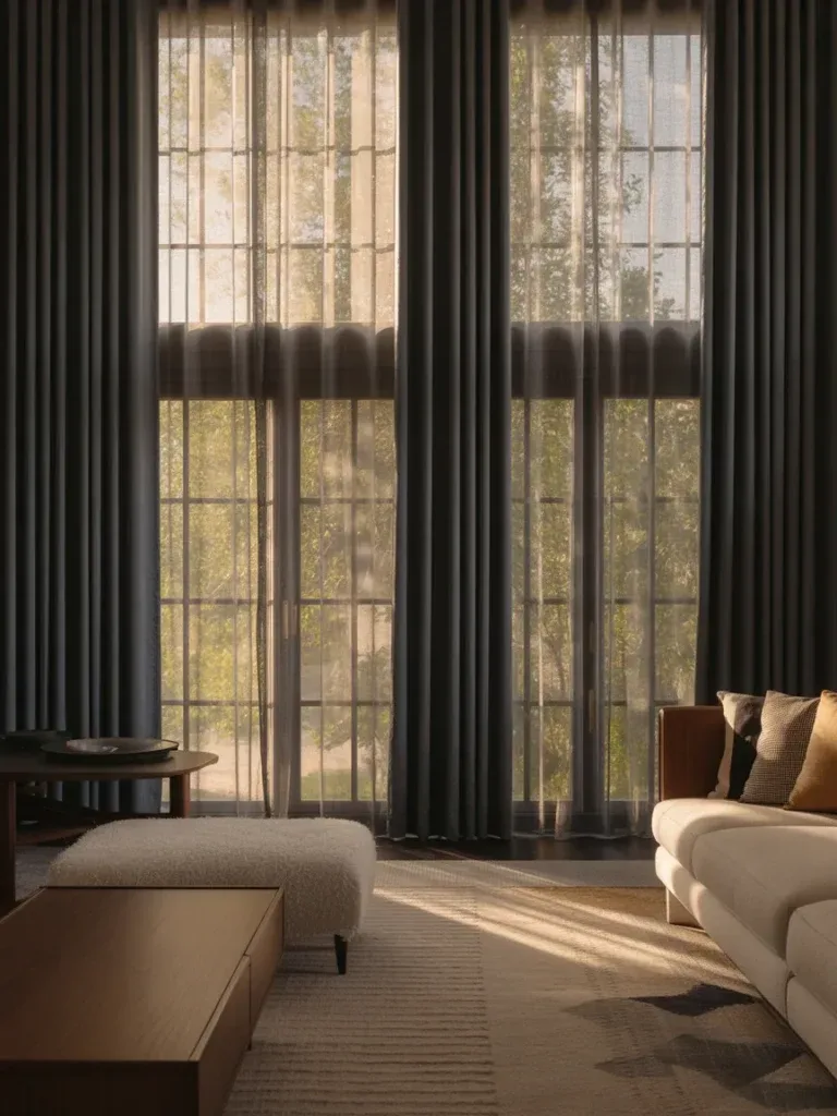
- Backbone: Deep greige or charcoal with warm undertones
- Secondary: Brass, caramel, or amber accents
- Accent: A jewel tone — emerald, sapphire, or ruby
Depth adds drama while good lighting keeps the space feeling alive rather than heavy. Layering in texture helps prevent a dark palette from feeling like it’s sinking the room.
Bright, Playful, and Surprisingly Grown-Up
- Backbone: Clean white with a touch of warmth
- Secondary: Sunny yellow, coral, or lime as accents
- Accent: Navy or charcoal to anchor the palette
This one feels cheerful without shouting — a strong option for a living room that doubles as a creative or social space.
Practical Color Picks for Different Living Room Vibes
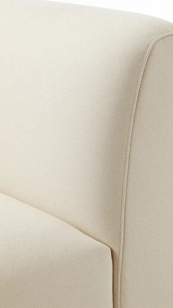
Matching a palette to a specific mood takes the guesswork out of choosing paint. Here are three reliable starting points for popular living room design ideas.
| Vibe | Wall Color | Key Accents |
|---|---|---|
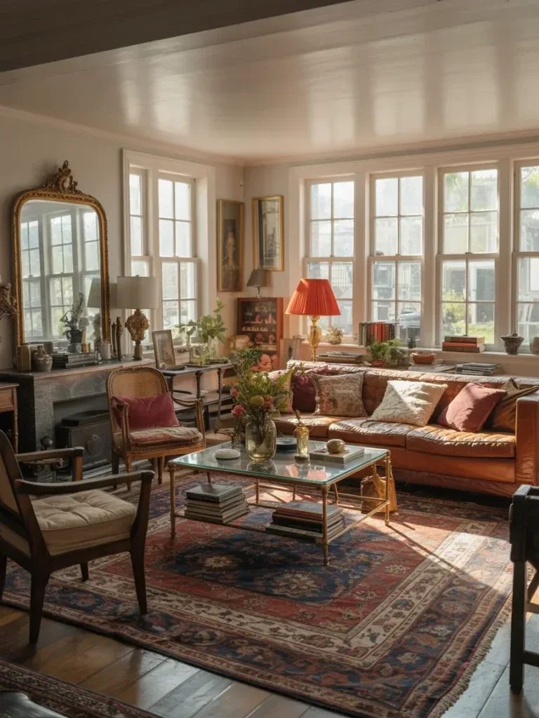
| Cozy Cottage, Modern Touches | Soft taupe or warm off-white | Honey wood tones, forest green or cranberry cushions |
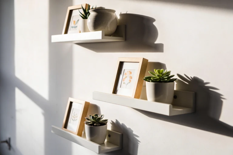
| Minimalist, Calm, Clean | Cool gray or warm white | Light wood, monochrome linen and wool, one saturated accent piece |
| Glam With a Wink | Warm mink or champagne | Brass or rose gold, velvet textiles, deep teal or plum |
The glam direction in particular leans into luxury living room design territory — for more inspiration on pulling that off at scale, this guide on mirror wall decor for instant glam pairs well with a champagne or mink palette.
How to Test Color Without Full Commitment
Testing properly is what stands between you and paint regret. A few careful steps go a long way toward getting this right.
- Test patches on multiple walls and in different lighting conditions — a single small chip isn’t enough to judge by.
- Live with it for 48 hours to see how the color shifts from morning light to evening light.
- Consider furniture you’re keeping. If large pieces are staying, choose wall colors that harmonize with them.
- Use textiles as a trial run. Swapping pillows and throws first simulates a bigger color change before you commit to paint.
When to Lean Into Bold Colors

Bold doesn’t have to mean every surface is saturated. Used strategically, it becomes one of the more effective luxurious living room ideas available without a full repaint.
- Use bold color on one wall for drama, keeping the rest of the room neutral.
- Choose a colorful rug to anchor the space — rugs are an easy way to shift color with far less commitment than paint.
- Pick accent furniture, like a blue sofa or a red chair, to draw the eye without overwhelming the room.
- Don’t overlook the ceiling. A tinted ceiling can be a pleasant surprise, as long as it stays light enough not to visually lower the room.
Lighting: The Secret Weapon for Color Accuracy
Lighting changes how color reads, which makes it just as important as the paint itself in any serious modern living room inspiration board.
- Natural light brightens colors and shows their truest tone.
- Warm artificial light (2700–3000K) makes warm colors feel cozier, while cooler light (3500–4000K) highlights neutrals and blues.
- Layer your lighting with overhead, task, and ambient sources — the same wall can look noticeably different under each.
- Test with lamps before committing. A color that looks great in daylight can turn muddy under incandescent bulbs.
Checklist: Before You Commit to a Palette
- Have you chosen one backbone neutral before adding secondary colors?
- Does your palette account for your room’s natural light direction?
- Have you tested swatches for at least 48 hours?
- Are your bold choices limited to one or two focal points?
- Have you checked the palette under both natural and artificial light?
- Does the palette work with furniture you’re planning to keep?
Frequently Asked Questions
Is it better to pick a color first or furniture first?
It depends on your starting point. If you already own bold furniture, choose wall colors that pull the room together around it. If you’re starting fresh, pick a wall color that makes your favorite pieces stand out — either way, start with the backbone and build outward.
How many colors should a living room have?
Three to four is usually the sweet spot: a backbone neutral, a secondary color, and one or two accents. More than that can feel busy, and fewer can feel flat — texture can add interest without adding another color.
What if my landlord won’t let me repaint?
Rugs, textiles, artwork, and removable wallpaper can achieve a meaningful color shift without touching the walls. Soft furnishings alone can change the entire feel of a room.
How can I tell if a color will clash with my furniture?
Hold swatches next to the furniture you own and view them under different lighting. If a color makes you wince or stands out awkwardly in photos, it’s likely a mismatch — the same piece can look completely different under another light source.
What are some reliable no-fail color pairs?
Navy with warm neutrals and brass accents, sage green with creamy whites and natural wood, blush pink with charcoal gray and black metal, and rust orange with teal and tan leather all balance warmth, contrast, and texture without feeling overdone.
Our Verdict: Build a Palette, Not Just a Paint Job
With a solid grasp of color fundamentals, a few tested palettes, and a plan for testing before you commit, you’re well equipped for living room decor ideas that hold up for years, not just one season. Keep the backbone neutral, layer in texture and one or two confident accents, and let lighting do some of the work.
If you want a fast, low-risk win, start with a bold rug or a single accent chair — it’s a quick way to give the room a personality upgrade without a full redo.