8 Pastel Room Decor Bedroom Ideas for Dreamy Spaces
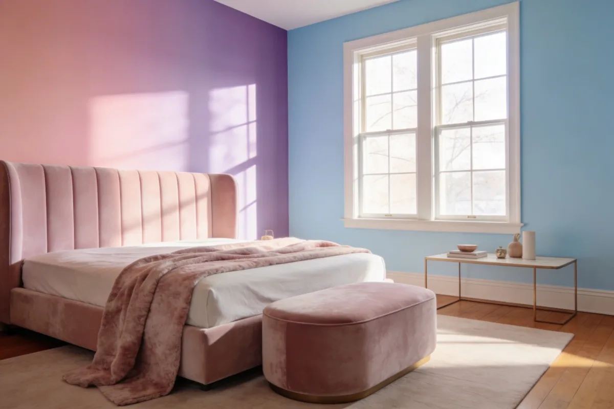
Pastel room decor bedroom ideas get a bad reputation for looking either too sugary or too flat — all soft pink, no depth. The eight ideas here fix that by leaning on texture, layering, and a little contrast instead of just color alone, so the room reads dreamy rather than childish. If you’re chasing a fuller aesthetic bedroom overhaul beyond just color, our aesthetic bedroom decor ideas guide covers the layout side of things too.
Quick Take: Building a Pastel Room That Doesn’t Look Flat
- Pick 2–3 pastel shades max — blush, lavender, and sage together works; five pastels together starts to look like an Easter basket
- Texture matters more than color count — velvet, knit, linen, and faux fur in the same two or three shades reads richer than one flat color in five fabrics
- Add one non-pastel neutral — cream, white, or light wood — so the palette has somewhere to rest
1. A Soothing Gradient Wall That Actually Reads as Intentional
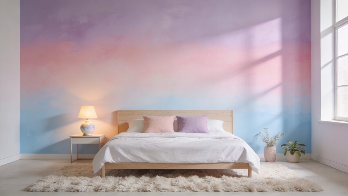
A blush-to-lavender-to-sky-blue gradient wall is one of the few pastel color room ideas bedrooms that works as a genuine focal point instead of just a backdrop. It’s more forgiving than people expect: because the transition is gradual, small unevenness in the blending doesn’t show the way it would on a single flat color.
Two or three shades that sit next to each other on the color wheel blend the most convincingly — blush into lavender into pale blue works because they’re tonally close. Painter’s tape gives you cleaner transition lines; a damp sponge worked in circular motions gives you a softer, more painterly fade. A matte or eggshell finish keeps the whole thing from looking glossy or plastic-y once it’s dry.
💡 Pro Tip: Paint your gradient in thin layers rather than trying to nail the blend in one coat. Two or three light passes let you build up the transition gradually and fix uneven spots before the paint fully sets.
2. Pastel Velvet as the One Statement Piece
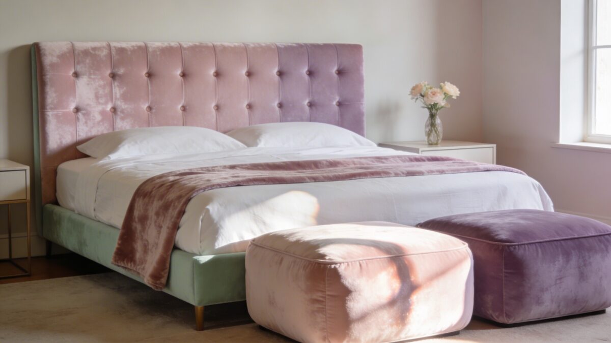
Velvet in a pastel shade avoids the two failure modes of pastel decor — looking childish or looking flat — because the fabric itself does visual work through light and shadow, not just color. A single tufted velvet headboard, one throw blanket, or a pair of ottomans is usually enough; velvet everywhere starts to feel heavy rather than luxe.
The common mistake here is buying velvet in three different pieces and three different pastel shades at once. Pick one item, one shade, and let the rest of the room’s fabrics stay simple — cotton, linen — so the velvet piece actually stands out instead of competing with itself.
3. Mixing Textures for Cozy Bedroom Aesthetic
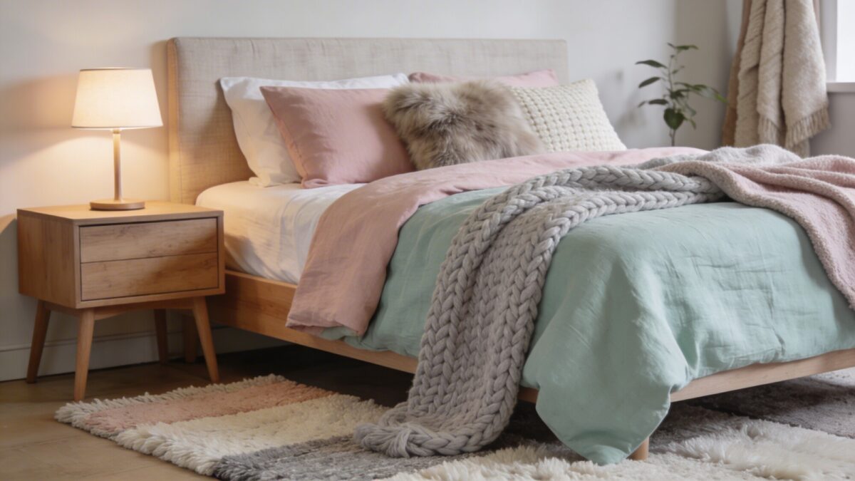
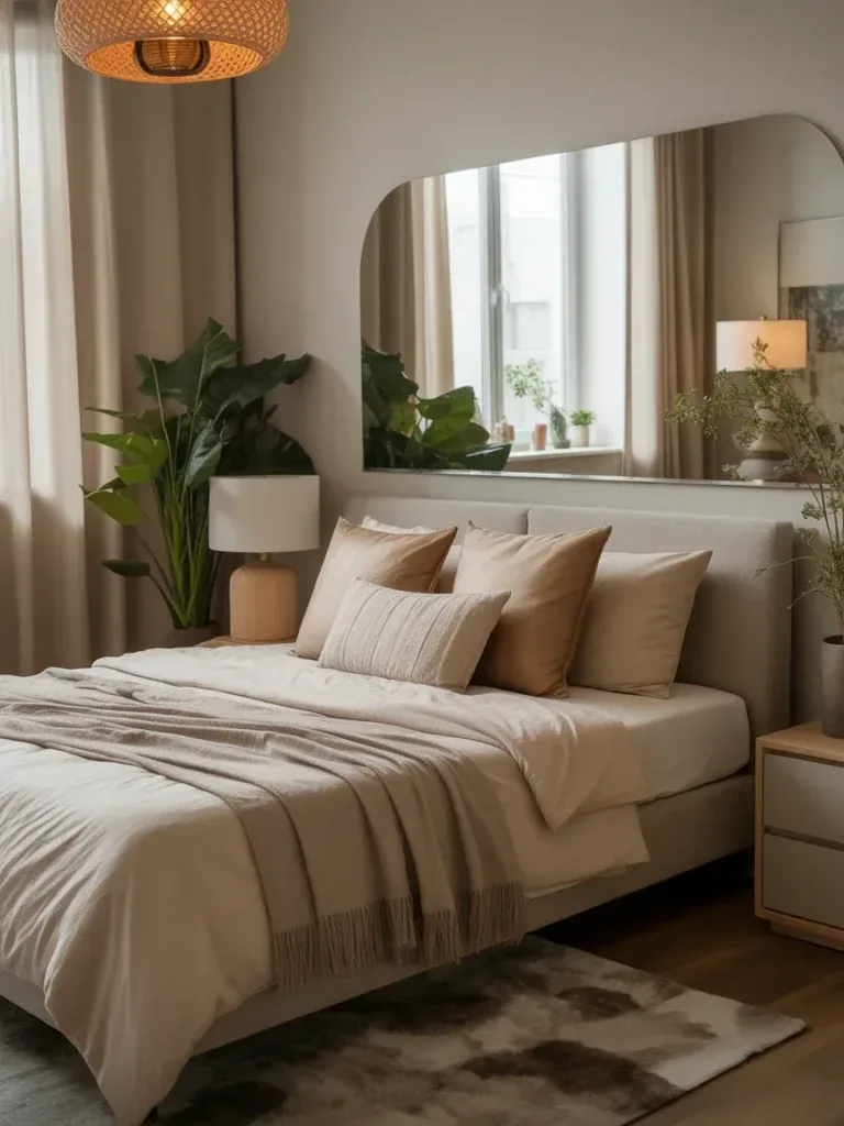
This is the step that separates a genuinely cozy room decor small bedrooms setup from one that just has pastel sheets. Layer a linen duvet, a chunky knit throw, one faux fur pillow, and a woven rug with some pile height — all within your two or three chosen colors — and the bed reads as curated rather than matched-from-a-set.
Don’t overthink the exact shade matching between pieces here — a blush linen duvet, a powder pink knit throw, and a cream faux fur pillow are close enough to read as coordinated without looking like they came from the same three-piece bedding set.
4. Warm Pastel Lighting for Bedroom Ambience
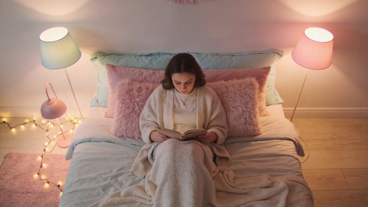
This is where a lot of pastel pink aesthetic bedroom ideas fall apart — the walls and bedding are soft, but the overhead light is a stark 4000K white that flattens the whole effect. Swap to warm white bulbs (2700–3000K) first; everything else in this list looks better once the base lighting is warm.
A pastel-tinted lampshade adds a gentle color wash to the light itself, and a string of small warm-white bulbs draped along a headboard or shelf gives a cozy bedroom ideas fairy lights effect without needing an electrician.
💡 Pro Tip: Test your bulb color temperature before committing to a whole set — screw in one 2700K bulb next to your existing fixture and compare them side by side at night. The difference is more noticeable than most people expect from a spec number on a box.
5. Small-Scale Patterns for Personality Without Chaos
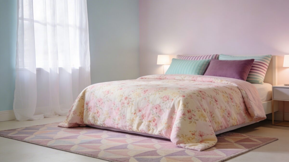
A small floral duvet paired with striped pillowcases in a complementary pastel adds personality without turning the bed into a pattern clash. The rule that actually holds up in practice: two patterns per surface, max, and keep the print scale small rather than large and bold — large florals in pastel tend to read more grandma than girly girl bedroom.
6. Swapping Furniture Pieces Instead of Starting Over
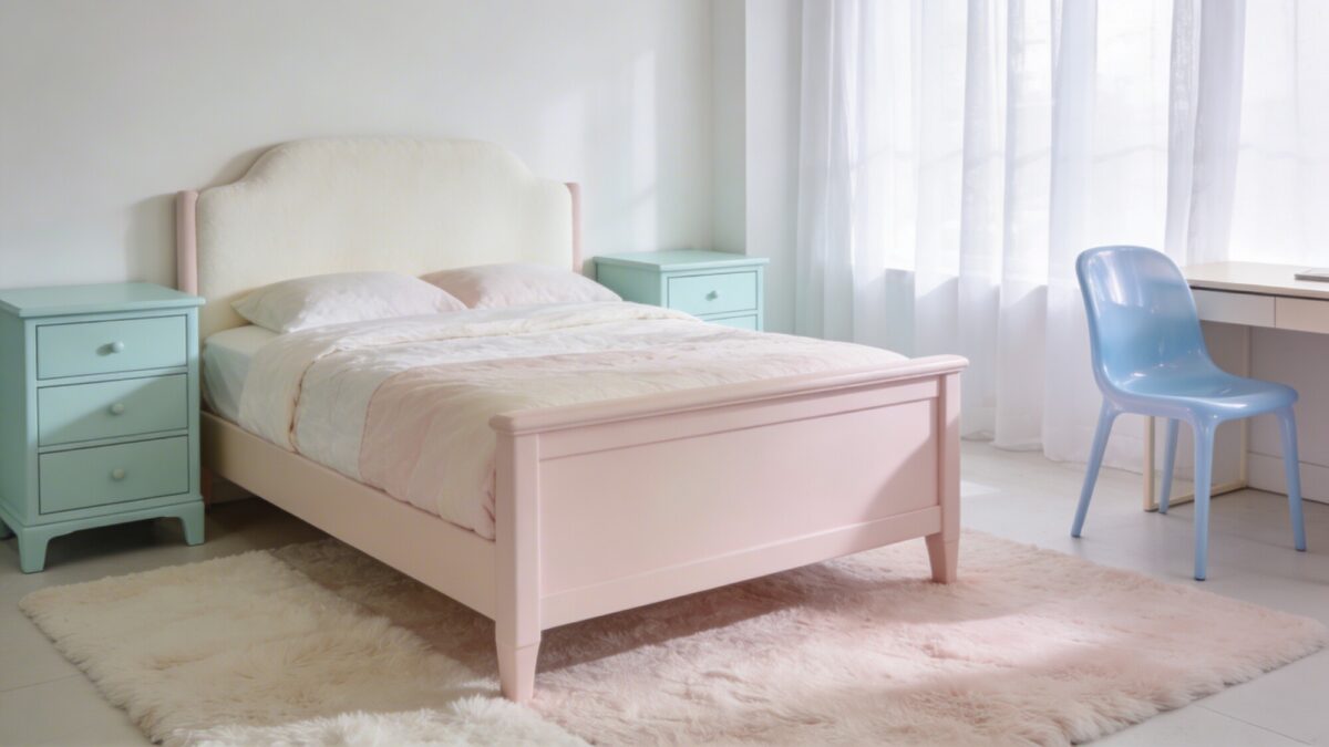
You don’t need to replace every piece to shift the room’s whole feel. Pale mint nightstands, a blush or ivory bed frame, or a single pastel desk chair each do more visual work than their price tag suggests, because furniture color reads at a bigger scale than a throw pillow does.
7. Layering Bedding for a Plush, Hotel-Like Look
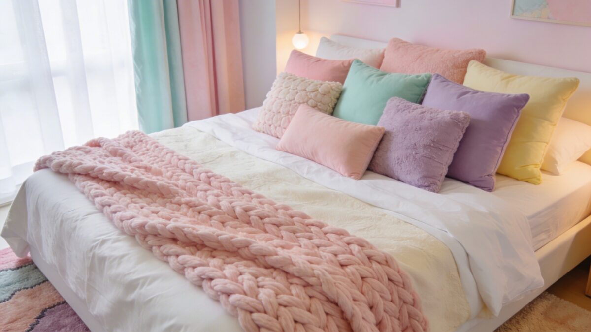
A white or cream base layer with pastel accents on top is the fastest single upgrade on this list — no painting, no furniture shopping, just bedding. Vary pillow sizes and textures rather than buying a matched five-piece set; a chunky knit throw at the foot of the bed adds the last bit of dimension.
8. Plants and Natural Touches to Keep It Grounded
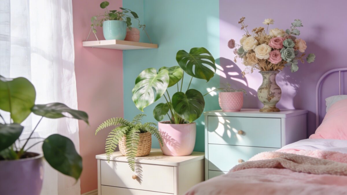
This is the step that keeps an all-pastel room from tipping into looking sterile or overly sweet. Pothos and philodendron in pastel-colored planters, a small fern for texture, and a dried floral arrangement in muted tones — beige, dusty pink, sage — add a natural counterweight to an otherwise soft, synthetic-feeling palette. For more layout ideas that pair greenery with a similar soft palette, see our sage green and pink bedroom ideas.
Which Pastel Direction Fits Your Room?
| If you want… | Lean toward | Best paired with |
|---|---|---|
| A coquette room aesthetic | Blush pink, cream, white lace or ruffle textures | Velvet accent, small floral print |
| A kawaii pink bedroom | Bubblegum pink, pale mint, playful accessories | String lights, rounded furniture shapes |
| A lilac room aesthetic | Lavender, dusty purple, cream | Gradient wall, warm lighting |
| A preppy college room look | Pale blue, white, small stripes | Gallery wall, structured bedding |
Frequently Asked Questions
How many pastel colors should I use in one bedroom?
Two or three, max. More than that and the room starts to look like a candy display instead of a coordinated space.
Will pastel colors make my room look too young?
Not if you pair them with texture — velvet, linen, matte wood — and at least one neutral like cream or white. Flat, glossy pastel with nothing else is what reads as childish, not the color itself.
What’s the easiest single pastel upgrade to start with?
Bedding. A cream base with two or three pastel accent pieces layered on top changes the whole room’s feel without touching paint or furniture.
Do pastel rooms work for small bedrooms?
Yes, often better than bold color — lighter tones don’t visually shrink the space the way a dark accent wall can in a tight room.
How do I keep a pastel room from feeling too sweet?
Add plants, a dried floral arrangement, or a natural wood tone somewhere in the room. One grounding, non-pastel element goes a long way.
Our Take
Start with lighting and bedding — they’re reversible, low-cost, and they tell you fast whether you actually like living with pastel before you commit to a gradient wall or new furniture. If the palette still feels right after a couple of weeks, that’s when the wall and the velvet piece are worth the extra effort. For a softer, more neutral-leaning take on the same dreamy mood, our light and airy bedroom ideas guide is a good next stop.