I repainted my living room four times in two years before I found a color I actually liked living with. Four times. So when people ask me what the best living room paint color is, I don’t give them a Pinterest-perfect answer off the top of my head — I give them the shortlist that actually held up in real light, with real furniture, on a Tuesday afternoon when the sun’s doing something weird through the blinds. That’s what you’re getting here: eleven colors I’d genuinely recommend, plus the reasoning behind each one. Table of Contents Toggle How I Found the Best Living Room Paint Color for My Own Space11 Best Living Room Paint Color Ideas to Try This Year1. Warm Greige — The Safest Bet for Best Living Room Paint Color Overall2. Muted Sage Green3. Boho Olive Green4. Burnt Orange5. Soft Terracotta6. Deep Charcoal (Accent Wall Only, Please)7. Creamy Off-White8. Dusty Blue9. Warm Taupe10. Butter Yellow11. Moody Forest GreenMuted Green Paint Ideas That Feel Calm, Not BoringThe Best Boho Green Paint Colors for a Relaxed, Earthy VibeBest Muted Green Paint Colors vs. Bold Greens: Which Wins?Green Wall Colors That Pair Beautifully with Wood and Boho DecorBurnt Orange Color Palette Ideas for a Cozy Living RoomHow to Test Paint Colors Before You Commit (Save Yourself the Regret)My Final Thoughts on the Best Living Room Paint Color for You How I Found the Best Living Room Paint Color for My Own Space My first mistake was picking a color off a paint chip under fluorescent hardware store lighting. Rookie move. It looked like a soft, cool gray on the little card and turned into something closer to lavender-gray by 4pm in my west-facing room. I painted an entire wall before I noticed, which, in hindsight, is a very expensive way to learn about north-facing versus west-facing light exposure. What I do now, and what I’d tell anyone starting this process, is test a color in the actual room, at multiple times of day, before buying a single gallon. Paint samples aren’t just a suggestion — they’re the only way to catch how a color shifts from morning to golden hour to lamp-lit evening. If your living room shares sightlines with your entryway or dining area, it also helps to look at a few budget-friendly living room decor ideas first, since your paint color needs to work with whatever furniture and textiles you’re already committed to, not just the swatch in isolation. 11 Best Living Room Paint Color Ideas to Try This Year I’ve grouped these by vibe rather than just listing them randomly, because honestly, “best” depends entirely on what your room is trying to do. 1. Warm Greige — The Safest Bet for Best Living Room Paint Color Overall If you want one answer and you want it now: warm greige. It’s the color equivalent of a good pair of jeans — goes with almost everything, ages well, doesn’t scream for attention. Look for a greige with more brown undertone than pink or purple (check the color’s “mass tone” on the paint strip, not just the tint) to avoid it reading dusty-rose in certain light. Expect to pay somewhere around $45–$70 a gallon for a quality eggshell finish, and plan on two coats minimum over any previous wall color. 2. Muted Sage Green Sage has had a moment for a few years now, and unlike most trend colors, I don’t think it’s going anywhere. A true sage sits right between green and gray — it reads calm rather than “look at my bold accent wall.” It pairs beautifully with natural wood tones, rattan, and linen, which makes it a natural fit if you’re already leaning into an organic modern living room look. 3. Boho Olive Green Olive is sage’s moodier cousin. It’s deeper, earthier, and honestly a little more forgiving in rooms that get a lot of natural light, since bright sun can wash out a paler sage. I used an olive-toned green on a single accent wall behind my sofa, and it made my thrifted brass lamps look intentional instead of mismatched — which, okay, might be doing a lot of heavy lifting for one paint color, but I stand by it. 4. Burnt Orange This is the one people are most nervous about, and I get it — burnt orange sounds like a big commitment. But used right, a burnt orange color palette in a living room reads warm and grounded rather than loud, especially in a smaller dose: think a single accent wall, the back of a built-in shelf, or even just a set of throw pillows and a rug if you’re not ready to paint. It plays incredibly well with charcoal, cream, and deep green, and it’s a genuinely great fit for anyone drawn to colorful eclectic living room ideas that mix bold color without tipping into chaos. 5. Soft Terracotta A lighter, dustier cousin of burnt orange. Terracotta has more pink in it, which sounds like it shouldn’t work in a living room but somehow does, especially against black metal furniture or dark wood floors. It’s a great option if burnt orange feels like too much of a leap but you still want warmth on the walls instead of another beige. 6. Deep Charcoal (Accent Wall Only, Please) I’ll say this with a light opinion attached: I am not a fan of full-room charcoal unless you’ve got serious natural light and high ceilings. It can swallow a small room whole. But on one wall — usually the one behind your media console or sofa — it adds real depth and makes everything in front of it pop, especially gallery walls, mirrors, or brass accents. 7. Creamy Off-White Not stark white. Not “builder white.” A genuinely creamy off-white with a touch of yellow or beige undertone, the kind that looks like butter in warm light and stays soft rather than cold under overhead lighting. This is the color I’d recommend if your living room doubles as a rental or a space you’ll want to sell in a few years — it photographs well and reads expensive without costing much (most creamy whites run $35–$55 a gallon). 8. Dusty Blue Dusty blue is what I’d call a quiet showstopper. It’s calming without being cold, and it has enough gray mixed in that it won’t read nursery-blue or nautical. It works especially well in living rooms with a lot of natural light, since blue tends to look flat and gray in dim rooms. 9. Warm Taupe Taupe gets a bad reputation as the boring builder-grade default, but a good warm taupe — one with actual brown or amber undertone rather than gray — is a completely different animal. It’s the color I’d suggest for someone furnishing a large living room that needs to feel cozy despite its size, since darker neutrals tend to pull big rooms in and make them feel more intimate. 10. Butter Yellow This one’s polarizing, and I’ll admit it’s not for everyone. But a soft, muted butter yellow — nothing neon, nothing that reads like a highlighter — brings genuine warmth into a room with limited natural light. I’ve seen it used beautifully in small apartment living rooms where a north-facing window meant everything else looked gray and flat by 3pm. 11. Moody Forest Green The boldest pick on this list, and also one of my favorites if you’ve got the confidence for it. Forest green works best in rooms with strong architectural bones — crown molding, built-ins, a fireplace — because the color needs something to play against or it can feel heavy. Pair it with warm brass and cream textiles and it stops feeling like a dare and starts feeling like a design choice. Muted Green Paint Ideas That Feel Calm, Not Boring A lot of people avoid green because they’re picturing something bright and grassy, but muted green paint ideas are a completely different category. The key is undertone. A muted green has gray, brown, or even a touch of black mixed into the base, which mutes the saturation without making it look washed out. Sherwin-Williams’ Evergreen Fog and Clare’s Fern Gully are the kind of shades I mean — soft enough to feel neutral, saturated enough to actually register as green rather than gray. If you’re nervous about committing to a full wall, start with a piece of furniture instead. A muted green sofa or a set of green dining chairs, if your space is open-concept, lets you live with the color before you paint anything permanent. The Best Boho Green Paint Colors for a Relaxed, Earthy Vibe Boho spaces lean on texture and imperfection — think jute rugs, macrame, mismatched vintage pieces — so the best boho green paint colors tend to have a slightly dirty, sun-faded quality rather than a crisp, clean saturation. I’m talking about greens that look like they’ve been sitting in a sunny window for a decade: olive, sage, and a deeper avocado-adjacent green all fit the bill. These tones read as collected and lived-in rather than freshly painted, which is exactly the point in a boho space. If this is the direction you’re leaning, it’s worth browsing a modern boho living room roundup for how these greens actually look next to rattan and layered textiles, since color swatches never quite tell the whole story. Best Muted Green Paint Colors vs. Bold Greens: Which Wins? Here’s my honest, slightly biased take: for a living room specifically, muted wins almost every time. Bold, saturated greens — the kelly greens, the emeralds — can be gorgeous, but they demand a lot from the rest of the room. Every other color decision has to work around them. The best muted green paint colors, on the other hand, function more like a neutral. They flex with whatever furniture, art, or seasonal decor you bring in. That said, if you’ve got a smaller accent space — a powder room, a reading nook, the inside of a built-in cabinet — that’s exactly where a bold green can shine without overwhelming the whole house. Save the drama for a space you’re not staring at from every angle. Green Wall Colors That Pair Beautifully with Wood and Boho Decor Green wall colors and warm wood tones are one of those pairings that just works, almost regardless of the specific shades involved. There’s a reason it shows up so often in nature — green and brown are basically the original color palette. For a boho or organic modern living room, pair a muted sage or olive wall with unfinished or lightly stained wood furniture (avoid anything with a heavy orange undertone, which can clash) and layer in cream, oatmeal, and rust textiles to round it out. One small tip: if your wood tones lean cool or gray-washed, choose a green with a slightly bluer undertone to match. If your wood is warm and honey-toned, go for a green with more yellow or brown mixed in. Mismatched undertones are subtle, but your eye picks up on them even if you can’t articulate why a room feels slightly off. Burnt Orange Color Palette Ideas for a Cozy Living Room I mentioned burnt orange earlier as a standalone wall color, but it’s worth talking about as a full palette too, because that’s really where it shines. A burnt orange color palette in a living room typically pairs the orange with deep charcoal or espresso brown, a warm cream, and small doses of forest green or mustard. Think of it as an autumn palette that works year-round rather than a seasonal decorating theme. If painting a whole wall feels risky, start smaller: a burnt orange throw blanket, a set of ceramic vases, or a rug with rust tones woven through it. You’ll get a feel for how the color behaves in your specific light before committing to a gallon of paint — and if it turns out you love it, you can always go bigger later. How to Test Paint Colors Before You Commit (Save Yourself the Regret) I learned this one the hard way, so let me save you the trouble. Buy the small sample pots, not just the paper chips — paper chips lie constantly. Paint a section at least two feet by two feet, on more than one wall if your room has different light exposures, and live with it for a minimum of three days. Look at it in the morning, at midday, and after dark with your lamps on. And don’t paint directly next to your trim without a buffer — undertones you can’t see on a swatch will suddenly appear the second two colors sit side by side. If you’re pulling inspiration from a room with statement curtains or heavy textiles, like some of these living room curtain ideas, test your paint sample against a scrap of that fabric too, not just the bare wall. My Final Thoughts on the Best Living Room Paint Color for You If I’m being honest, there isn’t one single best living room paint color — there’s the best one for your light, your furniture, and how bold you’re feeling this year. But if you want my personal ranking: warm greige for safety, muted sage for warmth without commitment, and burnt orange if you’re ready to have a little fun with it. I’ve lived with all three in different apartments, and none of them have ever felt like a mistake, which is more than I can say for that lavender-gray disaster from a few years back. Save this for whenever you’re finally ready to pick up the paint brush — and if you try one of these, I’d genuinely love to know which one you landed on.
I repainted my living room four times in two years before I found a color I actually liked living with. Four times. So when people ask me what the best living room paint color is, I don’t give them a Pinterest-perfect answer off the top of my head — I give them the shortlist that actually held up in real light, with real furniture, on a Tuesday afternoon when the sun’s doing something weird through the blinds. That’s what you’re getting here: eleven colors I’d genuinely recommend, plus the reasoning behind each one.
My first mistake was picking a color off a paint chip under fluorescent hardware store lighting. Rookie move. It looked like a soft, cool gray on the little card and turned into something closer to lavender-gray by 4pm in my west-facing room. I painted an entire wall before I noticed, which, in hindsight, is a very expensive way to learn about north-facing versus west-facing light exposure.
What I do now, and what I’d tell anyone starting this process, is test a color in the actual room, at multiple times of day, before buying a single gallon. Paint samples aren’t just a suggestion — they’re the only way to catch how a color shifts from morning to golden hour to lamp-lit evening. If your living room shares sightlines with your entryway or dining area, it also helps to look at a few budget-friendly living room decor ideas first, since your paint color needs to work with whatever furniture and textiles you’re already committed to, not just the swatch in isolation.
11 Best Living Room Paint Color Ideas to Try This Year
I’ve grouped these by vibe rather than just listing them randomly, because honestly, “best” depends entirely on what your room is trying to do.
1. Warm Greige — The Safest Bet for Best Living Room Paint Color Overall
If you want one answer and you want it now: warm greige. It’s the color equivalent of a good pair of jeans — goes with almost everything, ages well, doesn’t scream for attention. Look for a greige with more brown undertone than pink or purple (check the color’s “mass tone” on the paint strip, not just the tint) to avoid it reading dusty-rose in certain light. Expect to pay somewhere around $45–$70 a gallon for a quality eggshell finish, and plan on two coats minimum over any previous wall color.
2. Muted Sage Green
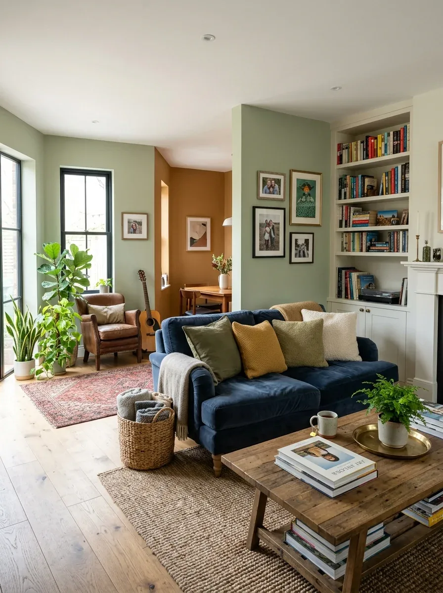
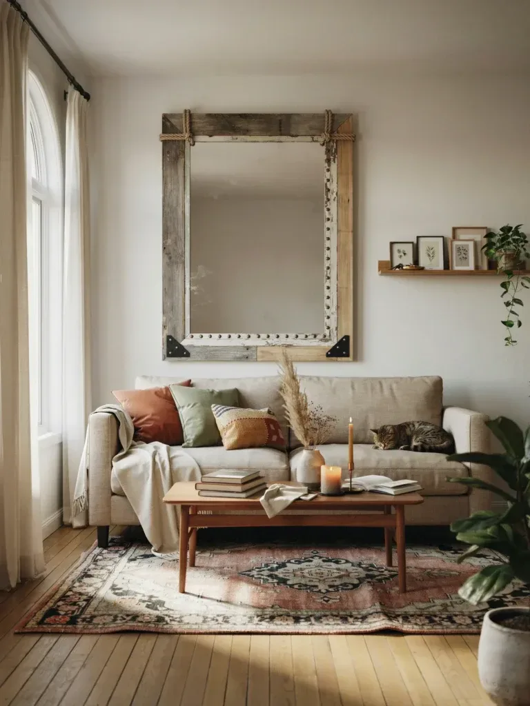
Sage has had a moment for a few years now, and unlike most trend colors, I don’t think it’s going anywhere. A true sage sits right between green and gray — it reads calm rather than “look at my bold accent wall.” It pairs beautifully with natural wood tones, rattan, and linen, which makes it a natural fit if you’re already leaning into an organic modern living room look.
Olive is sage’s moodier cousin. It’s deeper, earthier, and honestly a little more forgiving in rooms that get a lot of natural light, since bright sun can wash out a paler sage. I used an olive-toned green on a single accent wall behind my sofa, and it made my thrifted brass lamps look intentional instead of mismatched — which, okay, might be doing a lot of heavy lifting for one paint color, but I stand by it.
4. Burnt Orange
This is the one people are most nervous about, and I get it — burnt orange sounds like a big commitment. But used right, a burnt orange color palette in a living room reads warm and grounded rather than loud, especially in a smaller dose: think a single accent wall, the back of a built-in shelf, or even just a set of throw pillows and a rug if you’re not ready to paint. It plays incredibly well with charcoal, cream, and deep green, and it’s a genuinely great fit for anyone drawn to colorful eclectic living room ideas that mix bold color without tipping into chaos.
5. Soft Terracotta
A lighter, dustier cousin of burnt orange. Terracotta has more pink in it, which sounds like it shouldn’t work in a living room but somehow does, especially against black metal furniture or dark wood floors. It’s a great option if burnt orange feels like too much of a leap but you still want warmth on the walls instead of another beige.
6. Deep Charcoal (Accent Wall Only, Please)
I’ll say this with a light opinion attached: I am not a fan of full-room charcoal unless you’ve got serious natural light and high ceilings. It can swallow a small room whole. But on one wall — usually the one behind your media console or sofa — it adds real depth and makes everything in front of it pop, especially gallery walls, mirrors, or brass accents.
7. Creamy Off-White
Not stark white. Not “builder white.” A genuinely creamy off-white with a touch of yellow or beige undertone, the kind that looks like butter in warm light and stays soft rather than cold under overhead lighting. This is the color I’d recommend if your living room doubles as a rental or a space you’ll want to sell in a few years — it photographs well and reads expensive without costing much (most creamy whites run $35–$55 a gallon).
Dusty blue is what I’d call a quiet showstopper. It’s calming without being cold, and it has enough gray mixed in that it won’t read nursery-blue or nautical. It works especially well in living rooms with a lot of natural light, since blue tends to look flat and gray in dim rooms.
9. Warm Taupe
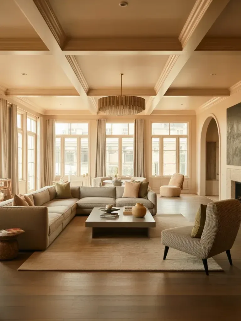
Taupe gets a bad reputation as the boring builder-grade default, but a good warm taupe — one with actual brown or amber undertone rather than gray — is a completely different animal. It’s the color I’d suggest for someone furnishing a large living room that needs to feel cozy despite its size, since darker neutrals tend to pull big rooms in and make them feel more intimate.
10. Butter Yellow
This one’s polarizing, and I’ll admit it’s not for everyone. But a soft, muted butter yellow — nothing neon, nothing that reads like a highlighter — brings genuine warmth into a room with limited natural light. I’ve seen it used beautifully in small apartment living rooms where a north-facing window meant everything else looked gray and flat by 3pm.
11. Moody Forest Green
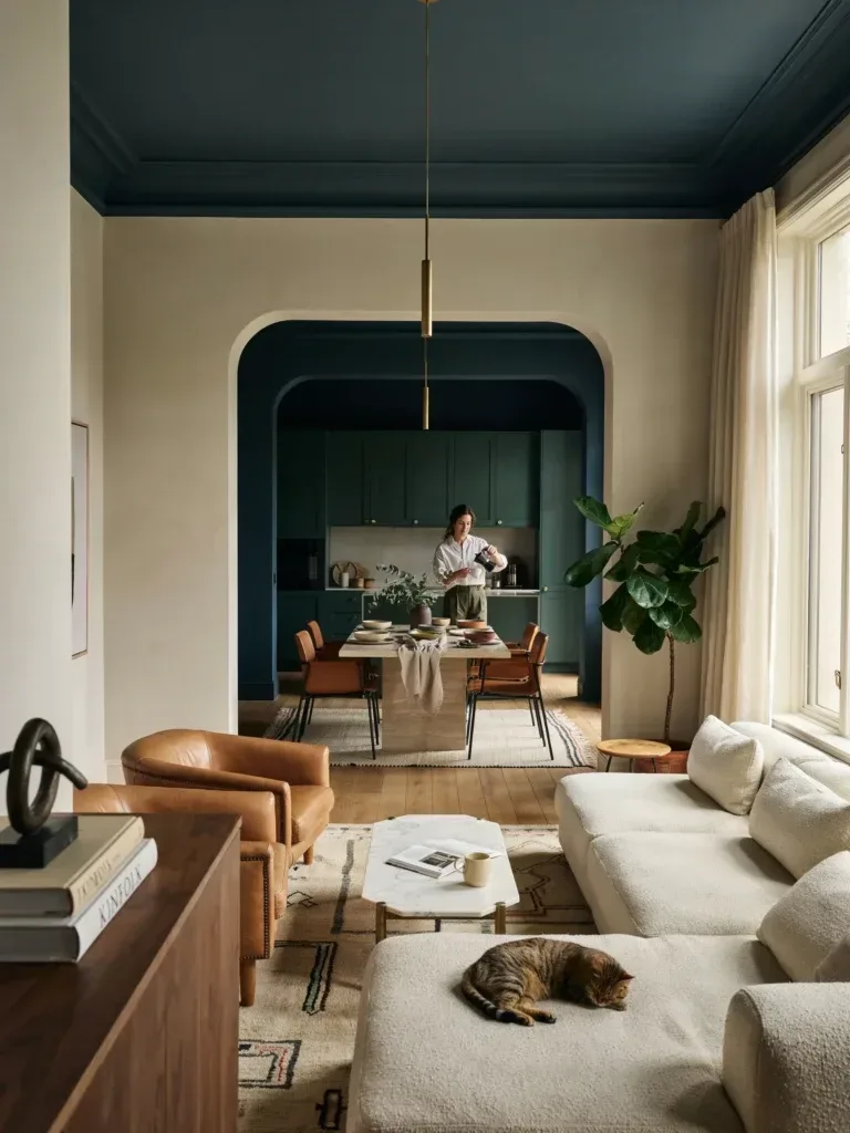
The boldest pick on this list, and also one of my favorites if you’ve got the confidence for it. Forest green works best in rooms with strong architectural bones — crown molding, built-ins, a fireplace — because the color needs something to play against or it can feel heavy. Pair it with warm brass and cream textiles and it stops feeling like a dare and starts feeling like a design choice.
Muted Green Paint Ideas That Feel Calm, Not Boring
A lot of people avoid green because they’re picturing something bright and grassy, but muted green paint ideas are a completely different category. The key is undertone. A muted green has gray, brown, or even a touch of black mixed into the base, which mutes the saturation without making it look washed out. Sherwin-Williams’ Evergreen Fog and Clare’s Fern Gully are the kind of shades I mean — soft enough to feel neutral, saturated enough to actually register as green rather than gray.
If you’re nervous about committing to a full wall, start with a piece of furniture instead. A muted green sofa or a set of green dining chairs, if your space is open-concept, lets you live with the color before you paint anything permanent.
The Best Boho Green Paint Colors for a Relaxed, Earthy Vibe
Boho spaces lean on texture and imperfection — think jute rugs, macrame, mismatched vintage pieces — so the best boho green paint colors tend to have a slightly dirty, sun-faded quality rather than a crisp, clean saturation. I’m talking about greens that look like they’ve been sitting in a sunny window for a decade: olive, sage, and a deeper avocado-adjacent green all fit the bill. These tones read as collected and lived-in rather than freshly painted, which is exactly the point in a boho space. If this is the direction you’re leaning, it’s worth browsing a modern boho living room roundup for how these greens actually look next to rattan and layered textiles, since color swatches never quite tell the whole story.
Best Muted Green Paint Colors vs. Bold Greens: Which Wins?
Here’s my honest, slightly biased take: for a living room specifically, muted wins almost every time. Bold, saturated greens — the kelly greens, the emeralds — can be gorgeous, but they demand a lot from the rest of the room. Every other color decision has to work around them. The best muted green paint colors, on the other hand, function more like a neutral. They flex with whatever furniture, art, or seasonal decor you bring in.
That said, if you’ve got a smaller accent space — a powder room, a reading nook, the inside of a built-in cabinet — that’s exactly where a bold green can shine without overwhelming the whole house. Save the drama for a space you’re not staring at from every angle.
Green Wall Colors That Pair Beautifully with Wood and Boho Decor
Green wall colors and warm wood tones are one of those pairings that just works, almost regardless of the specific shades involved. There’s a reason it shows up so often in nature — green and brown are basically the original color palette. For a boho or organic modern living room, pair a muted sage or olive wall with unfinished or lightly stained wood furniture (avoid anything with a heavy orange undertone, which can clash) and layer in cream, oatmeal, and rust textiles to round it out.
One small tip: if your wood tones lean cool or gray-washed, choose a green with a slightly bluer undertone to match. If your wood is warm and honey-toned, go for a green with more yellow or brown mixed in. Mismatched undertones are subtle, but your eye picks up on them even if you can’t articulate why a room feels slightly off.
Burnt Orange Color Palette Ideas for a Cozy Living Room
I mentioned burnt orange earlier as a standalone wall color, but it’s worth talking about as a full palette too, because that’s really where it shines. A burnt orange color palette in a living room typically pairs the orange with deep charcoal or espresso brown, a warm cream, and small doses of forest green or mustard. Think of it as an autumn palette that works year-round rather than a seasonal decorating theme.
If painting a whole wall feels risky, start smaller: a burnt orange throw blanket, a set of ceramic vases, or a rug with rust tones woven through it. You’ll get a feel for how the color behaves in your specific light before committing to a gallon of paint — and if it turns out you love it, you can always go bigger later.
How to Test Paint Colors Before You Commit (Save Yourself the Regret)
I learned this one the hard way, so let me save you the trouble. Buy the small sample pots, not just the paper chips — paper chips lie constantly. Paint a section at least two feet by two feet, on more than one wall if your room has different light exposures, and live with it for a minimum of three days. Look at it in the morning, at midday, and after dark with your lamps on.
And don’t paint directly next to your trim without a buffer — undertones you can’t see on a swatch will suddenly appear the second two colors sit side by side. If you’re pulling inspiration from a room with statement curtains or heavy textiles, like some of these living room curtain ideas, test your paint sample against a scrap of that fabric too, not just the bare wall.
My Final Thoughts on the Best Living Room Paint Color for You
If I’m being honest, there isn’t one single best living room paint color — there’s the best one for your light, your furniture, and how bold you’re feeling this year. But if you want my personal ranking: warm greige for safety, muted sage for warmth without commitment, and burnt orange if you’re ready to have a little fun with it. I’ve lived with all three in different apartments, and none of them have ever felt like a mistake, which is more than I can say for that lavender-gray disaster from a few years back.
Save this for whenever you’re finally ready to pick up the paint brush — and if you try one of these, I’d genuinely love to know which one you landed on.
Listen to this article 10 10 0:00 / 0:00 Speed 0.75×1×1.25×1.5×2× Got a huge living room that somehow still feels… awkward? Yeah, big spaces can be just as tricky as tiny ones. Too empty and it feels cold, too full and suddenly it’s chaos. The sweet spot is all about balancing scale with comfort—and once…
Listen to this article 10 10 0:00 / 0:00 Speed 0.75×1×1.25×1.5×2× Harsh overhead lighting? Absolutely not. A good cove lighting ceiling changes the whole mood of a room without screaming for attention. It wraps the space in a soft glow, makes ceilings feel taller, and somehow makes even your random Tuesday night leftovers look fancy….
Listen to this article 10 10 0:00 / 0:00 Speed 0.75×1×1.25×1.5×2× Bookshelves don’t have to be boring boxes glued to a wall. They can steal the spotlight, spark conversations, and honestly… make your guests a little jealous. Think sculptural shapes, unexpected materials, and layouts that feel more like gallery pieces than storage. Ready to upgrade…
Listen to this article 10 10 0:00 / 0:00 Speed 0.75×1×1.25×1.5×2× A plain mirror does the job, sure. But a mirror with a custom frame? That’s the kind of detail that makes a room feel finished without draining your wallet. The good news is that you don’t need fancy woodworking skills or a massive budget…
Listen to this article 10 10 0:00 / 0:00 Speed 0.75×1×1.25×1.5×2× A dark ceiling might sound like a decorating risk, but trust me, it can completely transform a room. While everyone obsesses over accent walls, the ceiling often sits there looking forgotten and boring. Pair a dramatic dark ceiling with light walls, though, and suddenly…
Listen to this article 10 10 0:00 / 0:00 Speed 0.75×1×1.25×1.5×2× Mirrors aren’t just for last-minute outfit checks—they’re secret weapons for transforming your living room. The right mirror wall can bounce light, expand space, and add that effortless “wow” factor. Whether you’re into sleek minimalism or bold drama, there’s a mirror moment waiting for you….