9 Neutral Bathroom Ideas for Timeless Serenity
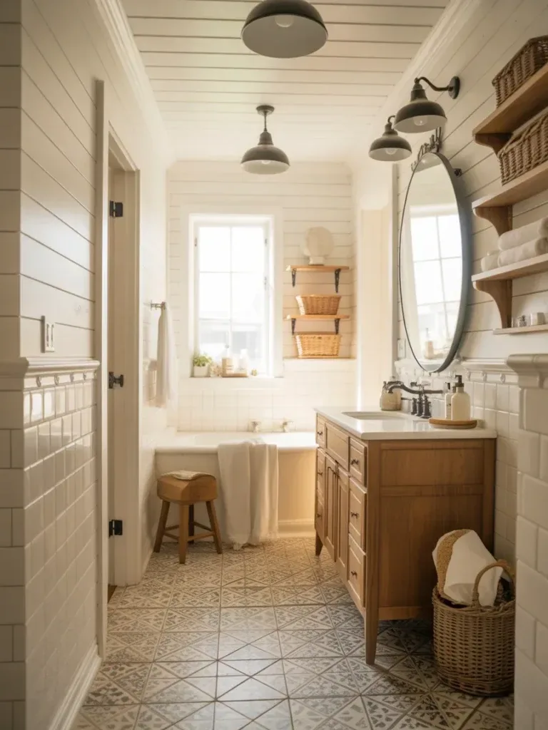
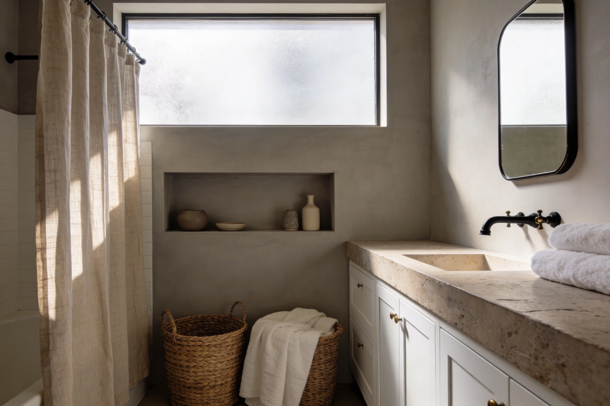
Neutral bathroom ideas have a reputation problem — done wrong, “neutral” just means beige and forgettable. Done right, it means a room that still looks good in five years when trends have moved on twice. The trick is that neutral doesn’t mean flat: it means the color palette stays quiet so texture, tile, and lighting can do the actual work. If you’re weighing a bigger project alongside these ideas, our full neutral bathroom idea collection has a wider range to pull from.
This is one of the more forgiving directions to take a bathroom in, whether you’re working with a full gut renovation or just refreshing what’s already there. It also happens to be one of the better small bathroom remodel ideas, since a tight neutral palette makes a small room read larger — busy color and pattern do the opposite. The nine approaches below cover texture, tile, storage, lighting, and the small personal touches that keep neutral from tipping into sterile.
Quick Takeaways
- Texture, not color, is what keeps a neutral palette from reading as boring — mix at least two to three tactile surfaces (stone, linen, wood, ceramic) rather than relying on paint alone.
- One warm metal accent (brass, matte black) against a neutral base gives the eye a focal point without breaking the calm.
- Grout color matters more than people expect — light grout with light tile keeps a room feeling calm; dark grout on light tile adds visual noise even if the tile itself is neutral.
- Layered lighting (ambient, task, accent) does more for a neutral bathroom’s mood than almost any single fixture swap.
- Built-in and vertical storage is what keeps a neutral bathroom looking uncluttered day to day — the palette does the calming, but storage is what actually prevents visual chaos.
1. Layer Texture Instead of Leaning on Color
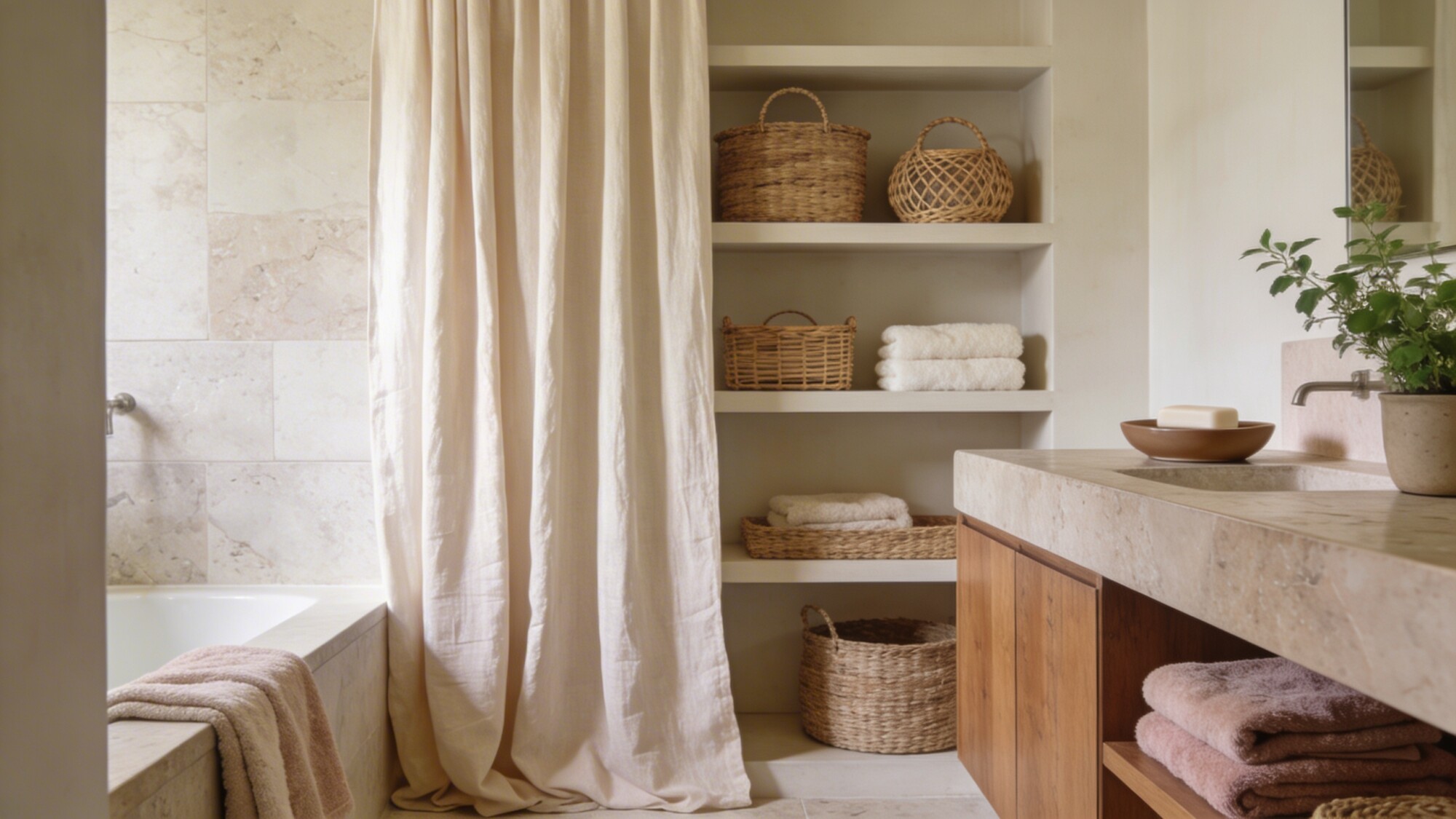
This is the single most important idea on this list, because it’s the difference between a neutral bathroom that looks intentional and one that just looks unfinished. A matte stone countertop next to a linen shower curtain already gives you two distinct textures before you’ve added a single decorative object.
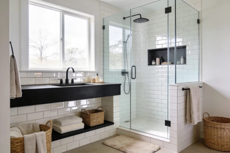
Woven baskets and rattan accessories bring in a third material — fiber — which is what most neutral bathrooms are missing. Stone, ceramic, and linen alone can still feel a little cold; adding one warm, organic texture like rattan or wood softens that. Keep it to two or three materials total, though — once you’re past four distinct textures in one small room, it starts reading busy again, even in a monochrome palette.
- Woven baskets or rattan accessories for open storage and warmth
- Matte ceramic soap dishes and trays instead of glossy plastic
- Fluffy cotton towels in soft, muted tones — cream, taupe, pale blush
💡 Pro Tip: If your bathroom gets limited natural light, favor matte finishes over glossy ones for the big surfaces (countertop, floor). Glossy tile bounces artificial light in a way that can look almost clinical in a room without much daylight — matte softens it.
2. Go Monochrome, But Add One Twist
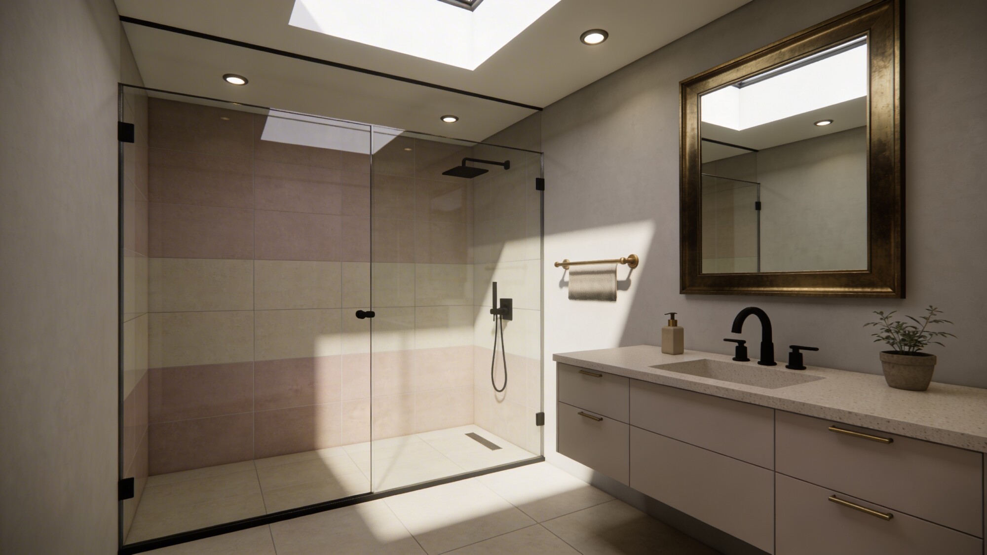
Monochrome doesn’t mean one flat shade everywhere — it means one color family (warm gray, greige, taupe) used across tiles, walls, and cabinetry at different intensities. Light walls, mid-tone tile, and a slightly darker vanity all within the same undertone create depth without introducing a second color.
The “twist” is what keeps this from feeling flat: one contrasting element, usually in brass or matte black, breaking the monochrome harmony. A bold mirror frame in brushed brass against an otherwise all-taupe room does more visual work than five smaller accent pieces scattered around — it gives the eye exactly one place to land.
- A single base neutral (greige, taupe, or warm gray) carried across tile, walls, and cabinetry
- Lighter and darker tints of that same neutral for depth
- One standout piece — usually a mirror or light fixture — in brass or black to break the harmony
3. Build In Storage That Disappears
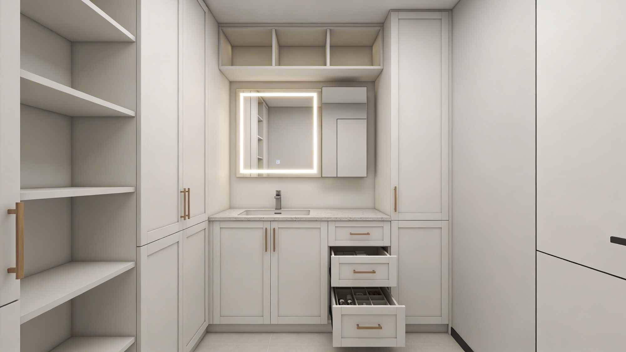
Clever storage solutions matter more in a neutral bathroom than a colorful one, because visible clutter reads louder against a calm palette than it does against a busier one. Floor-to-ceiling built-ins that blend into the wall color, rather than standing out as separate furniture, keep the room feeling uncluttered even when they’re holding a lot.
A medicine cabinet with integrated LED lighting solves two problems in one install — hidden storage plus better task light at the mirror, which most builder-grade bathrooms lack entirely. Pull-out organizers inside vanity drawers are a smaller, cheaper fix that still makes a real difference for anyone who’s tired of a jumbled under-sink cabinet.
- Floor-to-ceiling built-in cabinetry that blends into the wall
- Pull-out organizers inside vanity drawers
- A medicine cabinet with integrated soft LED lighting
💡 Pro Tip: Choose moisture-resistant finishes (sealed wood, laminate rated for bathrooms, or powder-coated metal) for any built-in near the shower — standard cabinetry finishes swell and peel faster than people expect in a room with regular humidity spikes.
4. Let Tile Carry the Visual Interest
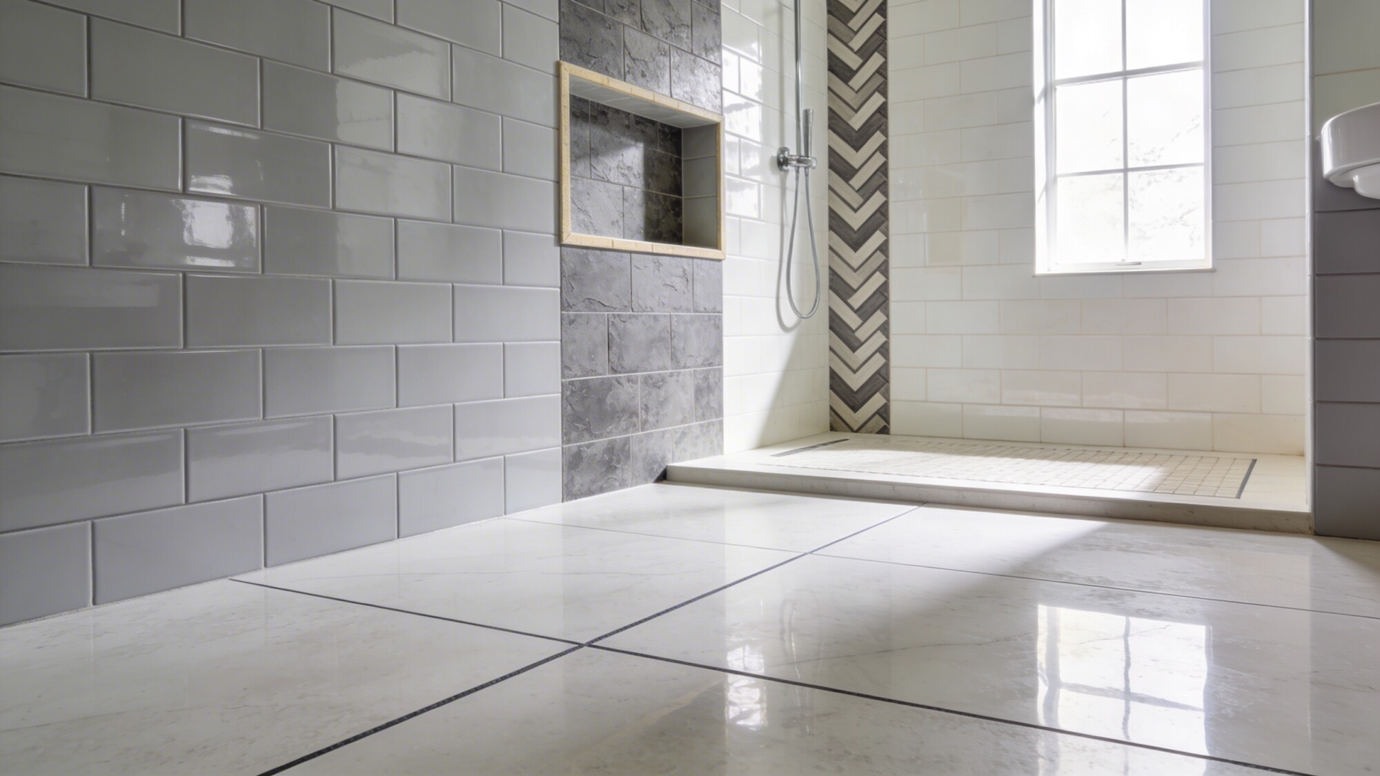
Tile is where you can add pattern and texture without ever touching color — this is what separates a genuinely interesting neutral bathroom from a flat one. Large-format subway tile in soft gray gives you a clean backdrop, while a textured encaustic pattern on a single accent wall or shower niche adds visual movement in grayscale only.
Grout is the detail people skip, and it matters more than the tile choice itself in a lot of cases. Dark grout on light tile creates a grid pattern that reads busy no matter how neutral the tile color is; light grout keeps the surface reading as one calm plane. If you’re set on a bold layout like herringbone or chevron, that pattern alone is usually enough drama — pair it with light grout, not dark, to keep the room feeling calm rather than graphic.
- Large-format subway tile for a clean, low-grout-line backdrop
- A textured grayscale encaustic pattern on one accent wall or niche
- Light grout throughout to avoid an unintended grid effect
5. Add Warmth With Natural Materials
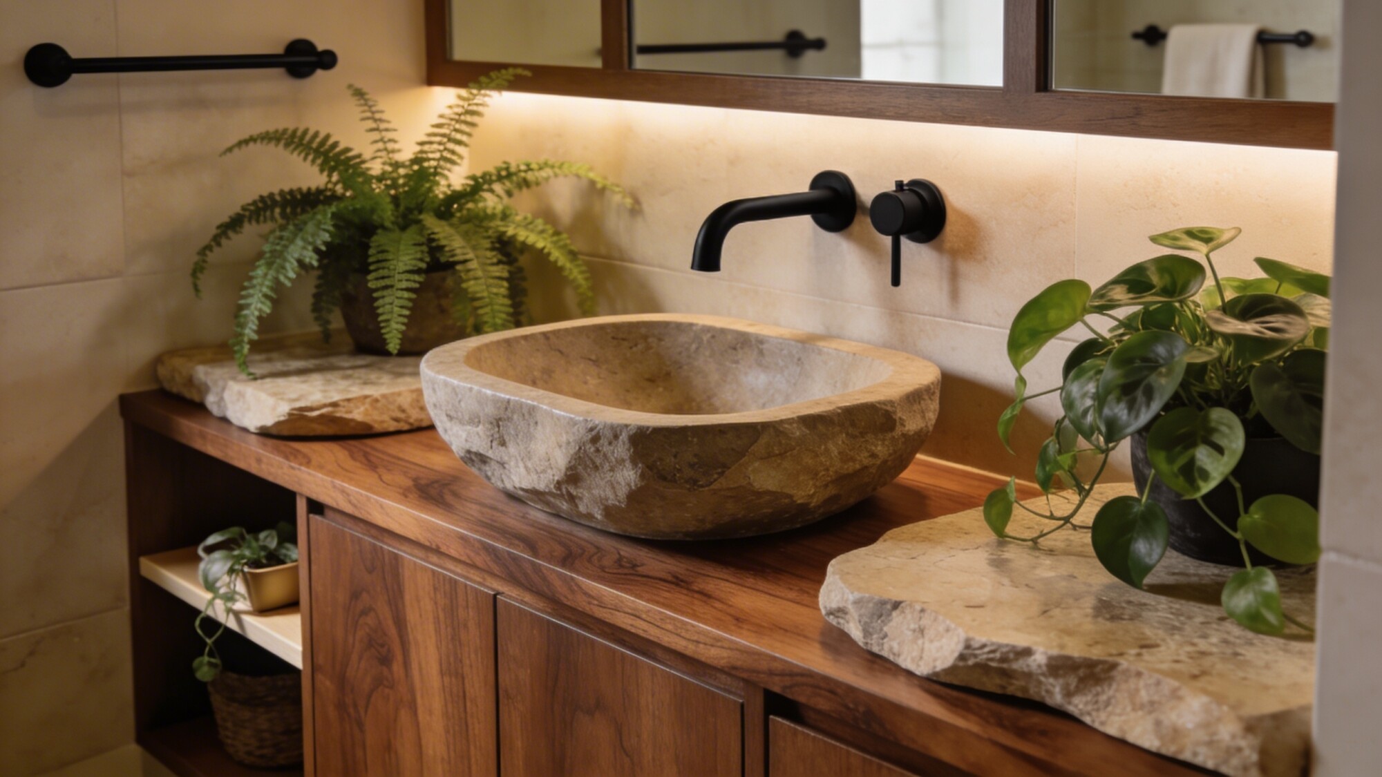
This is the fix for the most common complaint about neutral bathrooms — that they feel cold or sterile. A walnut or oak vanity brings real grain and warmth that no amount of beige paint can substitute for, and it pairs naturally with stone countertops or a stone vessel sink without introducing any actual color.
Live plants are worth the small maintenance commitment here specifically, because a bathroom with a window or good ventilation is one of the few rooms in the house where humidity-loving plants like ferns and pothos genuinely thrive rather than just survive. Matte black or brass fixtures against wood tones give you contrast without needing a second color in the palette.
- A walnut or oak vanity for visible wood grain and warmth
- A stone sink or natural stone countertop
- Live plants suited to bathroom humidity — ferns, pothos, or similar
6. Treat Lighting as the Hero Accessory
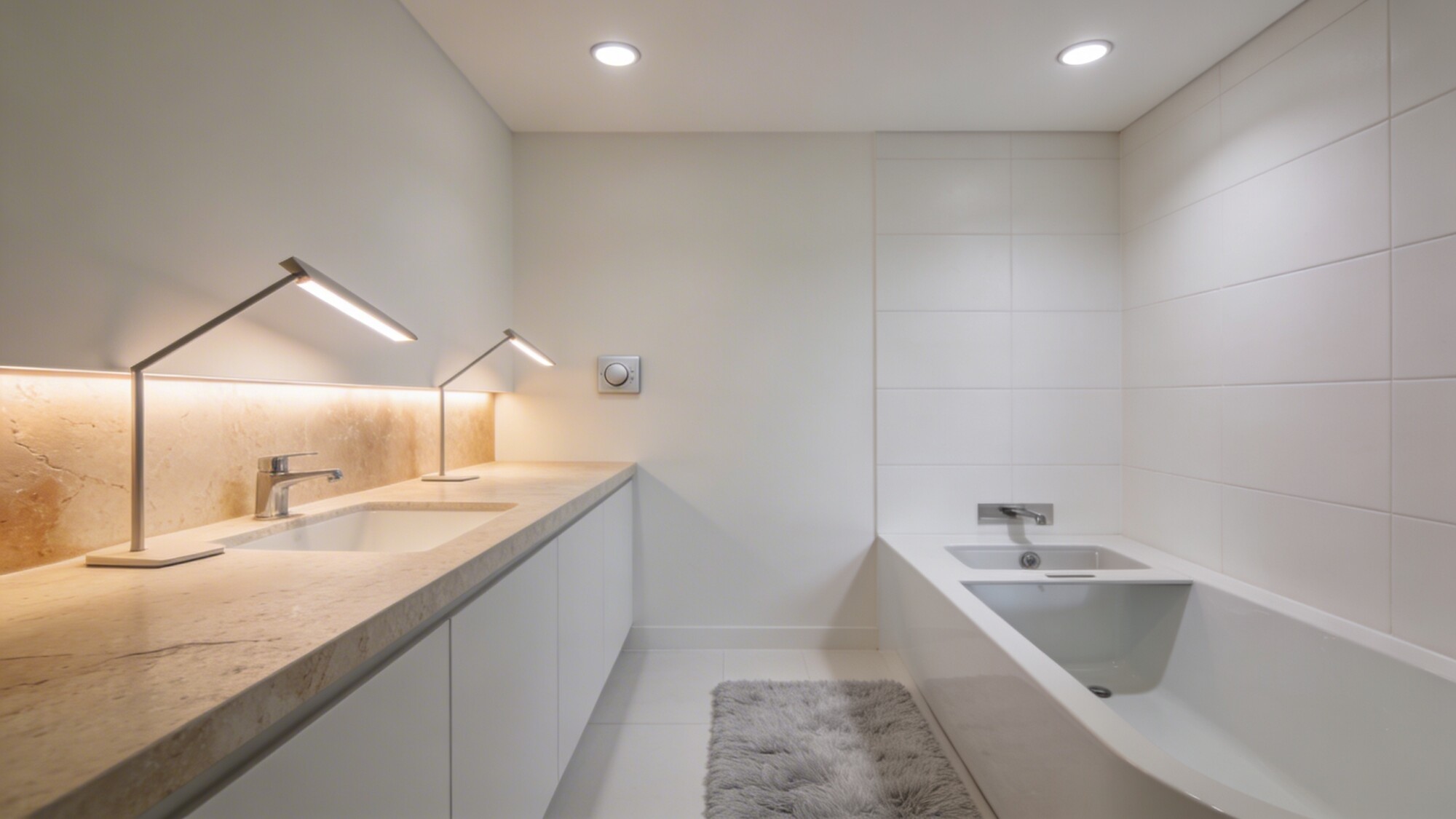
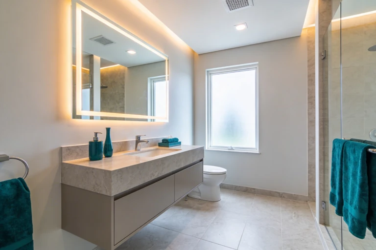
In a room without much color to lean on, lighting becomes one of the biggest levers you have for mood. Layering ambient, task, and accent lighting rather than relying on a single overhead fixture is what gives a neutral bathroom its spa-like feel — flat, single-source lighting is what makes the same room look clinical instead.
Bulb temperature matters as much as fixture placement. Soft white in the 2700–3000K range reads warm and calming against beige and taupe tones; anything cooler or bluer clashes with a warm neutral palette and can make the same materials look washed out. A dimmer is a small addition that lets one lighting setup serve both a bright morning routine and a slower evening one.
- Layered lighting — ambient, task, and accent — instead of one overhead source
- Soft white bulbs (2700–3000K) to match a warm neutral palette
- A dimmer switch to shift mood between morning and evening
💡 Pro Tip: Test bulb temperature in the actual fixture before committing — the same “soft white” label can render differently depending on the fixture’s diffuser, and a bulb that looked right in the store can skew slightly cool or yellow once it’s installed against your specific tile.
7. Choose Fixtures That Reduce Visual Noise
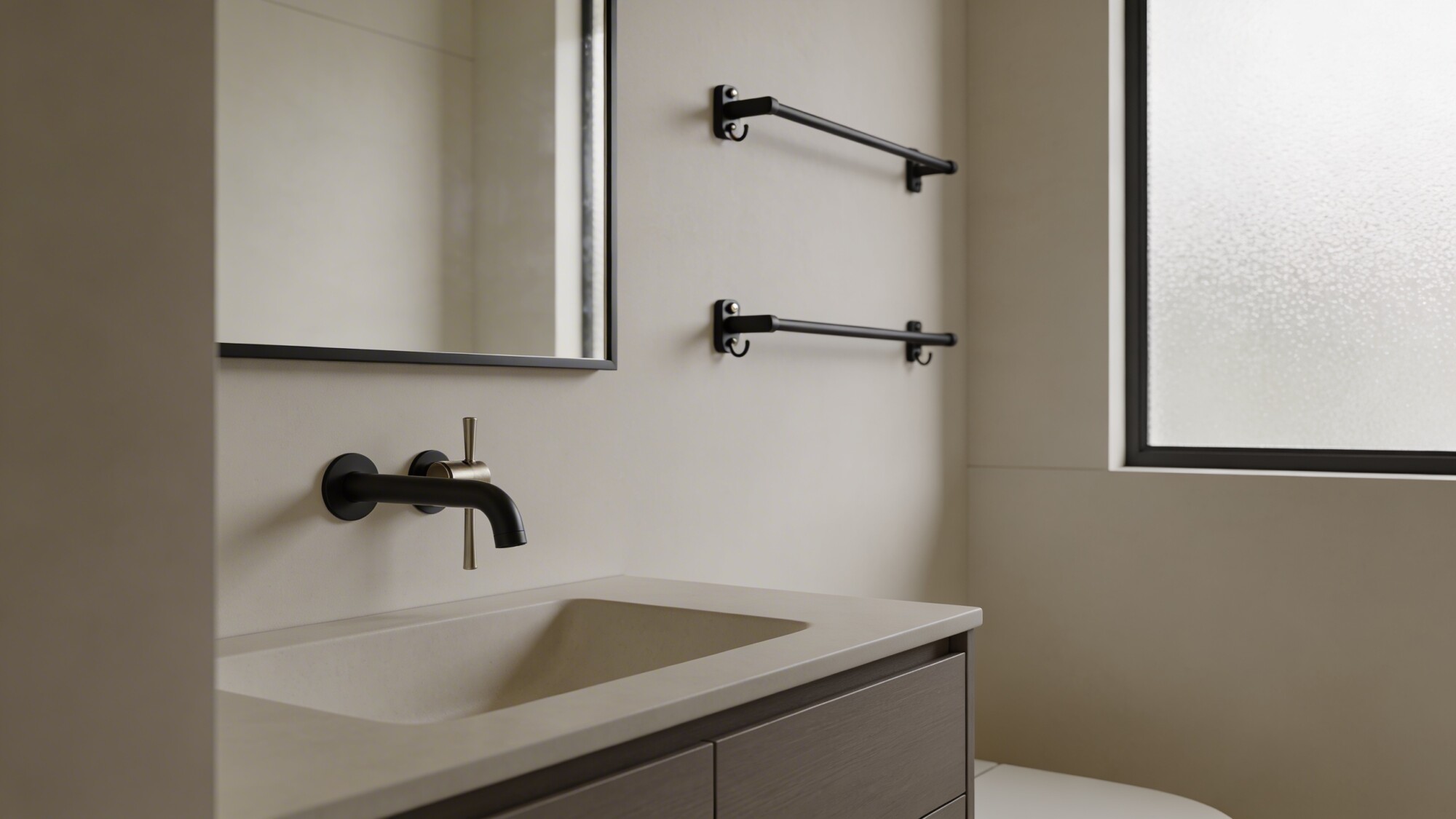
Mismatched hardware is one of the fastest ways to undercut an otherwise calm palette — a brushed nickel faucet next to matte black towel bars next to chrome drawer pulls reads as unplanned, even in a room with perfect wall color. Picking one finish and carrying it across every fixture is a small decision that has an outsized effect on how put-together the room feels.
Wall-mounted towel bars and under-mount sinks contribute to this too, just structurally rather than through finish — anything that reduces visible hardware or protruding shapes keeps the sightlines clean, which matters more in a small full bathroom than a larger one where a slightly busier fixture mix has room to breathe.
- One consistent finish (brushed nickel or matte black) across every fixture
- Wall-mounted towel bars to save visual and physical space
- Under-mount sinks for a clean, uninterrupted counter line
8. Use Textiles as the Fastest, Cheapest Update
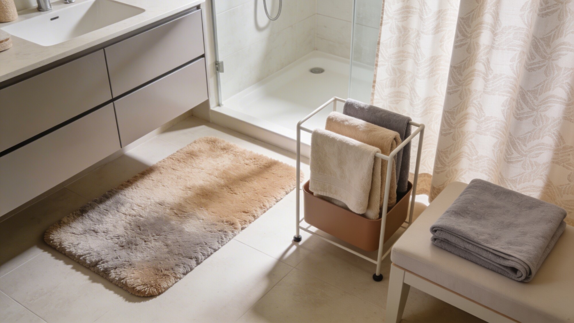
If you’re doing budget-friendly decor rather than a full renovation, textiles are where to start — they’re the lowest-cost, lowest-risk change on this whole list, and they’re fully reversible if you change your mind. A high-pile bath mat in warm beige or greige adds tactile comfort that a flat bath mat simply doesn’t.
Organic cotton or linen towels in a small color lift — not a different color exactly, just a slightly different shade within the same neutral family — keep things from looking too matched and flat. A folded towel stack on an open shelf or bench does more for the room’s finished feel than the towels themselves being expensive.
- High-pile bath mat in warm beige or greige for tactile warmth
- Organic cotton or linen towels in a slightly varied neutral shade
- A textured shower curtain in a subtle pattern rather than flat solid color
9. Add Personality Through Small, Subtle Accessories
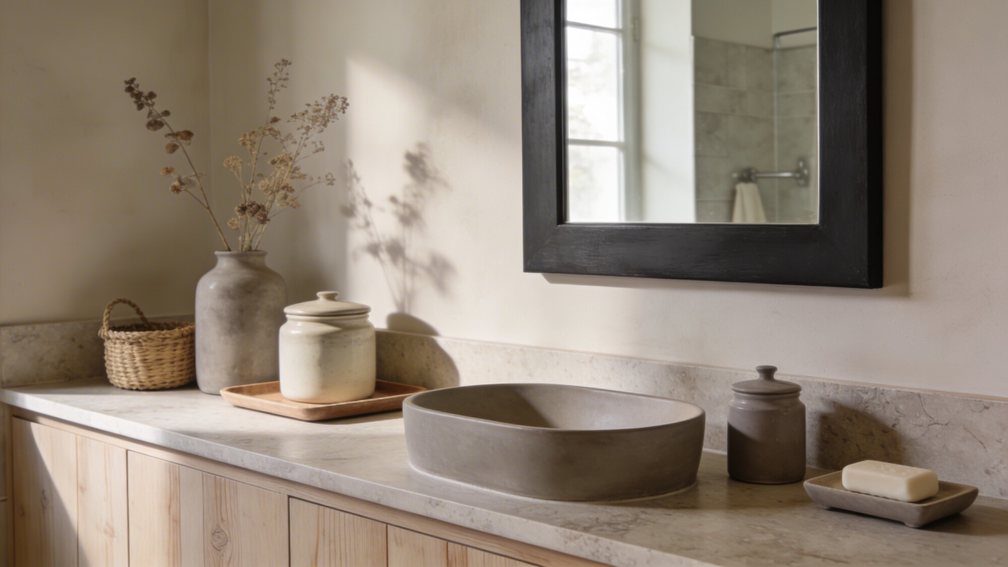
This is the last 10% that keeps a neutral bathroom from feeling like a hotel room instead of your bathroom. Ceramic jars and trays corral small items on the vanity so nothing looks like clutter, while a single bold mirror frame gives the whole room one clear anchor point — the same role the brass accent plays in the monochrome idea above.
Keep the accessory count genuinely small. Dried botanicals, one woven basket, a minimalist soap dish — three or four pieces is usually the ceiling before a neutral room starts to feel decorated rather than personal. More than that, and you’re back to the clutter problem the whole neutral approach was meant to solve.
- Ceramic jars and trays to organize vanity items out of sight of clutter
- One bold mirror frame as the room’s anchor point
- A small woven basket and minimalist soap dish for texture without excess
Neutral Palette Options at a Glance
| Palette | Best Paired With | Feel | Watch Out For |
|---|---|---|---|
| Warm gray / greige | Wood accents, brass hardware | Cozy, approachable | Can skew cold without a wood or brass element |
| Taupe / beige | Linen textiles, rattan storage | Soft, spa-like | Needs texture layering or it reads flat |
| Cool white / light gray | Matte black fixtures, glass shower | Crisp, modern | Can feel clinical without warm lighting (2700–3000K) |
| Creamy white / ivory | Natural stone, dried botanicals | Bright, airy | Shows dirt and water spots faster than darker neutrals |
Things to Consider Before You Start Planning
- Room size: lighter neutrals (cream, ivory, pale gray) generally suit a small full bathroom better since they reflect more light; deeper neutrals (greige, taupe) can work well in a larger master bath with more natural light to offset them.
- Undertone consistency: mixing a warm neutral (beige) with a cool one (blue-gray) in the same room is the most common way a “neutral” bathroom ends up looking mismatched — pick one undertone direction and stay in it.
- Maintenance: lighter grout and pale tile show grime faster than mid-tone neutrals — factor in cleaning frequency, not just the look, especially for a busy household bathroom.
- Fixture finish availability: confirm your chosen finish (brass, matte black, brushed nickel) is available across faucet, towel bar, and cabinet hardware before committing — running out mid-project and switching finishes is a common, avoidable mismatch.
Frequently Asked Questions
How do I keep a neutral bathroom from looking boring?
Layer texture instead of adding color — stone, linen, wood, and ceramic together do more than any paint choice. Add one contrasting metal accent (brass or matte black) as a focal point, and keep accessories to a small, curated handful rather than scattering decor everywhere.
What’s the difference between “neutral” and “beige”?
Neutral covers a wider range — warm gray, greige, taupe, cream, and true white all count. Beige is one specific shade within that range. Treating “neutral” as a single color is usually what makes a bathroom feel flat rather than calm.
Is a neutral bathroom a good idea if I plan to sell my home?
Generally yes — neutral palettes tend to appeal to more buyers than bold color choices, since a buyer can picture their own decor style layered on top of it more easily. It’s a reasonable direction for a small bathroom remodel done with resale in mind.
Do neutral bathrooms need more lighting than colorful ones?
Not more, but the quality matters more. A neutral palette relies on light and shadow to create depth since it isn’t getting that from color contrast, so layered lighting (ambient, task, accent) has a bigger visible impact here than in a room with bolder colors already doing some of that work.
What’s the easiest neutral bathroom idea to start with?
Textiles — new towels, a bath mat, and a textured shower curtain are low-cost, fully reversible, and can be done in an afternoon. It’s the natural first step before committing to anything involving tile or fixtures.
Our Take
If you’re planning a neutral bathroom from scratch, start with the palette and undertone before picking a single tile or fixture — that decision anchors everything else and is the hardest one to walk back once materials are ordered. If you’re refreshing an existing space, textiles and lighting give you the fastest, lowest-risk path to feeling the difference before you commit to anything structural.
For guidance on the planning side of a bigger project, our master bathroom design ideas guide covers spa-style layouts that pair well with a neutral palette, and if storage is your main pain point, the bathroom shelf styling ideas roundup has more ways to keep a neutral space looking as calm in daily use as it does on day one.