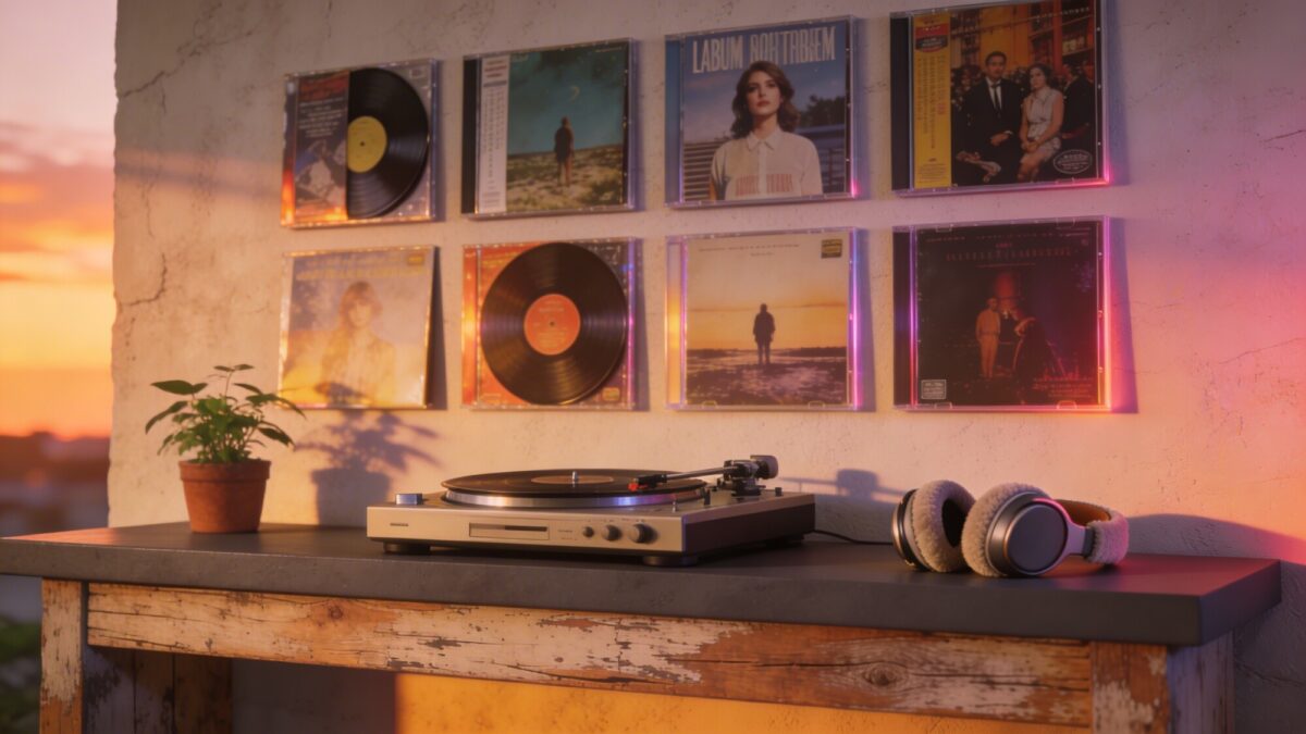
Album cover wall decor is one of the easiest ways to bring personality into a room without a full renovation. Whether you’re working with vinyl sleeves, CD covers, or poster reproductions, the right layout can turn a blank wall into a genuine focal point. Below are eight approaches to album cover art display, ranging from curated gallery walls to DIY collages, along with practical poster wall layout ideas for making each one work in a real room. Quick Takeaways Start small: 3–5 covers with a cohesive palette often reads better than a crowded wall. Frame style matters: mismatched frames feel curated; matching frames feel clean and modern. Lighting elevates everything: even a simple picture-light changes how the wall reads at night. Spacing prevents clutter: leave generous negative space so the covers don’t compete with each other. Theme it or don’t: color-coded, era-based, or mood-based groupings all work as poster organization ideas. 1. Frame the Iconic — A Gallery-Style Showstopper You don’t need to cover an entire wall to make an impact. A tightly curated set of iconic album covers can become the room’s centerpiece, and the secret is selectivity paired with deliberate spacing. Photo by Serena Tyrrell on Unsplash Key Points Choose 3–5 covers with a cohesive color palette. Use mismatched frames for a curated vibe, or matching frames for a cleaner look. Balance negative space so the wall doesn’t feel crowded. Hang everything at eye level and measure twice before drilling. A little planning upfront saves a lot of unnecessary nail holes later. For more inspiration on scaling this approach up, see our guide to bold gallery-style album wall decor for living rooms. 2. Mix Modern and Retro for an Eclectic Wall There’s no rule that says your wall has to stick to one era. Pairing a glossy contemporary cover with a retro staple keeps the display visually interesting, much like a well-built playlist mixes old and new. Tips Mix frame finishes: glass, wood, and metal. Rotate seasonal favorites to keep the display dynamic. Introduce one bold color accent in a small frame nearby. This approach gives a room personality without overwhelming it, and it tends to age well as your taste evolves. Photo by Fujiphilm on Unsplash 3. Black and White Harmony — A Minimalist Power Move Monochrome covers create drama with very little effort. Keeping the palette tight means every detail — grain, texture, contrast — actually gets noticed instead of getting lost in color. Why It Works Creates a cohesive, sophisticated backdrop. Pairs easily with most furniture and textiles. Works well in small spaces as a single focal point. Anchor the display with one bold lamp or a black chair nearby. Simplicity here reads as intentional, not boring. 4. Oversized Statement Print — Go Big Sometimes bigger really is better. An oversized album cover print makes an immediate statement and tends to become a natural conversation starter. Photo by Amy Hirschi on Unsplash How to Do It Choose a cover with strong geometry or vivid color. Mount with a simple frame or a floating canvas edge. Keep the surrounding decor minimal so the piece has room to breathe. When in doubt, size up rather than clustering several smaller pieces. If you want more large-scale layout inspiration, our roundup of album cover wall decor ideas has additional examples. 5. DIY Collage Wall — A Personal Music Timeline A DIY collage wall turns your personal music history into something visual. Layering smaller covers with ticket stubs, band pins, and handwritten notes creates a display that feels intimate rather than generic — one of the more personal music album covers wall decor DIY projects on this list. What to Include 2–4 mini covers, typically 8×8 or 9×9 inches. Personal memorabilia like concert tickets or lyric cards. Light directional lighting to highlight paper and vinyl textures. Balance items across the wall so no single area feels heavier than the rest. It’s your story — tell it without shouting. Photo by Dmitry Mashkin on Unsplash 6. Color-Coded Grid — Moody Yet Playful Sorting covers into a neat grid by dominant color creates a rainbow effect without visual chaos. It’s one of the more structured poster wall layout ideas, and it reads as organized rather than random. How to Nail It Sort covers by dominant color group — reds, blues, greens, and so on. Keep frames uniform for a polished, consistent look. Leave generous gaps between frames to avoid a crowded feel. This layout invites the eye to travel across the whole wall, which makes it feel both stylish and calming. 7. Lit From Above — Lighting That Elevates Your Art Good lighting makes glossy covers pop and matte finishes feel more expensive. A small amount of illumination can turn a wall from background decoration into a genuine feature. Photo by In The Making Studio on Unsplash Lighting Ideas Install a slim picture-light above the gallery. Use adjustable track lighting to spotlight individual covers. Add a dimmable bulb to shift the mood from daytime to evening. A well-lit wall tends to reveal details — subtle textures, small typography — that get missed in daylight. 8. Thematic Wall — Soundtrack by Mood or Moment A thematic wall curates covers that tell a story tied to a mood, season, or memory — a road trip, a specific era, or a particular sound. This kind of album poster collection inspiration tends to feel more immersive than a random assortment. How to Build It Pick a theme: sunset tones, neon ’80s vibes, or mellow acoustic. Limit the display to 4–6 pieces to avoid visual overload. Add a small shelf or bench below for a cozy listening corner. Themes give the wall continuity, which is often what separates a curated space from a cluttered one. Layout Style Comparison StyleBest ForEffort LevelVibeCurated Gallery (3–5 covers)Living rooms, entrywaysLowIntentional, cleanColor-Coded GridLarger walls, hallwaysMediumPlayful, organizedDIY CollageBedrooms, personal spacesMedium-HighIntimate, storytellingOversized StatementLiving rooms, focal wallsLowBold, dramatic Things to Consider Before You Start How many covers do you actually want to display — a tight curated set or a larger collection? Will the wall need dedicated lighting, or does the room already have good ambient light? Do you want a uniform frame style, or a mismatched, collected-over-time look? Is this a permanent display or one you’ll want to rotate seasonally? Frequently Asked Questions Do I need real vinyl records, or can I use posters? Either works. These layout ideas apply equally well to vinyl sleeves, CD covers, or poster reproductions — the key is choosing albums that resonate with you and arranging them intentionally. How many album covers should I start with? For a first attempt, 3–5 covers is a manageable starting point. It’s easier to expand a curated wall later than to simplify an overcrowded one. What’s the easiest layout for a beginner? A small curated gallery with matching frames tends to be the most forgiving option, since consistent framing hides minor spacing imperfections. Should frames match or be mismatched? Both work. Matching frames create a cleaner, more modern look, while mismatched frames tend to feel more curated and collected over time. How do I keep a large wall from looking cluttered? Leave generous negative space between pieces, keep the color palette relatively tight, and avoid mixing too many layout styles on a single wall. Our Verdict Album cover wall decor works because it’s flexible — it scales from a single oversized print to a full color-coded grid, depending on how much wall space and commitment you’re working with. Start with one focal piece, whether that’s a bold statement print or a small curated cluster, and expand outward from there. If you’re ready to build out a bigger display, our guide to cozy album cover bedroom makeover ideas and our music poster wall decor roundup both offer additional layout inspiration to build from here.
Album cover wall decor is one of the easiest ways to bring personality into a room without a full renovation. Whether you’re working with vinyl sleeves, CD covers, or poster reproductions, the right layout can turn a blank wall into a genuine focal point.
Below are eight approaches to album cover art display, ranging from curated gallery walls to DIY collages, along with practical poster wall layout ideas for making each one work in a real room.
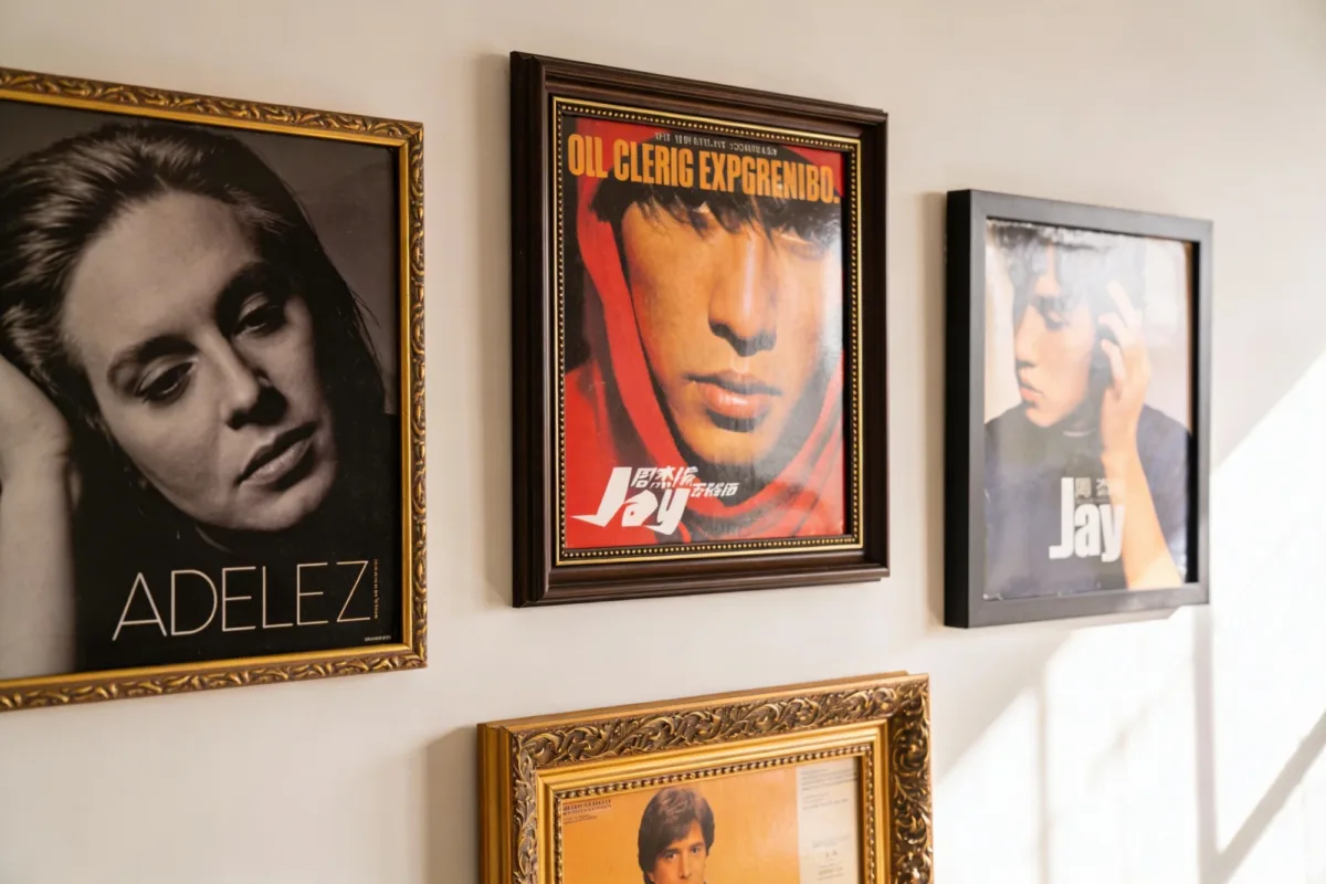
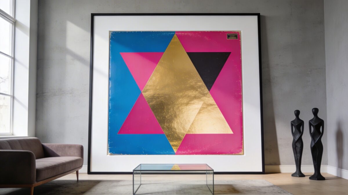
You don’t need to cover an entire wall to make an impact. A tightly curated set of iconic album covers can become the room’s centerpiece, and the secret is selectivity paired with deliberate spacing.
Use mismatched frames for a curated vibe, or matching frames for a cleaner look.
Balance negative space so the wall doesn’t feel crowded.
Hang everything at eye level and measure twice before drilling. A little planning upfront saves a lot of unnecessary nail holes later. For more inspiration on scaling this approach up, see our guide to bold gallery-style album wall decor for living rooms.
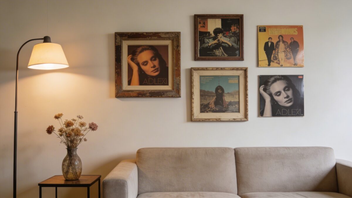
There’s no rule that says your wall has to stick to one era. Pairing a glossy contemporary cover with a retro staple keeps the display visually interesting, much like a well-built playlist mixes old and new.
Tips
Mix frame finishes: glass, wood, and metal.
Rotate seasonal favorites to keep the display dynamic.
Introduce one bold color accent in a small frame nearby.
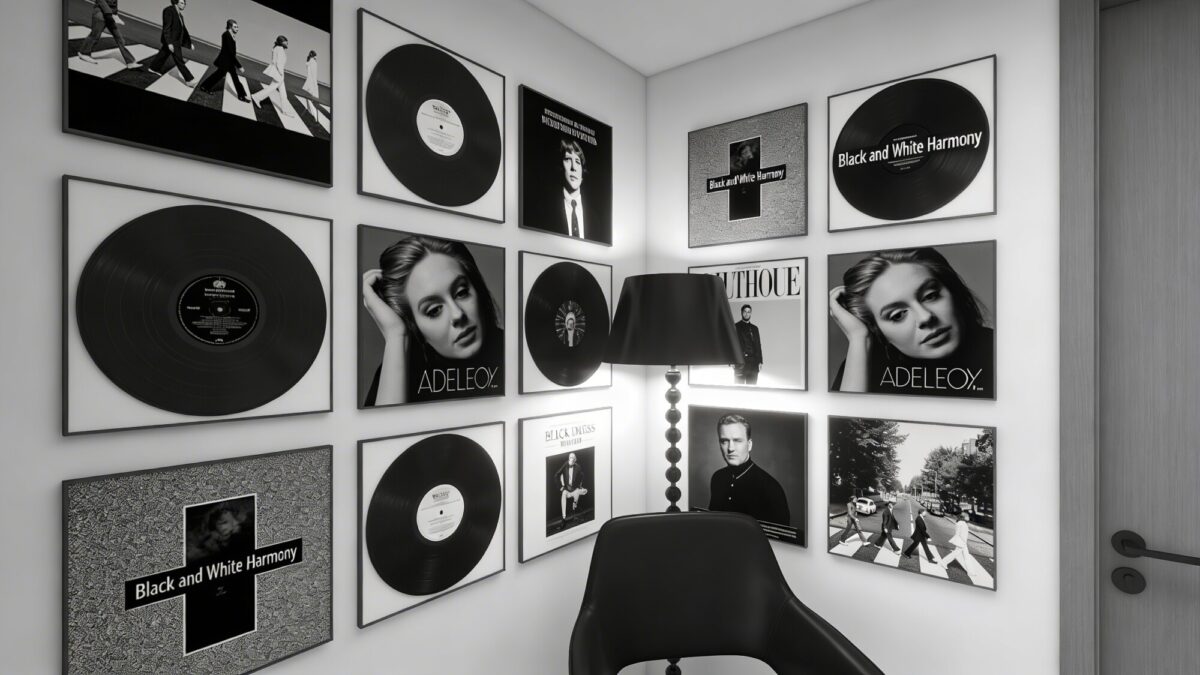
Monochrome covers create drama with very little effort. Keeping the palette tight means every detail — grain, texture, contrast — actually gets noticed instead of getting lost in color.
Why It Works
Creates a cohesive, sophisticated backdrop.
Pairs easily with most furniture and textiles.
Works well in small spaces as a single focal point.
Anchor the display with one bold lamp or a black chair nearby. Simplicity here reads as intentional, not boring.
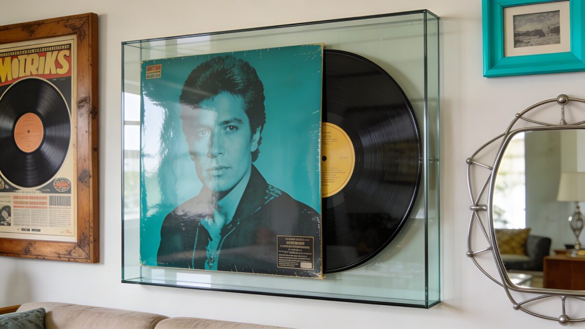
Choose a cover with strong geometry or vivid color.
Mount with a simple frame or a floating canvas edge.
Keep the surrounding decor minimal so the piece has room to breathe.
When in doubt, size up rather than clustering several smaller pieces. If you want more large-scale layout inspiration, our roundup of album cover wall decor ideas has additional examples.
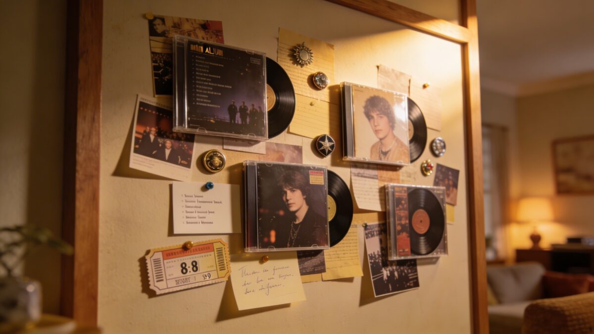
A DIY collage wall turns your personal music history into something visual. Layering smaller covers with ticket stubs, band pins, and handwritten notes creates a display that feels intimate rather than generic — one of the more personal music album covers wall decor DIY projects on this list.
What to Include
2–4 mini covers, typically 8×8 or 9×9 inches.
Personal memorabilia like concert tickets or lyric cards.
Light directional lighting to highlight paper and vinyl textures.
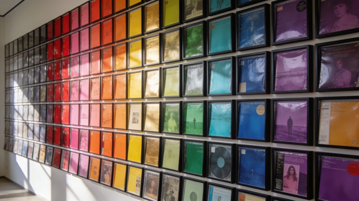
Sorting covers into a neat grid by dominant color creates a rainbow effect without visual chaos. It’s one of the more structured poster wall layout ideas, and it reads as organized rather than random.
How to Nail It
Sort covers by dominant color group — reds, blues, greens, and so on.
Keep frames uniform for a polished, consistent look.
Leave generous gaps between frames to avoid a crowded feel.
This layout invites the eye to travel across the whole wall, which makes it feel both stylish and calming.
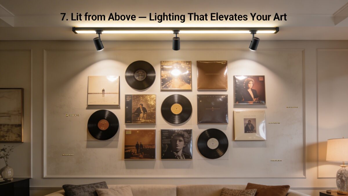
7. Lit From Above — Lighting That Elevates Your Art
Good lighting makes glossy covers pop and matte finishes feel more expensive. A small amount of illumination can turn a wall from background decoration into a genuine feature.
A thematic wall curates covers that tell a story tied to a mood, season, or memory — a road trip, a specific era, or a particular sound. This kind of album poster collection inspiration tends to feel more immersive than a random assortment.
How to Build It
Pick a theme: sunset tones, neon ’80s vibes, or mellow acoustic.
Limit the display to 4–6 pieces to avoid visual overload.
Add a small shelf or bench below for a cozy listening corner.
Themes give the wall continuity, which is often what separates a curated space from a cluttered one.
Layout Style Comparison
Style
Best For
Effort Level
Vibe
Curated Gallery (3–5 covers)
Living rooms, entryways
Low
Intentional, clean
Color-Coded Grid
Larger walls, hallways
Medium
Playful, organized
DIY Collage
Bedrooms, personal spaces
Medium-High
Intimate, storytelling
Oversized Statement
Living rooms, focal walls
Low
Bold, dramatic
Things to Consider Before You Start
How many covers do you actually want to display — a tight curated set or a larger collection?
Will the wall need dedicated lighting, or does the room already have good ambient light?
Do you want a uniform frame style, or a mismatched, collected-over-time look?
Is this a permanent display or one you’ll want to rotate seasonally?
Frequently Asked Questions
Do I need real vinyl records, or can I use posters?
Either works. These layout ideas apply equally well to vinyl sleeves, CD covers, or poster reproductions — the key is choosing albums that resonate with you and arranging them intentionally.
How many album covers should I start with?
For a first attempt, 3–5 covers is a manageable starting point. It’s easier to expand a curated wall later than to simplify an overcrowded one.
What’s the easiest layout for a beginner?
A small curated gallery with matching frames tends to be the most forgiving option, since consistent framing hides minor spacing imperfections.
Should frames match or be mismatched?
Both work. Matching frames create a cleaner, more modern look, while mismatched frames tend to feel more curated and collected over time.
How do I keep a large wall from looking cluttered?
Leave generous negative space between pieces, keep the color palette relatively tight, and avoid mixing too many layout styles on a single wall.
Our Verdict
Album cover wall decor works because it’s flexible — it scales from a single oversized print to a full color-coded grid, depending on how much wall space and commitment you’re working with. Start with one focal piece, whether that’s a bold statement print or a small curated cluster, and expand outward from there.
Listen to this article 10 10 0:00 / 0:00 Speed 0.75×1×1.25×1.5×2× Blank walls can make even the cutest room feel unfinished. The good news? You don’t need a giant budget or an interior designer to pull off that cozy, layered boho look everyone saves on Pinterest at 2 a.m. These DIY ideas bring texture, warmth,…
Listen to this article 10 10 0:00 / 0:00 Speed 0.75×1×1.25×1.5×2× Thinking about upgrading your living room centerpiece? A media wall can instantly elevate your space—but choosing between built-in and slatted designs isn’t as straightforward as it seems. Both styles scream “designer,” but in totally different ways. So which one actually looks more luxurious? Let’s…
Listen to this article 10 10 0:00 / 0:00 Speed 0.75×1×1.25×1.5×2× Walls feeling a little…meh? Yeah, we’ve all been there. The good news is you don’t need a full renovation or a huge budget to make your space feel completely new. Peel and stick wall murals are basically the design cheat code—zero commitment, maximum impact,…
Listen to this article 10 10 0:00 / 0:00 Speed 0.75×1×1.25×1.5×2× Blank walls can make even the nicest room feel unfinished. You know the vibe — comfy couch, cute rug, decent lighting… and then the walls look like they forgot to show up. The good news? Wall decor design changes everything faster than most people…
Listen to this article 10 10 0:00 / 0:00 Speed 0.75×1×1.25×1.5×2× Dreaming of a home that feels calm, bright, and effortlessly stylish? Scandinavian wall decor can completely transform your space without filling every empty corner with stuff. The Nordic approach proves that a few thoughtful pieces often create a bigger impact than a crowded gallery…
Listen to this article 10 10 0:00 / 0:00 Speed 0.75×1×1.25×1.5×2× Turning a favorite album cover into wallpaper sounds simple until you actually try it — crop wrong and your icons swallow the art, pick the wrong resolution and it looks blurry by lunchtime. A good album cover wallpaper does more than look pretty; it…