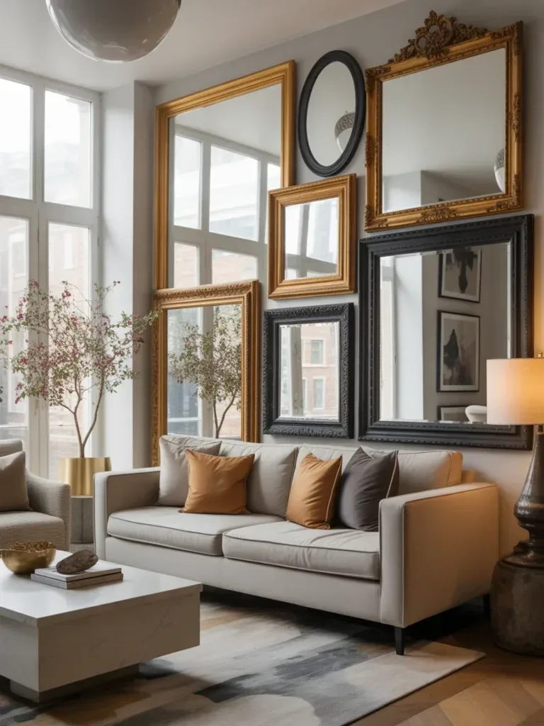
An album cover wall decor living room setup is one of the most personal ways to fill blank wall space, and it rewards a little planning far more than most art trends do. Done well, it reads as graphic minimalism with real emotional weight behind it — every sleeve on the wall is a memory, a mood, or a favorite record you can point to. Done carelessly, it can look like a dorm room that never grew up. This guide walks through the whole process: picking your core pieces, laying them out, framing on a budget, lighting them properly, and keeping the wall feeling fresh instead of frozen in time. Quick-Reference: Key Takeaways Start with 3–5 “core” album covers you genuinely love, not just what’s trending. Pick a layout style first — grid, salon-style, or hybrid — before you buy a single frame. Matching frame depth and color does more for cohesion than matching frame brand or price. Lighting angled at 30–45 degrees prevents glare on glass or acrylic fronts. Treat the wall as a living project — rotate a few covers seasonally instead of overhauling it. Why Album Covers Make an Album Cover Wall Decor Living Room Feel Alive Album cover art has a visual language that most other wall decor doesn’t. A sleeve carries color, typography, and cultural reference all in one square, which is part of why greatest album covers so often double as design icons on their own. When you group several thoughtfully, the wall becomes something guests actually stop and look at, rather than background noise. Photo by M. Antoine Vignon on Unsplash That’s the appeal of vinyl record wall art in general — it’s decor with a soundtrack attached. A well-chosen set of album sleeves can shift an entire room from forgettable to memorable, and it costs far less than most large-scale art. Choosing the Right Core Pieces for Your Room Album Cover Display Your anchor albums set the tone for everything else, so choose with intention. Pick three to five pieces that mean something to you personally — sentimental picks age better on a wall than anything pulled from a trending list. From there, look for a common thread that ties them together even if the music itself spans decades. Color harmony: settle on two or three dominant hues and let them repeat across the covers you choose. Frame consistency: keep the frame style — and matting, if used — identical across the group for a cleaner gallery wall layout. One statement piece: include a single bold, high-contrast cover that anchors the eye and gives the rest of the arrangement a reference point. How Many Albums Should You Start With? Begin with three to five core pieces. You can layer in two or three more later as your collection grows, which keeps the wall from feeling overwhelming on day one. Photo by Etkin Esmer on Unsplash Gallery Wall Layout Ideas That Don’t Look Accidental Before buying frames, decide on your structure. A tight grid reads as polished and modern; a salon-style collage feels looser and more collected-over-time. Both work in a cozy industrial living room or a cleaner, minimalist one — the layout just needs to match the rest of the room’s energy. Measure your wall space and mark a center point to build outward from. Leave 2–3 inches of breathing room between frames (more if you’re covering a large wall). Use frames of matching depth so the whole arrangement sits flush and tidy against the wall. The Rule of Three and Visual Rhythm People tend to read odd-numbered clusters — three, five, seven — as more intentional than even ones. Varying frame sizes within that cluster adds rhythm without tipping into visual chaos. Framing Styles for Music Album Posters on a Real Budget You don’t need a museum-level budget to make framed music posters look curated. Start affordable and upgrade individual frames over time as your taste (or your collection) evolves. Matting — even a simple white or black card insert — does a lot of heavy lifting for a small cost. Photo by R.D. Smith on Unsplash Framing OptionBest ForTrade-OffBasic black or white framesVersatility, mixing eras and stylesLess character on their ownMatted framesSophistication, keeping colors vibrantSlightly higher cost, needs standard sizingReplica vintage framesAdding texture and personalityCan clash if overused across a large wall Protecting Your Album Cover Art From Sun Damage If your wall gets direct sunlight, UV-protective glass or acrylic is worth the upgrade. It keeps colors from fading and prevents the sad, sun-bleached look that creeps in on unprotected prints over a year or two. Lighting: The Secret Ingredient for Music Decor Aesthetic Lighting can make or break a gallery wall. A warm, focused glow makes the printed colors pop, while soft ambient light keeps the whole room from feeling like a showroom. A mix of the two usually works best. Picture lights mounted above the frames add drama and draw the eye upward. LED strip lighting tucked behind shelves or frame edges creates a subtle glow. A dimmer switch lets you shift the mood to match whatever’s playing. Practical Lighting Angles Aim any direct lighting at roughly a 30–45 degree angle to cut down on glare. If your frames use glossy glass, angling the light slightly upward — so it bounces off the wall instead of straight into the room — solves most reflection problems. Photo by Bruno Guerrero on Unsplash Adding Personal Touches Without Cluttering the Wall The best album cover room decor reflects the person living there, not a showroom catalog. Mix in a few personal mementos — concert tickets, a handwritten lyric sheet, a spare vinyl sleeve — but keep additions deliberate rather than crowding every open inch. Mix media: art prints, photos, and vinyl sleeves can share the same wall space comfortably. Leave room for future finds instead of filling every gap right away. Rotate a few pieces seasonally to refresh the look without a full rehang. Try a Themed Rotation A “Spring Soundtrack” rotation with lighter, brighter covers in warmer months, swapped for darker, moodier art in fall, keeps a unique gallery wall from ever feeling static. Maintaining Your Wall Decor Music Setup Without the Hassle A wall that’s constantly in flux becomes a chore fast. A simple, repeatable system keeps updates fun instead of stressful. Photo by Miom _0326 on Unsplash Keep a small kit of spare frames, nails, and levelers on hand for quick swaps. Photograph new arrangements before committing, so you can compare options later. Dust frames every couple of weeks with a microfiber cloth to keep colors looking crisp. Things to Consider Before You Start Your Gallery Wall Do you want a formal grid or a looser salon-style spread? How much direct sunlight does the wall get during the day? Will this live in a shared living room space, or a quieter music corner just for you? Do you have a few sentimental albums already in mind, or are you still building the list? FAQ How many album covers should a starter gallery wall have? Three to five core pieces is a solid starting point. You can add more gradually as your collection grows. Should all my frames match? Matching frame depth and finish creates the most cohesive look, even if the album covers themselves span very different eras or genres. What’s the best layout for a small living room? A tight grid tends to work better in smaller spaces since it reads as neat and contained, while salon-style layouts need more wall room to breathe. How do I stop glare on framed album covers? Angle any direct lighting at 30–45 degrees, and consider UV-protective glass or acrylic if the wall gets strong natural light. Can I use this same approach for a bedroom instead of a living room? Yes — the same core principles apply to an aesthetic music bedroom setup, just on a smaller scale suited to bedroom wall space. Our Verdict An album cover wall decor living room works best when it’s treated as an evolving collection rather than a one-time purchase. Start small with pieces you genuinely love, commit to one layout style, light it properly, and let the wall change with you over time. For more layout inspiration, see this roundup of album cover wall decor ideas, or explore music poster wall decor ideas if you want to expand beyond album sleeves alone. If you’re planning a similar wall in a smaller room, this guide to album cover wall decor for bedrooms covers scaled-down layouts. And for lighting or framing that extends beyond music art specifically, this piece on wall decor design inspiration is a useful next stop, along with these eclectic gallery wall ideas for mixing art types.
An album cover wall decor living room setup is one of the most personal ways to fill blank wall space, and it rewards a little planning far more than most art trends do. Done well, it reads as graphic minimalism with real emotional weight behind it — every sleeve on the wall is a memory, a mood, or a favorite record you can point to. Done carelessly, it can look like a dorm room that never grew up.
This guide walks through the whole process: picking your core pieces, laying them out, framing on a budget, lighting them properly, and keeping the wall feeling fresh instead of frozen in time.
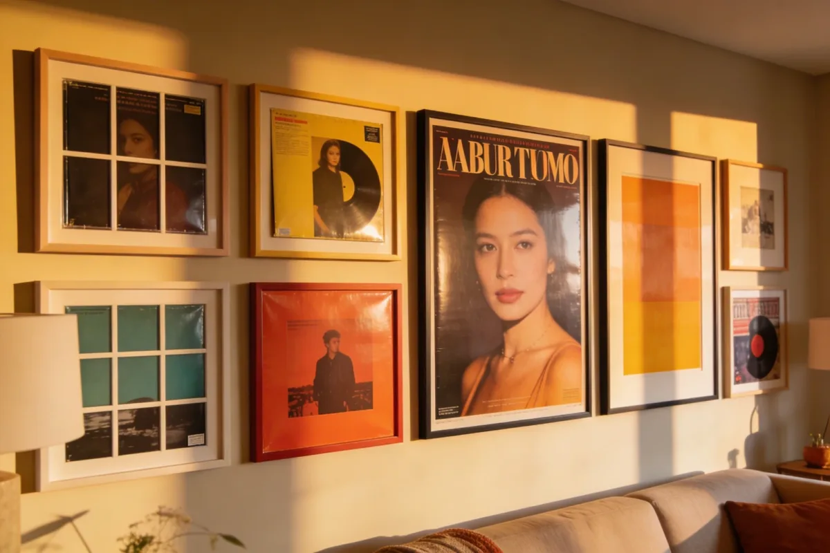
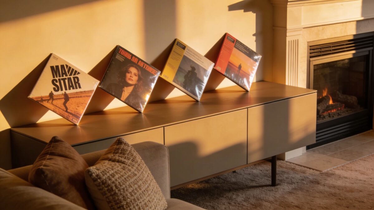
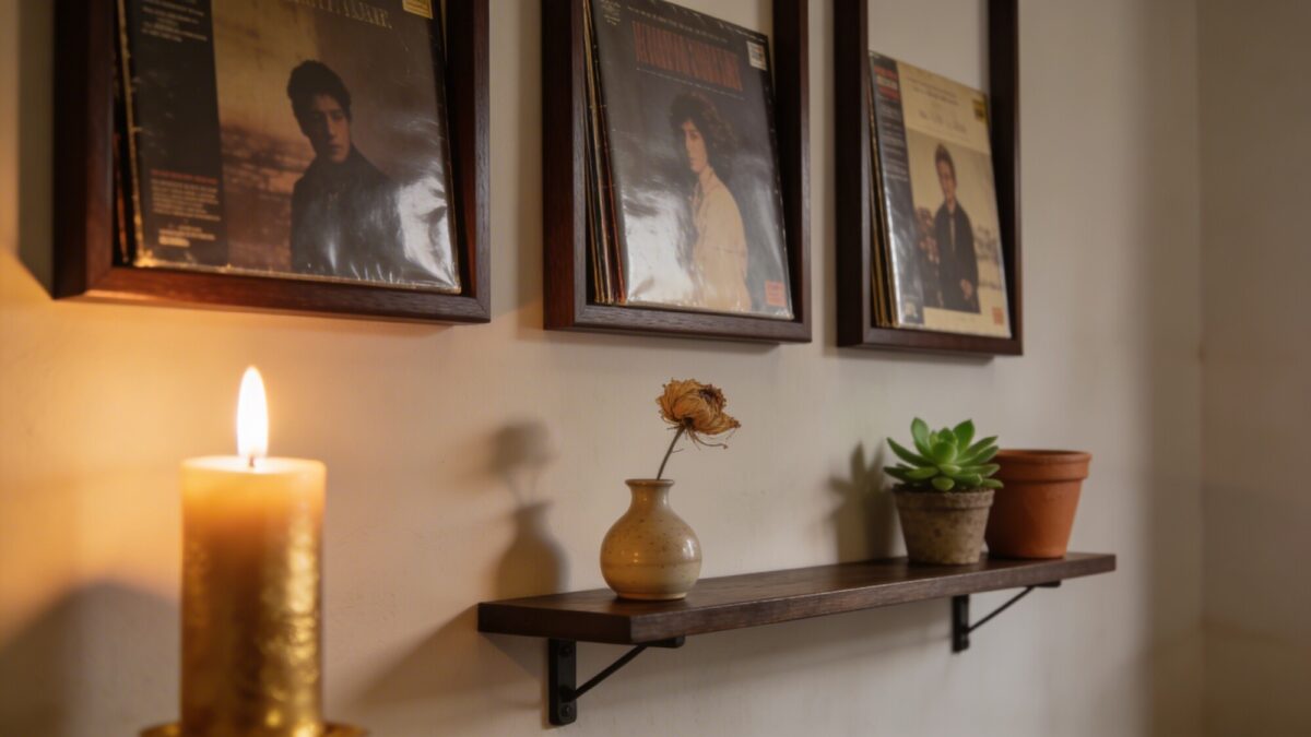
Album cover art has a visual language that most other wall decor doesn’t. A sleeve carries color, typography, and cultural reference all in one square, which is part of why greatest album covers so often double as design icons on their own. When you group several thoughtfully, the wall becomes something guests actually stop and look at, rather than background noise.
That’s the appeal of vinyl record wall art in general — it’s decor with a soundtrack attached. A well-chosen set of album sleeves can shift an entire room from forgettable to memorable, and it costs far less than most large-scale art.
Choosing the Right Core Pieces for Your Room Album Cover Display
Your anchor albums set the tone for everything else, so choose with intention. Pick three to five pieces that mean something to you personally — sentimental picks age better on a wall than anything pulled from a trending list. From there, look for a common thread that ties them together even if the music itself spans decades.
Color harmony: settle on two or three dominant hues and let them repeat across the covers you choose.
Frame consistency: keep the frame style — and matting, if used — identical across the group for a cleaner gallery wall layout.
One statement piece: include a single bold, high-contrast cover that anchors the eye and gives the rest of the arrangement a reference point.
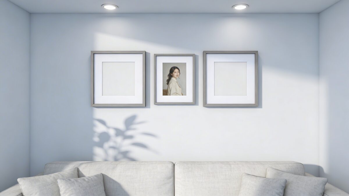
Begin with three to five core pieces. You can layer in two or three more later as your collection grows, which keeps the wall from feeling overwhelming on day one.
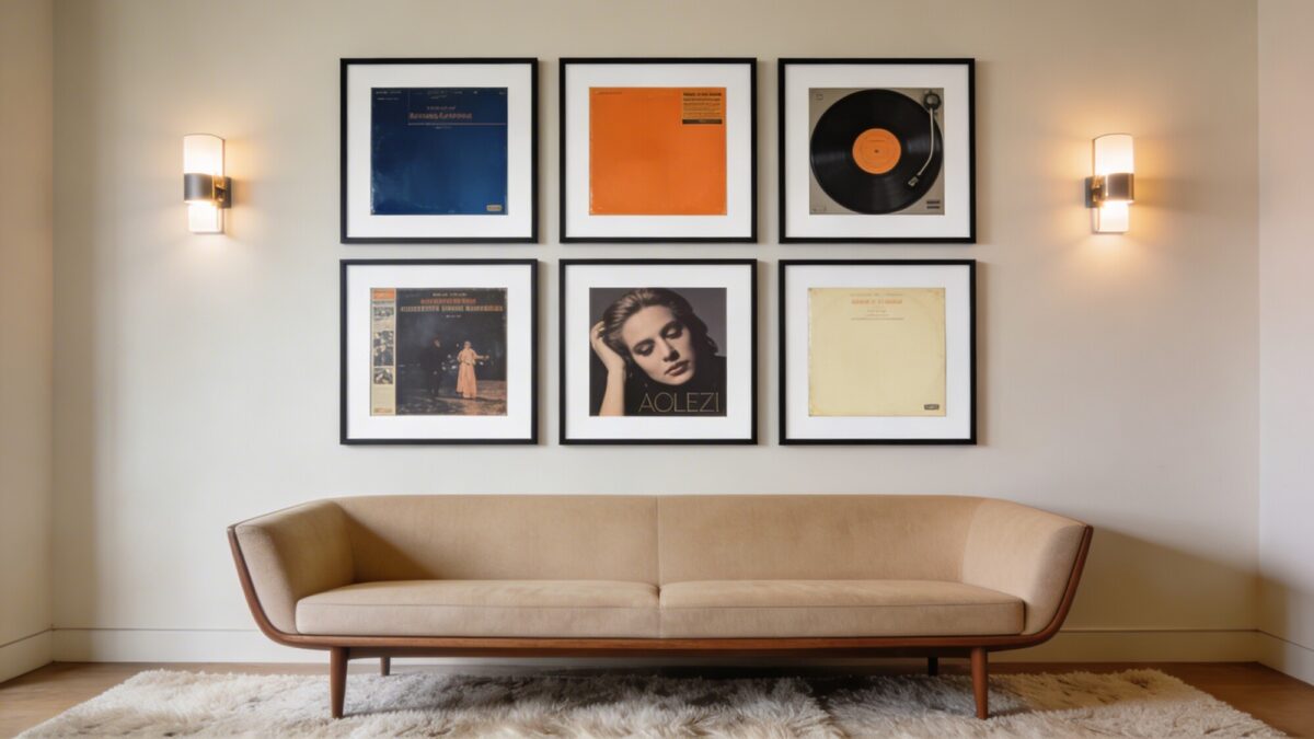
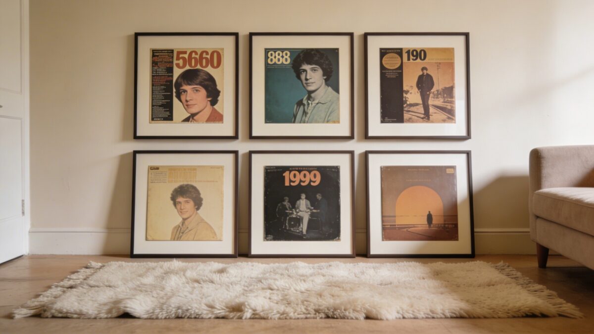
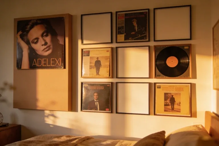
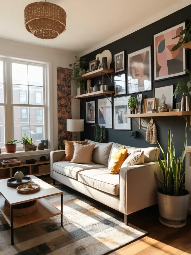
Before buying frames, decide on your structure. A tight grid reads as polished and modern; a salon-style collage feels looser and more collected-over-time. Both work in a cozy industrial living room or a cleaner, minimalist one — the layout just needs to match the rest of the room’s energy.
Measure your wall space and mark a center point to build outward from.
Leave 2–3 inches of breathing room between frames (more if you’re covering a large wall).
Use frames of matching depth so the whole arrangement sits flush and tidy against the wall.
The Rule of Three and Visual Rhythm
People tend to read odd-numbered clusters — three, five, seven — as more intentional than even ones. Varying frame sizes within that cluster adds rhythm without tipping into visual chaos.
Framing Styles for Music Album Posters on a Real Budget
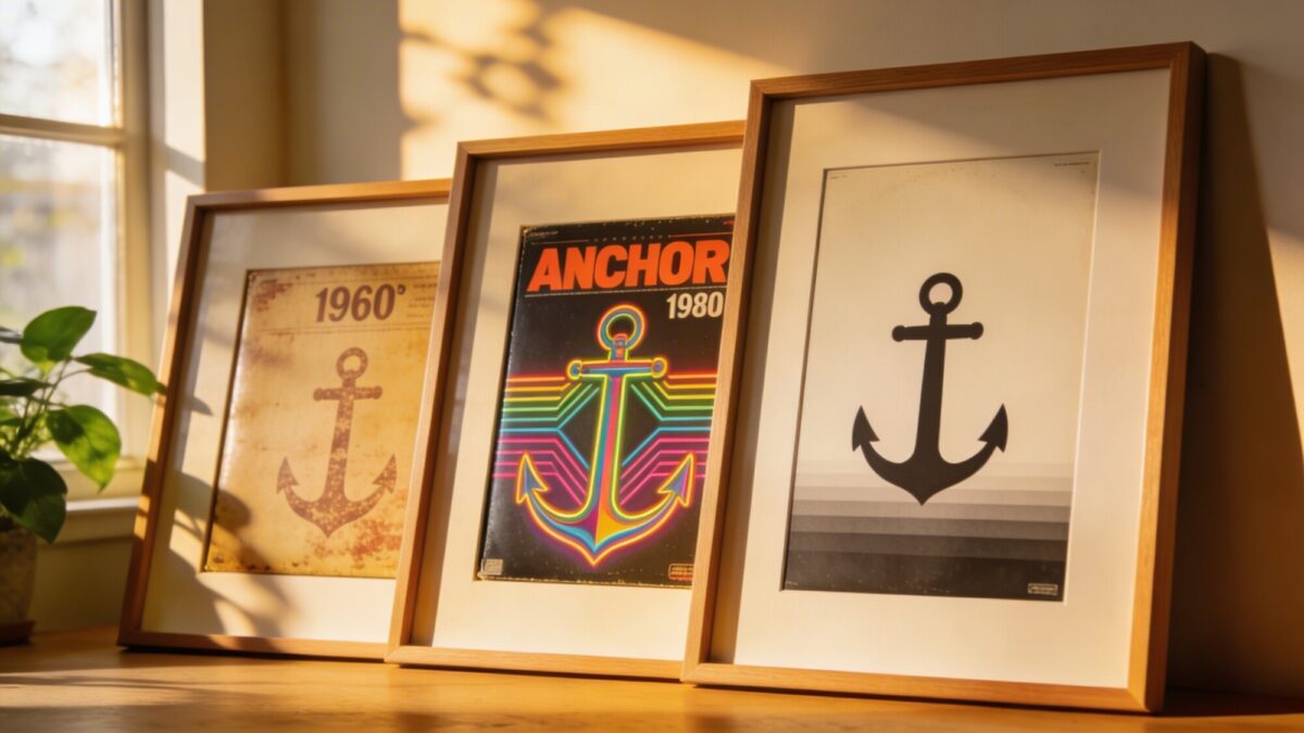
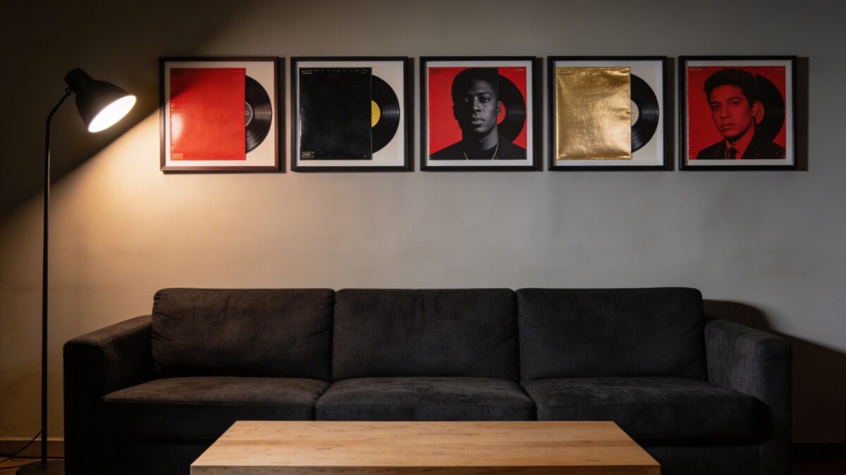
You don’t need a museum-level budget to make framed music posters look curated. Start affordable and upgrade individual frames over time as your taste (or your collection) evolves. Matting — even a simple white or black card insert — does a lot of heavy lifting for a small cost.
If your wall gets direct sunlight, UV-protective glass or acrylic is worth the upgrade. It keeps colors from fading and prevents the sad, sun-bleached look that creeps in on unprotected prints over a year or two.
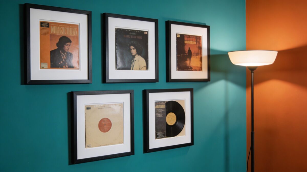
Lighting can make or break a gallery wall. A warm, focused glow makes the printed colors pop, while soft ambient light keeps the whole room from feeling like a showroom. A mix of the two usually works best.
Picture lights mounted above the frames add drama and draw the eye upward.
LED strip lighting tucked behind shelves or frame edges creates a subtle glow.
A dimmer switch lets you shift the mood to match whatever’s playing.
Practical Lighting Angles
Aim any direct lighting at roughly a 30–45 degree angle to cut down on glare. If your frames use glossy glass, angling the light slightly upward — so it bounces off the wall instead of straight into the room — solves most reflection problems.
The best album cover room decor reflects the person living there, not a showroom catalog. Mix in a few personal mementos — concert tickets, a handwritten lyric sheet, a spare vinyl sleeve — but keep additions deliberate rather than crowding every open inch.
Mix media: art prints, photos, and vinyl sleeves can share the same wall space comfortably.
Leave room for future finds instead of filling every gap right away.
Rotate a few pieces seasonally to refresh the look without a full rehang.
Try a Themed Rotation
A “Spring Soundtrack” rotation with lighter, brighter covers in warmer months, swapped for darker, moodier art in fall, keeps a unique gallery wall from ever feeling static.
Maintaining Your Wall Decor Music Setup Without the Hassle
Keep a small kit of spare frames, nails, and levelers on hand for quick swaps.
Photograph new arrangements before committing, so you can compare options later.
Dust frames every couple of weeks with a microfiber cloth to keep colors looking crisp.
Things to Consider Before You Start Your Gallery Wall
Do you want a formal grid or a looser salon-style spread?
How much direct sunlight does the wall get during the day?
Will this live in a shared living room space, or a quieter music corner just for you?
Do you have a few sentimental albums already in mind, or are you still building the list?
FAQ
How many album covers should a starter gallery wall have?
Three to five core pieces is a solid starting point. You can add more gradually as your collection grows.
Should all my frames match?
Matching frame depth and finish creates the most cohesive look, even if the album covers themselves span very different eras or genres.
What’s the best layout for a small living room?
A tight grid tends to work better in smaller spaces since it reads as neat and contained, while salon-style layouts need more wall room to breathe.
How do I stop glare on framed album covers?
Angle any direct lighting at 30–45 degrees, and consider UV-protective glass or acrylic if the wall gets strong natural light.
Can I use this same approach for a bedroom instead of a living room?
Yes — the same core principles apply to an aesthetic music bedroom setup, just on a smaller scale suited to bedroom wall space.
Our Verdict
An album cover wall decor living room works best when it’s treated as an evolving collection rather than a one-time purchase. Start small with pieces you genuinely love, commit to one layout style, light it properly, and let the wall change with you over time. For more layout inspiration, see this roundup of album cover wall decor ideas, or explore music poster wall decor ideas if you want to expand beyond album sleeves alone.
Listen to this article 10 10 0:00 / 0:00 Speed 0.75×1×1.25×1.5×2× Your bedroom deserves a soundtrack, and these album-cover wall ideas hit all the right notes. They’re 7 Album Cover Wall Decor Bedroom Ideas for Your Vibe Album cover wall decor bedroom ideas are one of the easiest ways to turn a plain wall into…
Listen to this article 10 10 0:00 / 0:00 Speed 0.75×1×1.25×1.5×2× Let’s be honest—your TV wall can either be the star of the room or the awkward afterthought you try to ignore. And if you’re still working with a plain wall and a dangling cable situation… yeah, we need to fix that. A well-designed media…
Listen to this article 10 10 0:00 / 0:00 Speed 0.75×1×1.25×1.5×2× Turning a favorite album cover into wallpaper sounds simple until you actually try it — crop wrong and your icons swallow the art, pick the wrong resolution and it looks blurry by lunchtime. A good album cover wallpaper does more than look pretty; it…
Listen to this article 10 10 0:00 / 0:00 Speed 0.75×1×1.25×1.5×2× Blank walls can make even the nicest room feel unfinished. You walk in, look around, and suddenly your home gives “waiting room energy.” Not ideal. The good news? You don’t need a massive budget or an interior design degree to fix it. A few…
Listen to this article 10 10 0:00 / 0:00 Speed 0.75×1×1.25×1.5×2× Blank walls can make even the nicest room feel unfinished. You know the vibe — comfy couch, cute rug, decent lighting… and then the walls look like they forgot to show up. The good news? Wall decor design changes everything faster than most people…
Listen to this article 10 10 0:00 / 0:00 Speed 0.75×1×1.25×1.5×2× Choosing between gold and black frame mirror wall decor sounds simple—until you’re staring at your living room wondering why everything suddenly feels “off.” The frame you pick can completely change the mood, style, and even perceived size of your space. Yeah, it’s that powerful….